## Line Plots: Real and Imaginary Components of a Complex Signal Evolution
### Overview
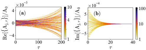
The image displays two side-by-side line plots, labeled (a) and (b), showing the evolution of the real and imaginary parts of a normalized complex quantity, `[A₁,τ]/A₀`, as a function of a parameter `τ`. Each plot contains multiple lines, color-coded according to a scale shown in a vertical color bar on the right side of each subplot. The plots suggest a simulation or analysis of a dynamic system where multiple trajectories are being tracked.
### Components/Axes
**Plot (a) - Left Panel:**
* **Title/Label:** `(a)` (positioned at the top-left corner of the plot area).
* **Y-axis Label:** `Re{[A₁,τ]}/A₀` (Real part of the normalized quantity). The axis has a multiplier of `×10⁻³` at the top.
* **X-axis Label:** `τ` (tau).
* **Y-axis Scale:** Linear scale with major ticks at -4, -2, 0, 2, 4 (all values to be multiplied by 10⁻³).
* **X-axis Scale:** Linear scale from 0 to 200, with major ticks at 0, 100, 200.
* **Color Bar/Legend:** A vertical bar positioned to the right of the plot. It is labeled with values `1`, `4`, `7`, `10` from bottom to top. The color gradient transitions from yellow (bottom, value ~1) through orange to dark red/purple (top, value ~10). This bar likely represents a third parameter or initial condition that varies across the plotted lines.
**Plot (b) - Right Panel:**
* **Title/Label:** `(b)` (positioned at the top-left corner of the plot area).
* **Y-axis Label:** `Im{[A₁,τ]}/A₀` (Imaginary part of the normalized quantity). The axis has a multiplier of `×10⁻⁴` at the top.
* **X-axis Label:** `τ` (tau).
* **Y-axis Scale:** Linear scale with major ticks at -5, 0, 5 (all values to be multiplied by 10⁻⁴).
* **X-axis Scale:** Linear scale from 0 to 40, with major ticks at 0, 20, 40.
* **Color Bar/Legend:** A vertical bar positioned to the right of the plot. It is labeled with values `1`, `10`, `100` from bottom to top. The color gradient transitions from yellow (bottom, value ~1) through orange to dark red/purple (top, value ~100). Note the different scale (1-100) compared to plot (a)'s scale (1-10).
### Detailed Analysis
**Plot (a) - Real Part Evolution:**
* **Trend Verification:** The bundle of lines originates near `Re{[A₁,τ]}/A₀ = 0` at `τ = 0`. As `τ` increases, the lines **diverge** or **spread out** symmetrically around the zero line. Some trajectories trend positively, others negatively, with the spread increasing with `τ`.
* **Data Points & Distribution:** At `τ = 200`, the lines span a range approximately from `-2.5 × 10⁻³` to `+2.5 × 10⁻³`. The density of lines appears highest near the center (zero) and decreases towards the extremes. The color coding (linked to the 1-10 scale) does not show an immediately obvious, simple correlation with the final value (e.g., all high-value lines do not go positive). The relationship between the color parameter and the trajectory's sign or magnitude is complex.
**Plot (b) - Imaginary Part Evolution:**
* **Trend Verification:** The bundle of lines originates with a wide spread around `Im{[A₁,τ]}/A₀ = 0` at `τ = 0`. As `τ` increases, the lines **converge** rapidly towards zero. By `τ ≈ 20`, all lines have effectively collapsed onto the `Im = 0` axis.
* **Data Points & Distribution:** At `τ = 0`, the lines span approximately from `-5 × 10⁻⁴` to `+5 × 10⁻⁴`. The convergence is very tight; by `τ = 40`, the imaginary component for all trajectories is negligible. The color coding (linked to the 1-100 scale) shows that lines with higher initial spread (both positive and negative) tend to correspond to higher values on the color scale (darker colors).
### Key Observations
1. **Asymmetric Evolution:** The real part (a) diverges over a long `τ` range (0-200), while the imaginary part (b) converges over a short `τ` range (0-40). This indicates fundamentally different dynamics for the two components.
2. **Scale Discrepancy:** The magnitude of the real part variations (order of 10⁻³) is about ten times larger than that of the imaginary part variations (order of 10⁻⁴).
3. **Color Parameter Influence:** The parameter represented by the color bar has a more visually apparent correlation with the initial conditions and spread in the imaginary plot (b) than with the final outcomes in the real plot (a).
4. **Symmetry:** Both plots show approximate symmetry around the zero axis in their initial distributions.
### Interpretation
These plots likely visualize the results of a numerical simulation of a complex dynamical system, possibly in physics (e.g., wave mechanics, quantum states, signal processing) or engineering (e.g., control systems, oscillations). The quantity `[A₁,τ]` appears to be a complex amplitude evolving with a parameter `τ` (which could represent time, distance, or an iteration count).
* **What the data suggests:** The system exhibits **stable convergence** in its phase (imaginary part) but **unstable divergence** in its amplitude or in-phase component (real part). This could represent a system where phase coherence is quickly established or damped, while energy or amplitude grows or fluctuates unpredictably over a longer period.
* **Relationship between elements:** The two plots are two views of the same underlying complex process. The color-coded parameter acts as an initial condition or system constant. Its strong link to the initial imaginary spread suggests it might control an initial phase distribution or coupling strength. Its weaker link to the final real part suggests the long-term amplitude growth is sensitive to many factors or is chaotic.
* **Notable Anomalies/Patterns:** The clean, symmetric convergence in (b) is striking and suggests a strong damping or synchronization mechanism for the imaginary component. The "fanning out" pattern in (a) is characteristic of unstable or sensitive dependence on initial conditions. The difference in `τ` scales (200 vs. 40) is crucial—it highlights that the convergent process is an order of magnitude faster than the divergent one.
**Language Note:** All text in the image is in English and mathematical notation. No other languages are present.