## Line Charts: Real and Imaginary Components vs. Tau
### Overview
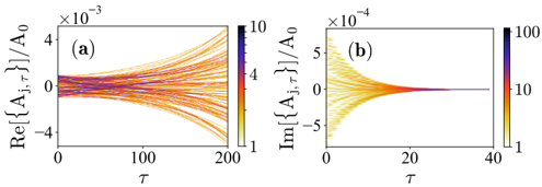
The image contains two line charts, (a) and (b), displaying the behavior of real and imaginary components of a variable A with respect to a parameter tau. Chart (a) shows the real component, while chart (b) shows the imaginary component. The lines are color-coded based on a third, unspecified parameter, with color scales provided to the right of each chart.
### Components/Axes
**Chart (a): Real Component**
* **Title:** Re[{Aj,τ}]/A0
* **Y-axis:** Re[{Aj,τ}]/A0, with a scale factor of ×10^-3. The axis ranges from approximately -4 × 10^-3 to 4 × 10^-3.
* **X-axis:** τ (tau), ranging from 0 to 200.
* **Colorbar:** Located on the right side of chart (a), ranging from 1 (yellow) to 10 (purple). Intermediate values of 4 (orange/red) are also marked.
**Chart (b): Imaginary Component**
* **Title:** Im[{Aj,τ}]/A0
* **Y-axis:** Im[{Aj,τ}]/A0, with a scale factor of ×10^-4. The axis ranges from approximately -5 × 10^-4 to 5 × 10^-4.
* **X-axis:** τ (tau), ranging from 0 to 40.
* **Colorbar:** Located on the right side of chart (b), ranging from 1 (yellow) to 100 (purple). Intermediate values of 10 (orange/red) are also marked.
### Detailed Analysis
**Chart (a): Real Component**
* **General Trend:** The lines start near zero and diverge as τ increases. The lines with lower colorbar values (yellow) tend to increase more rapidly, while the lines with higher colorbar values (purple) tend to decrease more rapidly.
* **Specific Values:**
* At τ = 0, all lines are clustered around 0.
* At τ = 200, the lines span from approximately -4 × 10^-3 to 4 × 10^-3.
* The lines colored yellow (value 1) tend to reach around 4 × 10^-3 at τ = 200.
* The lines colored purple (value 10) tend to reach around -4 × 10^-3 at τ = 200.
**Chart (b): Imaginary Component**
* **General Trend:** The lines start with a range of values and converge towards zero as τ increases. The lines with lower colorbar values (yellow) converge more slowly, while the lines with higher colorbar values (purple) converge more rapidly.
* **Specific Values:**
* At τ = 0, the lines span from approximately -5 × 10^-4 to 5 × 10^-4.
* At τ = 40, all lines are clustered around 0.
* The lines colored yellow (value 1) are still slightly away from 0 at τ = 40.
* The lines colored purple (value 100) converge to 0 very quickly.
### Key Observations
* The real component diverges with increasing τ, while the imaginary component converges.
* The color-coding reveals a strong correlation between the colorbar value and the rate of divergence/convergence. Lower values (yellow) correspond to faster divergence in the real component and slower convergence in the imaginary component. Higher values (purple) correspond to slower divergence in the real component and faster convergence in the imaginary component.
* The x-axis scales are different for the two charts, indicating that the imaginary component converges much faster than the real component diverges.
### Interpretation
The charts illustrate the temporal evolution of the real and imaginary components of a complex variable. The parameter represented by the color scale significantly influences the dynamics of both components. The data suggests that this parameter controls the stability or damping of the system, with higher values leading to faster damping (convergence of the imaginary component) and slower growth (divergence of the real component). The opposite is true for lower values of the parameter. The difference in time scales between the two charts indicates that the imaginary component is a transient effect, while the real component represents a longer-term behavior.