\n
## Chart: Real and Imaginary Parts of A<sub>i,τ</sub>/A<sub>0</sub>
### Overview
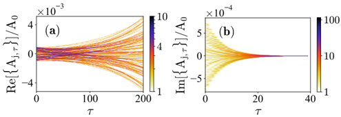
The image presents two charts, labeled (a) and (b), displaying the real and imaginary components of a normalized quantity, A<sub>i,τ</sub>/A<sub>0</sub>, as a function of τ. Both charts utilize a color scale to represent a third dimension of data. Chart (a) shows the real part (Re{A<sub>i,τ</sub>}) against τ, while chart (b) shows the imaginary part (Im{A<sub>i,τ</sub>}) against τ.
### Components/Axes
* **Chart (a):**
* X-axis: τ (ranging from approximately 0 to 200)
* Y-axis: Re{A<sub>i,τ</sub>}/A<sub>0</sub> (ranging from approximately -4 to 4, scaled by ×10<sup>-3</sup>)
* Colorbar: Represents values from 1 to 10, scaled by ×10<sup>-3</sup>.
* **Chart (b):**
* X-axis: τ (ranging from approximately 0 to 40)
* Y-axis: Im{A<sub>i,τ</sub>}/A<sub>0</sub> (ranging from approximately -5 to 5, scaled by ×10<sup>-4</sup>)
* Colorbar: Represents values from 1 to 100.
### Detailed Analysis or Content Details
**Chart (a):**
The chart displays a series of curves that initially diverge from the y-axis (Re{A<sub>i,τ</sub>}/A<sub>0</sub> = 0) at τ = 0. The curves generally slope downwards, becoming more spread out as τ increases. The color of the curves changes along their length, indicating variations in the value represented by the colorbar.
* At τ ≈ 0, the curves are predominantly yellow/orange (values around 1-4 on the colorbar).
* As τ increases to approximately 200, the curves transition to shades of purple/blue (values around 8-10 on the colorbar).
* The curves appear to converge slightly towards the end of the chart.
**Chart (b):**
This chart shows a similar pattern to chart (a), but with the imaginary component. The curves start at the y-axis (Im{A<sub>i,τ</sub>}/A<sub>0</sub> = 0) at τ = 0 and diverge.
* At τ ≈ 0, the curves are predominantly yellow/orange (values around 1-10 on the colorbar).
* As τ increases to approximately 40, the curves transition to shades of purple/red (values around 50-100 on the colorbar).
* The curves converge more rapidly in this chart than in chart (a).
### Key Observations
* Both charts exhibit a diverging pattern of curves, suggesting a complex relationship between A<sub>i,τ</sub> and τ.
* The colorbars indicate that the magnitude of A<sub>i,τ</sub>/A<sub>0</sub> changes significantly with τ.
* Chart (b) has a much wider range of values represented by the colorbar (1-100) compared to chart (a) (1-10).
* The x-axis scale differs significantly between the two charts, with chart (b) covering a much shorter range of τ values.
### Interpretation
The charts likely represent the evolution of some oscillatory or wave-like phenomenon over time (τ). The real and imaginary parts suggest a complex amplitude or phase modulation. The diverging curves could indicate the growth of multiple modes or frequencies. The color variation suggests that the amplitude or phase of these modes changes over time.
The difference in the x-axis scales and colorbar ranges between the two charts suggests that the dynamics of the real and imaginary components are different. The imaginary component (chart b) appears to reach higher magnitudes and evolves more rapidly over a shorter time scale than the real component (chart a).
The convergence of the curves in both charts could indicate a damping or stabilization of the system over time. The specific meaning of A<sub>i,τ</sub> and A<sub>0</sub> would require additional context, but the charts provide valuable insights into the temporal behavior of this quantity. The data suggests a system that initially exhibits a wide range of behaviors, which then converge over time, with the imaginary component evolving more rapidly and reaching higher magnitudes.