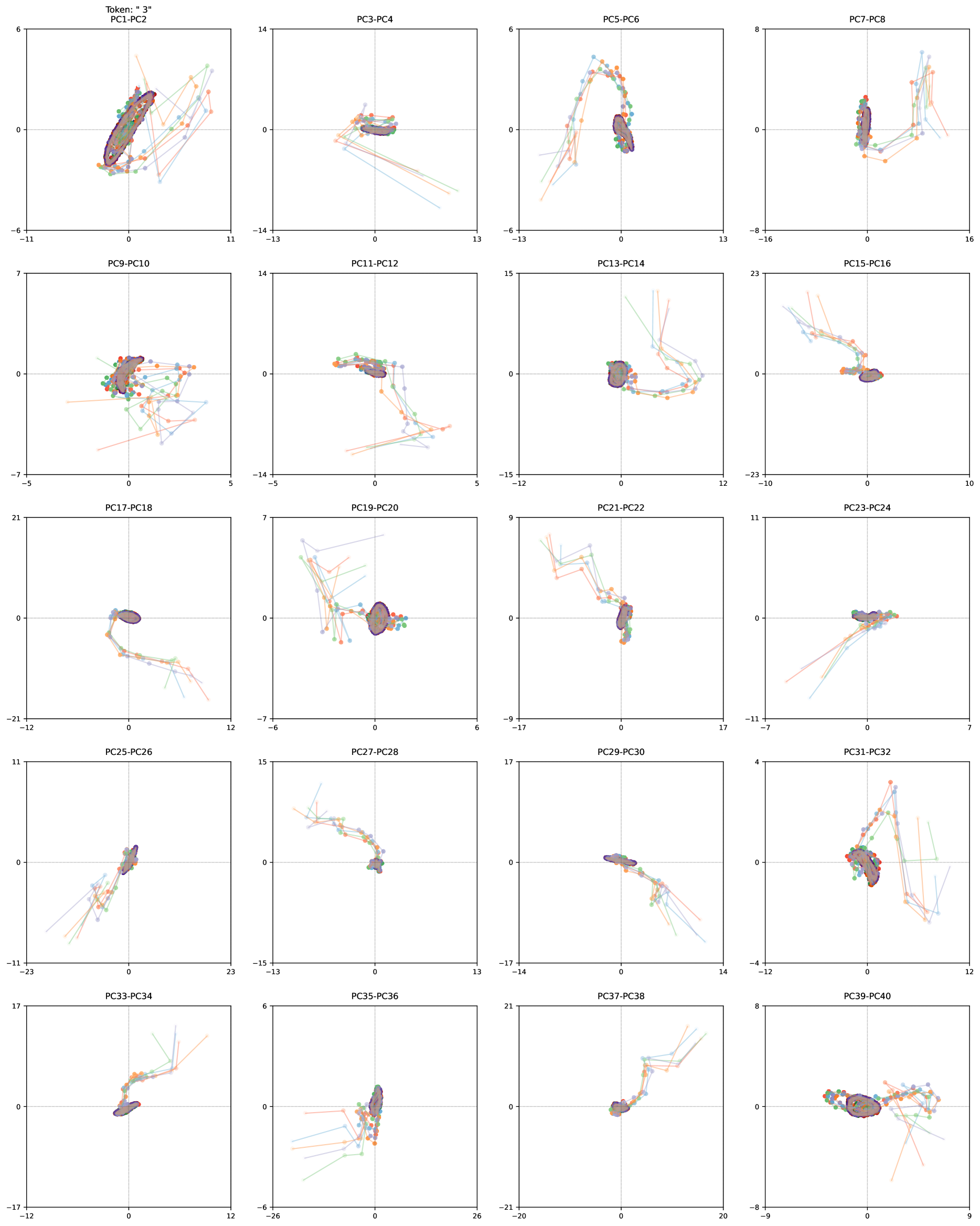
## Chart Type: Scatter Plot Matrix
### Overview
The image presents a matrix of 2D scatter plots. Each plot visualizes the relationship between two principal components (PCs) of a dataset. The plots show trajectories or movements in the PC space, with different colored lines representing different data instances or categories. A dark, filled shape, possibly representing a cluster or region of interest, is present in each plot.
### Components/Axes
Each subplot has the following components:
* **Title:** Each plot is titled with the names of the two principal components being visualized (e.g., "PC1-PC2", "PC3-PC4", etc.).
* **X-axis:** The horizontal axis represents the first principal component in the title (e.g., PC1 in "PC1-PC2").
* The X-axis ranges vary across subplots.
* **Y-axis:** The vertical axis represents the second principal component in the title (e.g., PC2 in "PC1-PC2").
* The Y-axis ranges vary across subplots.
* **Origin:** Each plot has a dashed gray line indicating the origin (0, 0).
* **Data Points:** Each plot contains multiple colored lines, each with circular markers. The colors are orange, light blue, green, and red.
* **Cluster/Region:** A dark, filled shape (appears to be a dark purple/brown) is present in each plot, generally near the origin. This shape likely represents a cluster or region of high data density.
### Detailed Analysis
The image contains 20 subplots arranged in a 5x4 grid. Each subplot displays a scatter plot of two principal components. The data points are connected by lines, showing the trajectory of the data in the PC space. The dark, filled shape in each plot seems to represent a central tendency or cluster of the data.
Here's a breakdown of the subplots and their approximate axis ranges:
1. **PC1-PC2:** X-axis: -11 to 11, Y-axis: -6 to 6. The data points are clustered around the origin, with trajectories extending outwards.
2. **PC3-PC4:** X-axis: -13 to 13, Y-axis: -14 to 14. Data points are clustered near the origin.
3. **PC5-PC6:** X-axis: -13 to 13, Y-axis: -8 to 8. The trajectories form a curved shape, moving from the bottom-left to the top-right.
4. **PC7-PC8:** X-axis: -16 to 16, Y-axis: -8 to 8. Data points are clustered near the origin.
5. **PC9-PC10:** X-axis: -5 to 5, Y-axis: -7 to 7. Data points are clustered near the origin.
6. **PC11-PC12:** X-axis: -5 to 5, Y-axis: -14 to 14. Data points are clustered near the origin.
7. **PC13-PC14:** X-axis: -12 to 12, Y-axis: -15 to 15. The trajectories form a curved shape.
8. **PC15-PC16:** X-axis: -10 to 10, Y-axis: -23 to 23. The trajectories move from the top to the bottom.
9. **PC17-PC18:** X-axis: -12 to 12, Y-axis: -21 to 21. The trajectories move from the top to the bottom.
10. **PC19-PC20:** X-axis: -6 to 6, Y-axis: -7 to 7. Data points are clustered near the origin.
11. **PC21-PC22:** X-axis: -17 to 17, Y-axis: -9 to 9. The trajectories move from the top to the bottom.
12. **PC23-PC24:** X-axis: -7 to 7, Y-axis: -11 to 11. Data points are clustered near the origin.
13. **PC25-PC26:** X-axis: -23 to 23, Y-axis: -11 to 11. The trajectories move from the bottom to the top.
14. **PC27-PC28:** X-axis: -13 to 13, Y-axis: -15 to 15. The trajectories move from the top to the bottom.
15. **PC29-PC30:** X-axis: -14 to 14, Y-axis: -17 to 17. The trajectories move from the top to the bottom.
16. **PC31-PC32:** X-axis: -12 to 12, Y-axis: -4 to 4. The trajectories move from the bottom to the top.
17. **PC33-PC34:** X-axis: -12 to 12, Y-axis: -17 to 17. The trajectories move from the bottom to the top.
18. **PC35-PC36:** X-axis: -26 to 26, Y-axis: -6 to 6. Data points are clustered near the origin.
19. **PC37-PC38:** X-axis: -20 to 20, Y-axis: -21 to 21. The trajectories move from the top to the bottom.
20. **PC39-PC40:** X-axis: -9 to 9, Y-axis: -8 to 8. Data points are clustered near the origin.
### Key Observations
* The data points in each plot tend to cluster around the origin.
* The trajectories show the movement of the data in the PC space.
* The dark, filled shape in each plot likely represents a region of high data density or a cluster.
* The ranges of the axes vary across the subplots, indicating that the principal components have different scales.
* Some plots show clear trends or patterns in the trajectories, while others show more random movement.
### Interpretation
The scatter plot matrix visualizes the relationships between different principal components of a dataset. The clustering of data points around the origin suggests that the data is centered around a common point in the PC space. The trajectories show how the data moves in the PC space, and the dark, filled shape likely represents a region of high data density or a cluster.
The different patterns and trends observed in the subplots suggest that the principal components capture different aspects of the data. Some components may be more strongly correlated than others, and some may exhibit more complex relationships.
The plot titled "Token: " 3" PC1-PC2" at the top-left suggests that the data may be related to tokens or sequences, and the number "3" may be a parameter or identifier.