\n
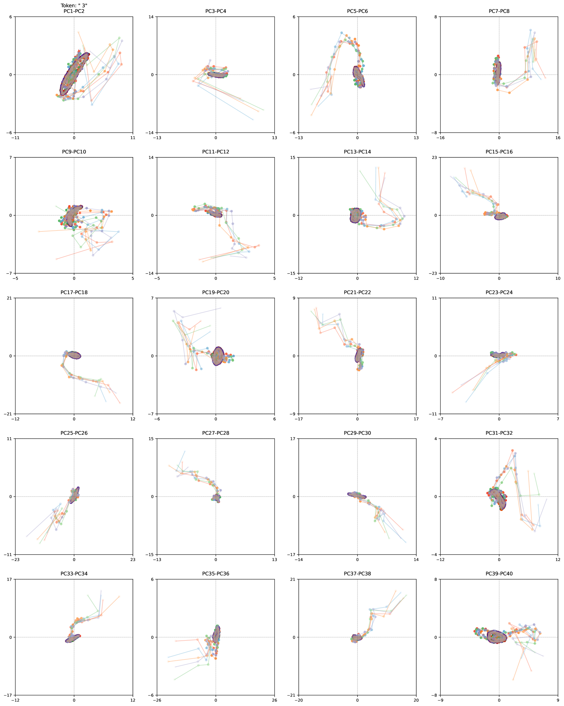
## Scatter Plot Matrix: Principal Component Analysis (PCA)
### Overview
The image presents a scatter plot matrix visualizing the results of a Principal Component Analysis (PCA). It consists of 20 rows and 4 columns of scatter plots, each representing the relationship between two principal components (PC). Each point in the scatter plots is color-coded, likely representing different classes or groups within the dataset. The plots are arranged to show all pairwise combinations of PCs from PC1 to PC40.
### Components/Axes
Each individual scatter plot has two axes, labeled as "PCx-PCy" where x and y are integers from 1 to 40. The axes scales vary for each plot, ranging approximately from -30 to 30, -20 to 20, -15 to 15, -10 to 10, -8 to 8, -7 to 7, -6 to 6, -5 to 5, -4 to 4, -3 to 3, -2 to 2, -1 to 1, 0 to 6. A legend is present in the top-left plot, indicating the color coding scheme. The legend contains the following colors and their corresponding labels:
* Purple
* Green
* Red
* Cyan
* Blue
* Orange
### Detailed Analysis or Content Details
The matrix is organized as follows:
* **Row 1:** PC1-PC2, PC3-PC4, PC5-PC6, PC7-PC8
* **Row 2:** PC9-PC10, PC11-PC12, PC13-PC14, PC15-PC16
* **Row 3:** PC17-PC18, PC19-PC20, PC21-PC22, PC23-PC24
* **Row 4:** PC25-PC26, PC27-PC28, PC29-PC30, PC31-PC32
* **Row 5:** PC33-PC34, PC35-PC36, PC37-PC38, PC39-PC40
Due to the density of the plots and the varying scales, precise numerical data extraction is difficult. However, we can describe the general trends and distributions:
* **PC1-PC2:** The points form several distinct clusters, with purple and green being the most prominent. The clusters are somewhat elongated, suggesting a correlation between PC1 and PC2.
* **PC3-PC4:** Similar to PC1-PC2, there are distinct clusters, but they appear more dispersed.
* **PC5-PC6:** The points are more scattered, with less clear clustering.
* **PC7-PC8:** The points form a curved shape, with a clear separation between the purple and green clusters.
* **PC9-PC10:** The points are relatively dispersed, with some overlap between the clusters.
* **PC11-PC12:** The points are highly dispersed, with no clear clustering.
* **PC13-PC14:** The points form a curved shape, with a clear separation between the purple and green clusters.
* **PC15-PC16:** The points are relatively dispersed, with some overlap between the clusters.
* **PC17-PC18:** The points are relatively dispersed, with some overlap between the clusters.
* **PC19-PC20:** The points are relatively dispersed, with some overlap between the clusters.
* **PC21-PC22:** The points are relatively dispersed, with some overlap between the clusters.
* **PC23-PC24:** The points are relatively dispersed, with some overlap between the clusters.
* **PC25-PC26:** The points are relatively dispersed, with some overlap between the clusters.
* **PC27-PC28:** The points are relatively dispersed, with some overlap between the clusters.
* **PC29-PC30:** The points are relatively dispersed, with some overlap between the clusters.
* **PC31-PC32:** The points are relatively dispersed, with some overlap between the clusters.
* **PC33-PC34:** The points are relatively dispersed, with some overlap between the clusters.
* **PC35-PC36:** The points are relatively dispersed, with some overlap between the clusters.
* **PC37-PC38:** The points are relatively dispersed, with some overlap between the clusters.
* **PC39-PC40:** The points are relatively dispersed, with some overlap between the clusters.
### Key Observations
* The first few principal components (PC1-PC8) appear to capture the most variance in the data, as evidenced by the clearer clustering in these plots.
* As the principal component number increases, the plots become more dispersed, suggesting that these components capture less variance and may represent noise or less important features.
* The color-coding scheme reveals distinct groups within the dataset, with purple and green being the most prominent.
* The shapes formed by the points in some plots (e.g., PC7-PC8, PC13-PC14) suggest non-linear relationships between the principal components.
### Interpretation
This PCA plot matrix provides a visual representation of the data's structure in a lower-dimensional space. The principal components are ordered by the amount of variance they explain, with PC1 capturing the most variance and PC40 capturing the least. The clustering of points in the scatter plots indicates that the data can be separated into distinct groups based on the principal components. The color-coding scheme allows for the identification of these groups.
The decreasing clarity of the clusters as the principal component number increases suggests that the first few components are sufficient to capture the most important information in the data. The non-linear relationships between the components, as evidenced by the curved shapes in some plots, indicate that a linear model may not be the best fit for the data.
The matrix is a powerful tool for dimensionality reduction and data visualization, allowing for the identification of patterns and relationships that may not be apparent in the original high-dimensional data. The specific meaning of the principal components and the groups they represent would depend on the nature of the original data and the context of the analysis. The "Token: * 3*" label at the top-left suggests this PCA is part of a larger tokenization or embedding process.