## Bar Chart: Overlap Ratio vs. Percentage
### Overview
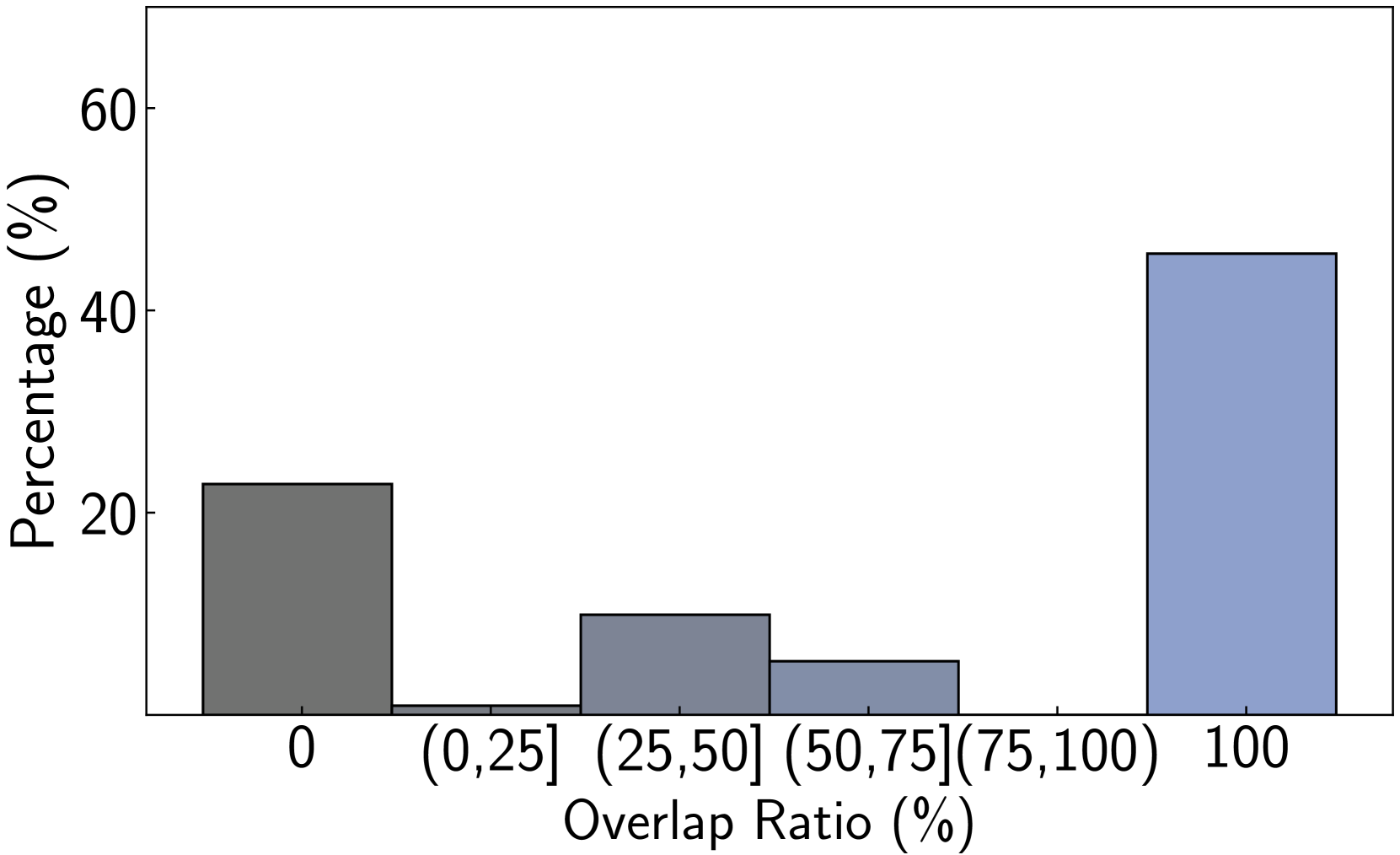
The image is a bar chart showing the distribution of overlap ratios, grouped into bins, with the percentage of occurrences on the y-axis. The x-axis represents the overlap ratio in percentage, divided into intervals, and the y-axis represents the percentage.
### Components/Axes
* **X-axis:** Overlap Ratio (%), with categories: 0, (0,25], (25,50], (50,75], (75,100), 100
* **Y-axis:** Percentage (%), with a scale from 0 to 60.
* **Bars:** Represent the percentage for each overlap ratio category. The bars are colored in shades of gray and blue.
### Detailed Analysis
* **Overlap Ratio 0%:** The bar is gray and has a height of approximately 23%.
* **Overlap Ratio (0, 25]%:** The bar is very short, close to 0%.
* **Overlap Ratio (25, 50]%:** The bar is gray and has a height of approximately 10%.
* **Overlap Ratio (50, 75]%:** The bar is gray and has a height of approximately 6%.
* **Overlap Ratio (75, 100]%:** No bar is present.
* **Overlap Ratio 100%:** The bar is light blue and has a height of approximately 45%.
### Key Observations
* The highest percentage occurs when the overlap ratio is 100%.
* The percentage is also relatively high when the overlap ratio is 0%.
* The percentages for overlap ratios between 0% and 75% are very low.
### Interpretation
The bar chart suggests that there are two dominant scenarios: either there is no overlap (0% overlap ratio), or there is a complete overlap (100% overlap ratio). The intermediate overlap ratios (between 0% and 75%) are relatively rare. This could indicate a bimodal distribution where entities either do not overlap at all or overlap completely, with very few instances of partial overlap.