## Contour Plot & Marginal Distributions: Dimensionality Reduction of Text Data
### Overview
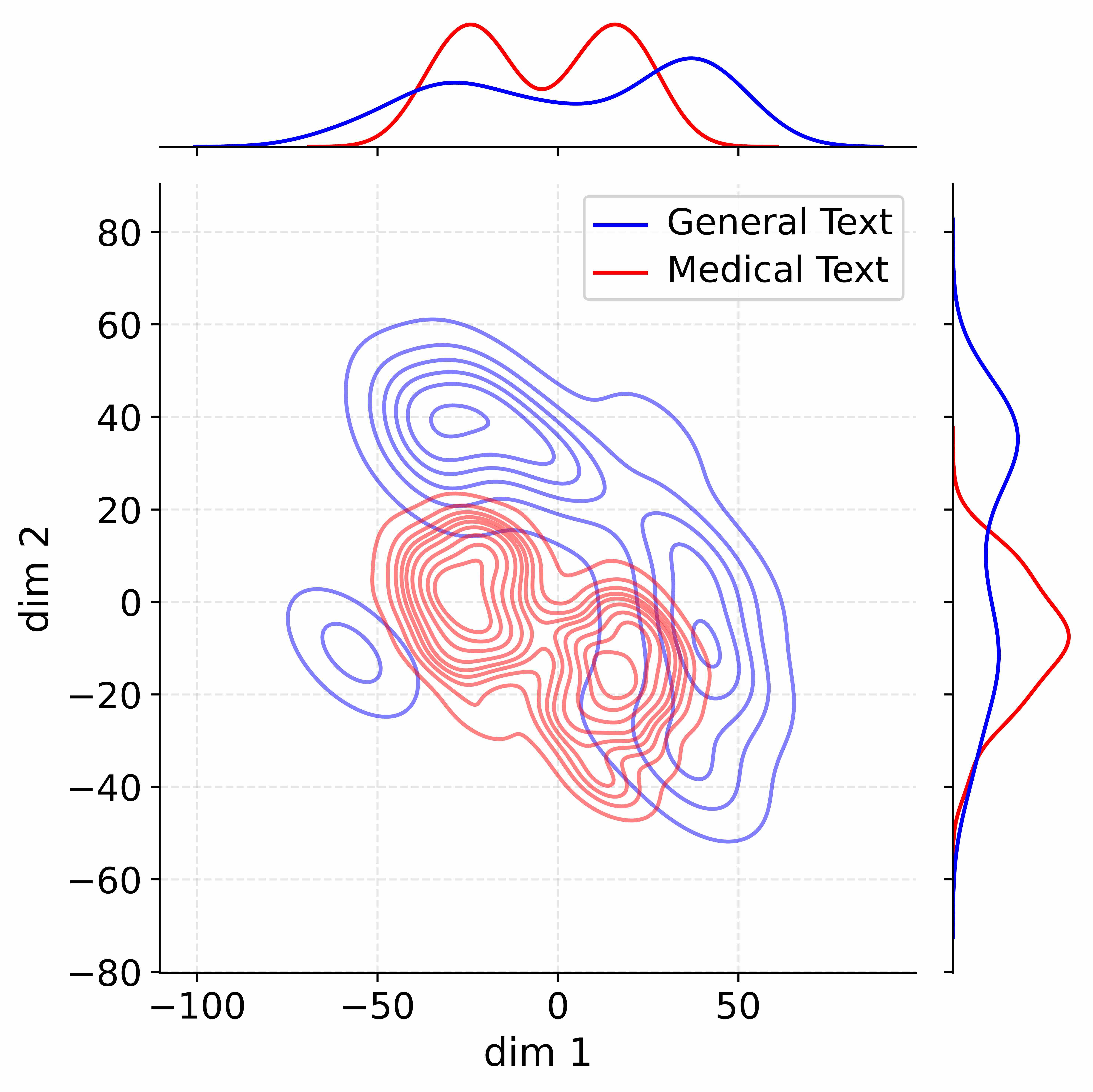
The image presents a 2D contour plot representing a dimensionality reduction of text data, likely generated using techniques like t-SNE or UMAP. The plot visualizes the distribution of "General Text" and "Medical Text" across two dimensions (dim 1 and dim 2). Additionally, marginal distributions (histograms) are displayed along the top and right edges, showing the density of data points along each dimension for each text type.
### Components/Axes
* **X-axis:** Labeled "dim 1", ranging from approximately -110 to 60.
* **Y-axis:** Labeled "dim 2", ranging from approximately -80 to 80.
* **Contour Plot:** Displays density contours for two text categories.
* **Legend (Top-Right):**
* "General Text" - represented by a blue line and contours.
* "Medical Text" - represented by a red line and contours.
* **Marginal Distribution (Top):** Shows the density of data points along dim 1, separated for "General Text" (blue) and "Medical Text" (red).
* **Marginal Distribution (Right):** Shows the density of data points along dim 2, separated for "General Text" (blue) and "Medical Text" (red).
### Detailed Analysis or Content Details
**Contour Plot Analysis:**
* **General Text (Blue Contours):** The blue contours form a roughly elliptical shape centered around dim 1 = -40 and dim 2 = -20. The density appears highest in the region around these coordinates. The contours are more spread out in the dim 2 direction than in the dim 1 direction.
* **Medical Text (Red Contours):** The red contours also form an elliptical shape, but it's more elongated and centered around dim 1 = 0 and dim 2 = 10. The highest density appears to be around these coordinates. There is significant overlap between the red and blue contours, particularly in the region where dim 1 is negative and dim 2 is near zero.
**Marginal Distribution Analysis (Dim 1 - Top):**
* **General Text (Blue):** The blue distribution peaks around dim 1 = -50, with a long tail extending towards positive values. The distribution is relatively broad.
* **Medical Text (Red):** The red distribution peaks around dim 1 = 10, with a more rapid decline towards negative values. The distribution is narrower than the blue distribution.
**Marginal Distribution Analysis (Dim 2 - Right):**
* **General Text (Blue):** The blue distribution peaks around dim 2 = -40, with a relatively symmetrical shape.
* **Medical Text (Red):** The red distribution peaks around dim 2 = 20, with a more pronounced tail extending towards negative values.
### Key Observations
* **Overlap:** There is substantial overlap between the distributions of "General Text" and "Medical Text" in both dimensions. This suggests that the two types of text are not completely separable in this reduced dimensional space.
* **Shift in Dim 1:** The "Medical Text" distribution is shifted towards higher values of dim 1 compared to the "General Text" distribution.
* **Shift in Dim 2:** The "Medical Text" distribution is shifted towards higher values of dim 2 compared to the "General Text" distribution.
* **Distribution Shape:** The marginal distributions reveal differences in the spread and skewness of the data along each dimension for the two text types.
### Interpretation
This visualization suggests that dimensionality reduction has successfully captured some differences between "General Text" and "Medical Text," but complete separation is not achievable. The shift in the distributions along both dimensions indicates that these text types occupy different regions of the reduced dimensional space. The overlap suggests that there are shared characteristics or features between the two types of text.
The marginal distributions provide further insight into the characteristics of each text type. The broader distribution of "General Text" along dim 1 suggests greater variability in this dimension, while the narrower distribution of "Medical Text" indicates more consistency. The differences in the peaks and tails of the distributions along dim 2 also highlight distinct features of each text type.
The contour plot and marginal distributions together provide a comprehensive view of the data's structure and the relationships between the two text categories. This type of analysis can be used to identify potential features for text classification or to understand the underlying semantic differences between different types of text. The fact that the data is not perfectly separated suggests that more sophisticated techniques or additional features may be needed to achieve higher accuracy in text classification tasks.