\n
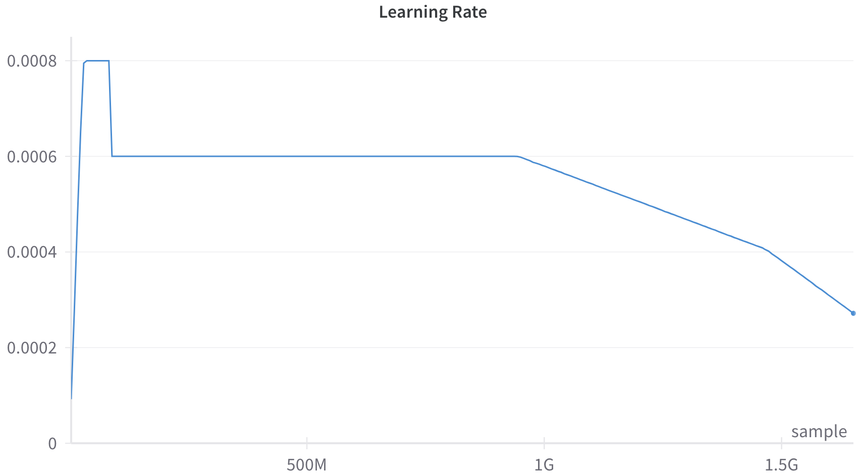
## Line Chart: Learning Rate
### Overview
The image presents a line chart illustrating the learning rate over a training process, likely measured in terms of the number of samples processed. The chart shows a decreasing learning rate as the training progresses.
### Components/Axes
* **Title:** "Learning Rate" - positioned at the top-center of the chart.
* **X-axis:** Represents the training progress, labeled with values "0", "500M", "1G", and "1.5G". "M" likely stands for million, and "G" for billion, indicating the number of samples processed.
* **Y-axis:** Represents the learning rate, ranging from approximately 0 to 0.008.
* **Data Series:** A single blue line representing the learning rate.
* **Label:** "sample" - positioned at the bottom-right of the chart.
### Detailed Analysis
The blue line representing the learning rate exhibits three distinct phases:
1. **Initial Drop:** The learning rate starts at approximately 0.008 at 0 samples and rapidly decreases to approximately 0.006 at around 100M samples.
2. **Plateau:** The learning rate remains relatively constant at approximately 0.006 between 100M and 1G samples.
3. **Gradual Decline:** From 1G samples onwards, the learning rate gradually decreases from approximately 0.006 to approximately 0.002 at 1.5G samples.
Here's a breakdown of approximate data points:
* 0 samples: 0.008
* 100M samples: 0.006
* 500M samples: 0.006
* 1G samples: 0.006
* 1.5G samples: 0.002
### Key Observations
The learning rate is initially high to allow for rapid initial learning, then stabilizes for a period, and finally decreases to fine-tune the model and prevent overshooting the optimal solution. The plateau phase suggests a period of stable learning, while the final decline indicates a focus on convergence.
### Interpretation
This chart demonstrates a common learning rate scheduling strategy used in machine learning. The initial high learning rate allows the model to quickly move towards a region of low loss. The plateau phase allows for refinement within that region, and the final decay helps to converge to a more precise solution. The "sample" label suggests that the x-axis represents the number of training samples processed. The decreasing learning rate is a technique to improve the stability and performance of the training process, especially as the model approaches a minimum in the loss landscape. The shape of the curve suggests a deliberate strategy to balance exploration (initial high rate) and exploitation (final decay).