## Line Chart: Learning Rate
### Overview
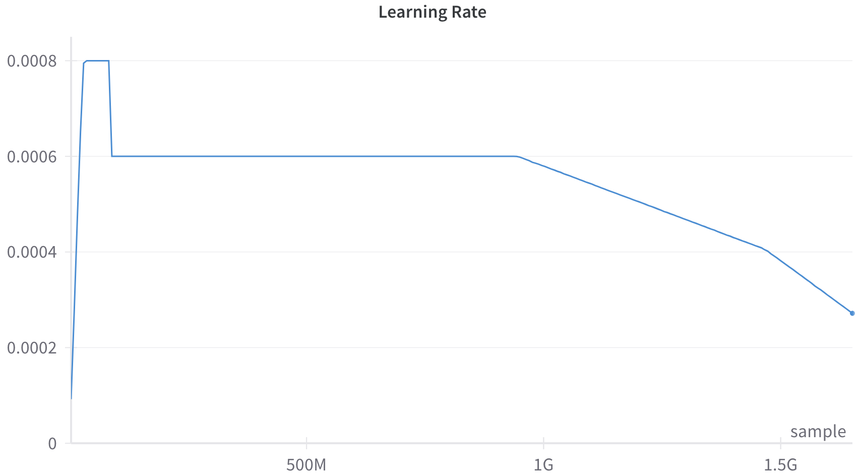
The image depicts a line chart titled "Learning Rate," showing the relationship between the number of samples (x-axis) and the learning rate (y-axis). The chart features a single blue line that exhibits a sharp initial increase, followed by a prolonged flat phase, and a gradual decline toward the end of the sample range.
### Components/Axes
- **X-axis (Horizontal)**: Labeled "sample," with values ranging from 0 to 1.5G (1.5 billion). Tick marks are at 0, 500M, 1G, and 1.5G.
- **Y-axis (Vertical)**: Labeled "Learning Rate," with values ranging from 0 to 0.0008. Tick marks are at 0.0002, 0.0004, 0.0006, and 0.0008.
- **Legend**: Located at the bottom-right corner, labeled "sample" with a blue color. The legend confirms the line's color corresponds to the "sample" data series.
- **Line**: A single blue line representing the learning rate over the sample range.
### Detailed Analysis
- **Initial Spike**: The line starts near 0.0002 at 0 samples, then sharply rises to 0.0008 within the first 500M samples. This suggests an abrupt increase in the learning rate at the beginning of training.
- **Flat Phase**: From 500M to 1G samples, the learning rate remains constant at 0.0008. This indicates a stable phase where the learning rate is not adjusted.
- **Gradual Decline**: After 1G samples, the learning rate decreases linearly from 0.0008 to approximately 0.0003 at 1.5G samples. The slope of this decline is consistent, suggesting a controlled reduction in the learning rate.
### Key Observations
1. **Sharp Initial Increase**: The learning rate jumps from ~0.0002 to 0.0008 within the first 500M samples, indicating a possible warm-up phase or aggressive initial training.
2. **Stable Phase**: The flat line from 500M to 1G samples suggests the learning rate was held constant during this period, possibly to allow the model to stabilize.
3. **Gradual Decline**: The linear decrease after 1G samples implies a learning rate scheduler was applied to reduce the rate over time, likely to fine-tune the model and avoid overfitting.
### Interpretation
The chart illustrates a learning rate schedule that prioritizes rapid initial training (via the sharp increase) followed by stabilization and gradual refinement. The flat phase (500M–1G samples) may reflect a period where the model's performance was optimized at a fixed learning rate. The subsequent decline could be part of a strategy to reduce the learning rate to improve convergence or prevent overfitting. The absence of error bars or variability in the line suggests the data is presented as a deterministic trend rather than a probabilistic distribution. The use of a single data series (blue line) indicates the chart focuses on a specific training configuration or hyperparameter setting. The x-axis range (up to 1.5G samples) implies the model was trained on a large dataset, with the learning rate adjusted to manage computational efficiency and model performance.