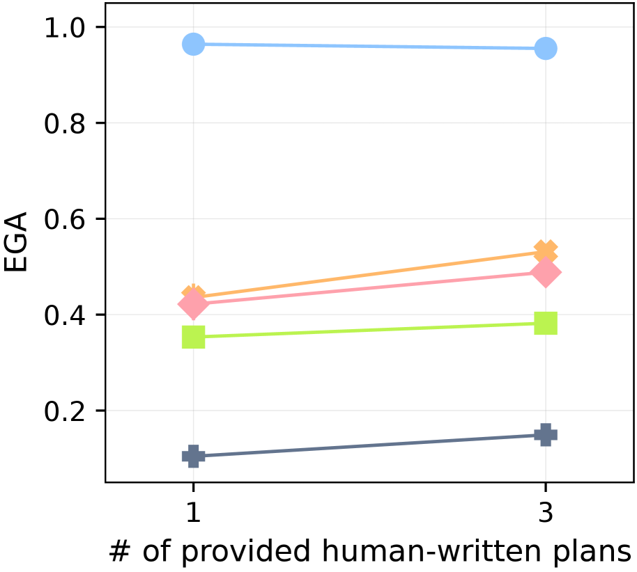
## Line Chart: EGA vs. Number of Provided Human-Written Plans
### Overview
The image is a line chart comparing the EGA (Exact Goal Achievement) score against the number of provided human-written plans (1 or 3). There are five data series represented by different colored lines, each showing the EGA score for a given number of provided plans.
### Components/Axes
* **X-axis:** "# of provided human-written plans" with values 1 and 3.
* **Y-axis:** "EGA" (Exact Goal Achievement) ranging from 0.2 to 1.0 in increments of 0.2.
* **Data Series:** Five distinct data series are plotted, each represented by a different color and marker. The colors are light blue (circle marker), light orange (cross marker), light pink (diamond marker), light green (square marker), and dark blue (plus marker). There is no explicit legend, so the series are identified by color and marker type.
### Detailed Analysis
* **Light Blue (Circle Marker):** This line represents the highest EGA scores.
* At 1 plan, the EGA is approximately 0.97.
* At 3 plans, the EGA is approximately 0.96.
* Trend: Relatively flat, showing a slight decrease.
* **Light Orange (Cross Marker):** This line shows a moderate EGA score.
* At 1 plan, the EGA is approximately 0.45.
* At 3 plans, the EGA is approximately 0.54.
* Trend: Slopes upward.
* **Light Pink (Diamond Marker):** This line shows a moderate EGA score.
* At 1 plan, the EGA is approximately 0.42.
* At 3 plans, the EGA is approximately 0.51.
* Trend: Slopes upward.
* **Light Green (Square Marker):** This line shows a lower EGA score.
* At 1 plan, the EGA is approximately 0.35.
* At 3 plans, the EGA is approximately 0.38.
* Trend: Slopes slightly upward.
* **Dark Blue (Plus Marker):** This line represents the lowest EGA scores.
* At 1 plan, the EGA is approximately 0.10.
* At 3 plans, the EGA is approximately 0.15.
* Trend: Slopes upward.
### Key Observations
* The light blue series consistently achieves the highest EGA scores, regardless of the number of provided plans.
* All series except the light blue one show an increase in EGA score when the number of provided plans increases from 1 to 3.
* The dark blue series consistently has the lowest EGA scores.
### Interpretation
The chart suggests that providing more human-written plans (increasing from 1 to 3) generally improves the Exact Goal Achievement (EGA) score for most of the data series represented, except for the light blue series, which remains relatively stable. The different colored lines likely represent different models or algorithms being evaluated. The light blue series represents a model that performs well regardless of the number of provided plans, while the other models benefit from having more examples. The dark blue series consistently underperforms compared to the others.