\n
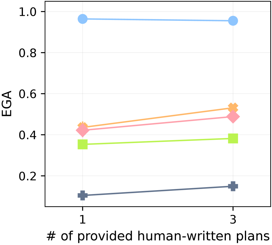
## Line Chart: EGA vs. Number of Human-Written Plans
### Overview
This image presents a line chart illustrating the relationship between the number of provided human-written plans and the EGA (Error-Guided Adaptation) score. The chart displays data for five different lines, each representing a different condition or model. The x-axis represents the number of plans (1 or 3), and the y-axis represents the EGA score, ranging from 0 to 1.
### Components/Axes
* **X-axis Label:** "# of provided human-written plans" with markers at 1 and 3.
* **Y-axis Label:** "EGA" with a scale from 0.0 to 1.0, incrementing by 0.2.
* **Lines:** Five distinct lines, each with a unique color:
* Light Blue
* Orange
* Pink
* Lime Green
* Gray
* **Data Points:** Each line has two data points, corresponding to the x-axis values of 1 and 3.
### Detailed Analysis
Let's analyze each line individually, noting the trend and approximate data points.
* **Light Blue Line:** This line is nearly flat. It slopes very slightly downward.
* At x = 1, EGA ≈ 0.95
* At x = 3, EGA ≈ 0.93
* **Orange Line:** This line slopes upward.
* At x = 1, EGA ≈ 0.42
* At x = 3, EGA ≈ 0.54
* **Pink Line:** This line slopes upward.
* At x = 1, EGA ≈ 0.44
* At x = 3, EGA ≈ 0.55
* **Lime Green Line:** This line is relatively flat.
* At x = 1, EGA ≈ 0.34
* At x = 3, EGA ≈ 0.38
* **Gray Line:** This line slopes upward.
* At x = 1, EGA ≈ 0.12
* At x = 3, EGA ≈ 0.18
### Key Observations
* The light blue line consistently has the highest EGA scores across both plan numbers.
* The lime green line consistently has the lowest EGA scores.
* The orange, pink, and gray lines show an increasing trend in EGA scores as the number of provided plans increases from 1 to 3.
* The difference in EGA scores between 1 and 3 plans is more pronounced for the orange, pink, and gray lines than for the light blue and lime green lines.
### Interpretation
The chart suggests that providing more human-written plans generally leads to improved EGA scores for some models (orange, pink, gray). However, the impact of additional plans varies significantly depending on the model. The light blue model already achieves a high EGA score with only one plan, indicating it may be less reliant on additional human input. Conversely, the gray model shows the most significant improvement with the addition of a second plan, suggesting it benefits substantially from more human guidance. The lime green model shows minimal improvement, indicating it may be less sensitive to the number of provided plans or may have inherent limitations.
The EGA score likely represents a measure of performance or quality, and the human-written plans serve as a form of guidance or training data. The chart highlights the importance of considering model-specific characteristics when determining the optimal amount of human input for error-guided adaptation. The data suggests that a one-size-fits-all approach to providing human plans may not be effective, and the ideal number of plans should be tailored to the specific model being used.