## Heatmap: Row-Column Value Matrix
### Overview
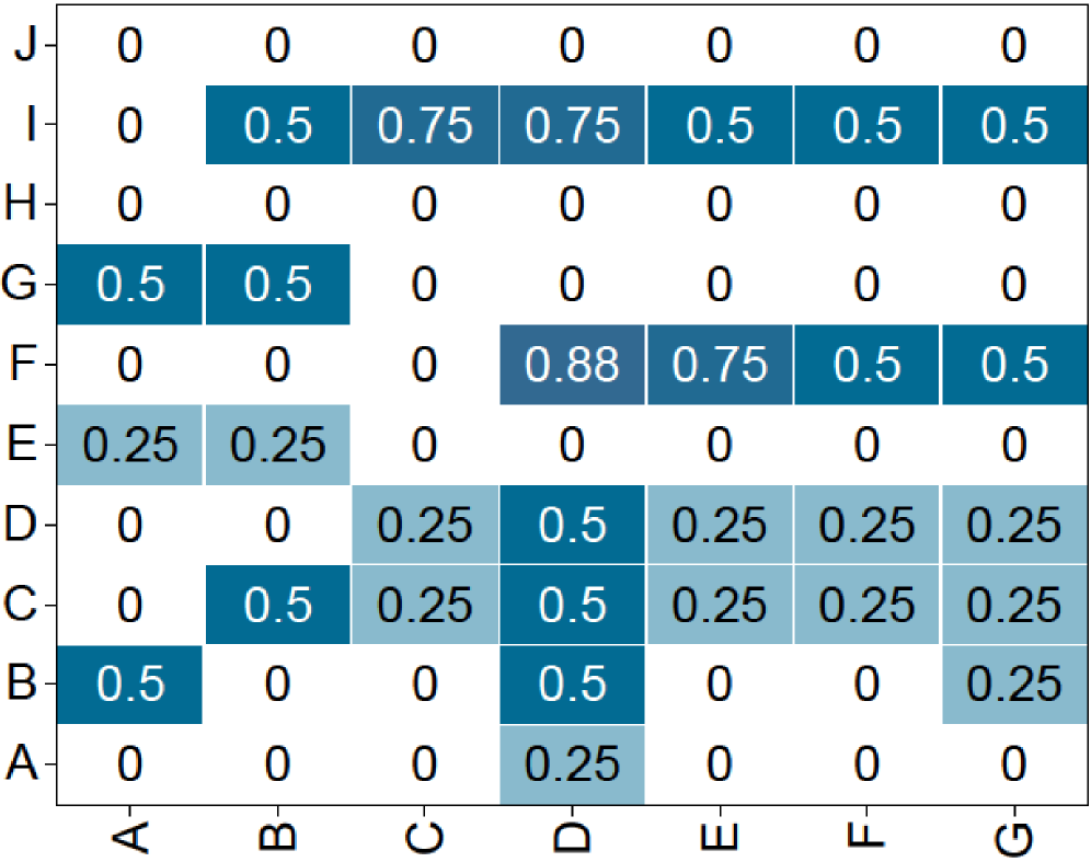
The image displays a heatmap or matrix chart with 10 rows (labeled A through J) and 7 columns (labeled A through G). Each cell contains a numerical value, and the cell's background color intensity corresponds to that value, with darker shades of blue representing higher numbers. The chart is presented on a plain white background.
### Components/Axes
* **Vertical Axis (Y-axis):** Labeled with single letters from bottom to top: A, B, C, D, E, F, G, H, I, J.
* **Horizontal Axis (X-axis):** Labeled with single letters from left to right: A, B, C, D, E, F, G.
* **Data Encoding:** Each cell's value is displayed as text (e.g., "0.5", "0.25"). The background color is a shade of blue, where the saturation/lightness correlates with the numerical value. Higher values (e.g., 0.88, 0.75) are a darker, more saturated blue. Lower non-zero values (e.g., 0.25) are a lighter, grayish-blue. Zero values have a white background.
* **Legend:** There is no explicit legend provided. The color-to-value mapping must be inferred from the data presented.
### Detailed Analysis
The following table reconstructs the matrix data. Rows are listed from top (J) to bottom (A), matching the visual layout.
| Row \ Col | A | B | C | D | E | F | G |
| :-------- | :---- | :---- | :---- | :---- | :---- | :---- | :---- |
| **J** | 0 | 0 | 0 | 0 | 0 | 0 | 0 |
| **I** | 0 | 0.5 | 0.75 | 0.75 | 0.5 | 0.5 | 0.5 |
| **H** | 0 | 0 | 0 | 0 | 0 | 0 | 0 |
| **G** | 0.5 | 0.5 | 0 | 0 | 0 | 0 | 0 |
| **F** | 0 | 0 | 0 | 0.88 | 0.75 | 0.5 | 0.5 |
| **E** | 0.25 | 0.25 | 0 | 0 | 0 | 0 | 0 |
| **D** | 0 | 0 | 0.25 | 0.5 | 0.25 | 0.25 | 0.25 |
| **C** | 0 | 0.5 | 0.25 | 0.5 | 0.25 | 0.25 | 0.25 |
| **B** | 0.5 | 0 | 0 | 0.5 | 0 | 0 | 0.25 |
| **A** | 0 | 0 | 0 | 0.25 | 0 | 0 | 0 |
**Trend Verification & Spatial Grounding:**
* **Row J (Top):** All cells are 0 with white backgrounds. No trend.
* **Row I:** Shows a cluster of high values. The line of data slopes upward from left (0 at A-I) to a peak at C-I and D-I (0.75), then slopes gently downward to 0.5 at G-I. The cells from B-I to G-I are all dark blue.
* **Row H:** All cells are 0 with white backgrounds. No trend.
* **Row G:** Contains two 0.5 values at the far left (A-G, B-G), both dark blue. The rest are 0.
* **Row F:** Shows a distinct peak. The value is 0 at A-F, B-F, C-F, then jumps to the highest value in the chart, 0.88, at D-F (darkest blue cell). It then decreases to 0.75 at E-F, and 0.5 at F-F and G-F.
* **Row E:** Contains two 0.25 values at the far left (A-E, B-E), both light blue. The rest are 0.
* **Row D:** Values are mostly 0.25 (light blue) except for a 0.5 (darker blue) at D-D.
* **Row C:** Similar pattern to Row D, with a 0.5 at B-C and D-C, and 0.25 elsewhere from C-C to G-C.
* **Row B:** Scattered values: 0.5 (dark blue) at A-B and D-B, and 0.25 (light blue) at G-B.
* **Row A (Bottom):** Only one non-zero value: 0.25 (light blue) at D-A.
### Key Observations
1. **Zero-Dominant Rows:** Rows J and H are entirely zero, creating two horizontal bands of white across the matrix.
2. **High-Value Clusters:** The highest values (0.75, 0.88) are concentrated in the central columns (C, D, E) of rows I and F.
3. **Column D Prominence:** Column D contains non-zero values in 8 out of 10 rows (all except J and H), making it the most frequently active column.
4. **Symmetry/Pattern:** There is no obvious diagonal symmetry. The distribution appears asymmetric, with higher values clustered in the upper-middle section (Rows I, F) and lower values scattered in the lower rows (A-E).
5. **Value Discrete Set:** All values are multiples of 0.25 (0, 0.25, 0.5, 0.75, 0.88). The 0.88 value is an outlier as it is not a clean multiple of 0.25.
### Interpretation
This heatmap likely represents a **correlation matrix, a confusion matrix, or a similarity/distance matrix** between entities labeled A-J (rows) and A-G (columns). The asymmetry (10x7 grid) suggests the row and column sets are different, possibly representing two different groups or stages.
* **What the data suggests:** The matrix shows weak to moderate relationships (values ≤ 0.88) between the row and column entities. The strongest relationship (0.88) is between Row F and Column D. The complete lack of relationship (0) between certain pairs (e.g., all of Row J with anything) is also significant.
* **How elements relate:** The color intensity provides an immediate visual cue for strength. The clustering of dark blue in the upper-middle indicates that entities I and F have the strongest and most widespread connections to the column entities, particularly to columns C, D, and E.
* **Notable anomalies:** The value 0.88 at (F, D) is the maximum and stands out. The two all-zero rows (J, H) are notable for their complete lack of measured relationship with any column entity. The pattern suggests that entities A, B, C, D, E, F, G (columns) have varying degrees of connection to the row entities, with D being the most connected column.