## Chart: Distribution Plot
### Overview
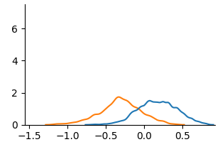
The image shows a distribution plot with two overlapping curves, one blue and one orange. The plot visualizes the distribution of some variable, with the x-axis ranging from approximately -1.5 to 0.5 and the y-axis representing the density or frequency of the variable.
### Components/Axes
* **X-axis:** Ranges from -1.5 to 0.5, with tick marks at -1.5, -1.0, -0.5, 0.0, and 0.5.
* **Y-axis:** Ranges from 0 to approximately 7, with tick marks at 0, 2, 4, and 6.
* **Blue Curve:** Represents one distribution.
* **Orange Curve:** Represents another distribution.
### Detailed Analysis
* **Blue Curve:** The blue curve starts near 0 at x = -1.5, gradually increases to a peak around x = 0.25 with a y-value of approximately 1.5, and then decreases back to near 0 at x = 0.5.
* **Orange Curve:** The orange curve starts near 0 at x = -1.5, increases to a peak around x = -0.3 with a y-value of approximately 1.8, and then decreases back to near 0 at x = 0.5.
### Key Observations
* The orange curve is shifted to the left compared to the blue curve.
* Both curves are unimodal, meaning they have a single peak.
* The peak of the orange curve is slightly higher than the peak of the blue curve.
* The blue curve appears to be slightly wider than the orange curve, indicating a larger standard deviation.
### Interpretation
The plot compares the distributions of two different variables or groups. The orange distribution has a lower mean than the blue distribution, as indicated by its peak being shifted to the left. The blue distribution has a slightly larger spread, suggesting greater variability. The difference in the distributions could be due to various factors depending on the context of the data.