## Line Chart: Dual Distribution Curves
### Overview
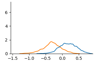
The image displays a 2D line chart featuring two smooth, bell-shaped curves plotted against a common horizontal axis. The chart lacks a title, axis labels, and a legend, presenting only the numerical scales and the plotted data series. The visual suggests a comparison between two related distributions or functions.
### Components/Axes
* **X-Axis (Horizontal):**
* **Scale:** Linear.
* **Range:** Approximately -1.5 to 0.5.
* **Major Tick Marks & Labels:** Located at -1.5, -1.0, -0.5, 0.0, 0.5.
* **Y-Axis (Vertical):**
* **Scale:** Linear.
* **Range:** 0 to 6.
* **Major Tick Marks & Labels:** Located at 0, 2, 4, 6.
* **Data Series:**
* **Series 1 (Blue Line):** A smooth, unimodal curve.
* **Series 2 (Orange Line):** A smooth, unimodal curve.
* **Legend:** **Not present.** The identity and meaning of the blue and orange lines are not defined within the image.
### Detailed Analysis
* **Blue Curve Trend & Points:**
* **Trend:** The curve starts near y=0 at the far left (x ≈ -1.5), rises gradually, accelerates to a peak, then descends symmetrically.
* **Key Points (Approximate):**
* Start: (x ≈ -1.5, y ≈ 0)
* Peak: (x ≈ 0.2, y ≈ 1.5)
* End: (x ≈ 0.5, y ≈ 0)
* **Orange Curve Trend & Points:**
* **Trend:** The curve starts near y=0 at the far left (x ≈ -1.5), rises more steeply than the blue curve to an earlier peak, then descends.
* **Key Points (Approximate):**
* Start: (x ≈ -1.5, y ≈ 0)
* Peak: (x ≈ -0.3, y ≈ 2.0)
* End: (x ≈ 0.5, y ≈ 0)
* **Spatial Relationship:** The orange curve is positioned to the left of and reaches a higher maximum value than the blue curve. The two curves intersect at approximately (x ≈ -0.05, y ≈ 1.0).
### Key Observations
1. **Missing Context:** The most significant observation is the complete absence of explanatory labels (chart title, axis titles, legend). This renders the chart's specific subject matter and the identity of the two series unknown.
2. **Distribution Shapes:** Both curves resemble probability density functions (e.g., Gaussian/Normal distributions) or similar mathematical functions, characterized by their smooth, symmetric, bell-like shapes.
3. **Comparative Properties:** The orange distribution has a **higher peak** (mode) and a **lower mean** (centered further left on the x-axis) compared to the blue distribution. The blue distribution appears slightly wider (larger variance/spread).
4. **Data Range:** The meaningful data for both series is concentrated between x = -1.0 and x = 0.5.
### Interpretation
The chart visually compares two distinct but related quantitative distributions. The lack of labels forces a purely formal interpretation:
* **What it demonstrates:** It shows two unimodal datasets or functions where one (orange) is centered on a lower value of the measured variable (x-axis) and has a higher concentration of values near its center (higher peak) than the other (blue).
* **How elements relate:** The x-axis represents a continuous independent variable. The y-axis represents a dependent variable, likely frequency, probability density, or magnitude. The curves show how this dependent variable changes across the range of the independent variable for two different groups, conditions, or models.
* **Potential Contexts (Speculative):** Without labels, this could represent:
* Comparison of two sensor readings or signal distributions.
* Results from two different statistical models or machine learning algorithms.
* Performance metrics under two different conditions.
* Physical measurements of two similar phenomena.
* **Notable Anomaly:** The primary anomaly is the chart's lack of self-contained explanatory information, which is a critical flaw for a technical document. The data is presented without the necessary context for meaningful analysis.
**Language Note:** No non-English text is present in the image.