## Line Graph: Unlabeled Data Series Comparison
### Overview
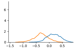
The image depicts a line graph with two distinct data series represented by orange and blue lines. The x-axis spans from -1.5 to 0.5, while the y-axis ranges from 0 to 6. Both lines exhibit unimodal distributions with peaks in the negative and positive x-regions, respectively. The graph lacks explicit axis labels, titles, or contextual annotations.
### Components/Axes
- **X-Axis**: Labeled with numerical values from -1.5 to 0.5 in increments of 0.5. No explicit label text is visible.
- **Y-Axis**: Labeled with numerical values from 0 to 6 in increments of 2. No explicit label text is visible.
- **Legend**: Located in the top-right corner, associating:
- **Orange line**: "Line A"
- **Blue line**: "Line B"
### Detailed Analysis
1. **Orange Line (Line A)**:
- **Trend**: Starts near zero at x ≈ -1.5, rises gradually to a peak at x ≈ -0.5 (y ≈ 1.8), then declines sharply to near zero by x ≈ 0.5.
- **Key Data Points**:
- x = -1.0: y ≈ 0.3
- x = -0.5: y ≈ 1.8 (peak)
- x = 0.0: y ≈ 0.8
- x = 0.5: y ≈ 0.1
2. **Blue Line (Line B)**:
- **Trend**: Remains near zero until x ≈ -0.5, then rises gradually to a peak at x ≈ 0.2 (y ≈ 1.5), followed by a gradual decline to near zero by x ≈ 0.5.
- **Key Data Points**:
- x = -0.5: y ≈ 0.2
- x = 0.0: y ≈ 1.2
- x = 0.2: y ≈ 1.5 (peak)
- x = 0.5: y ≈ 0.6
### Key Observations
- **Intersection**: The two lines intersect near x = 0.0, where both have y-values between 0.8 and 1.2.
- **Asymmetry**: Line A peaks earlier (x = -0.5) and declines faster, while Line B peaks later (x = 0.2) with a broader plateau.
- **Amplitude**: Line A has a slightly higher peak (1.8 vs. 1.5) but a narrower distribution.
### Interpretation
The graph suggests a comparison of two processes or distributions with opposing temporal or spatial characteristics. Line A’s peak at x = -0.5 could represent an early-event-driven phenomenon, while Line B’s delayed peak at x = 0.2 might indicate a response or recovery phase. The intersection at x = 0.0 implies a transitional state where both processes equilibrate. The absence of axis labels and context limits direct interpretation, but the relative trends highlight divergent behaviors in magnitude and timing. The orange line’s sharper decline may indicate a more volatile or transient process compared to the blue line’s sustained activity.