## [Chart Type]: Dual-Panel Logarithmic Plot Analysis
### Overview
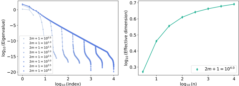
The image contains two side-by-side scientific plots, both using logarithmic scales. The left panel is a line plot showing the decay of eigenvalues across different system sizes. The right panel is a scatter plot showing the growth of an "Effective dimension" as a function of a parameter `n`. The plots appear to analyze properties of a mathematical or physical system, likely related to matrix theory, statistical mechanics, or machine learning model complexity.
### Components/Axes
**Left Plot:**
* **Chart Type:** Line plot with multiple series.
* **X-axis:** Label: `log10(index)`. Scale: Linear from 0 to 4.
* **Y-axis:** Label: `log10(Eigenvalue)`. Scale: Linear from -20 to 0.
* **Legend:** Located in the bottom-left corner. Contains 8 entries, each corresponding to a different value of the parameter `2m+1`. The entries are:
* `2m+1 = 10^0.5` (lightest blue)
* `2m+1 = 10^1.0`
* `2m+1 = 10^1.5`
* `2m+1 = 10^2.0`
* `2m+1 = 10^2.5`
* `2m+1 = 10^3.0`
* `2m+1 = 10^3.5`
* `2m+1 = 10^4.0` (darkest blue)
* **Data Series:** 8 distinct lines, each plotted with a unique shade of blue corresponding to its legend entry. The color gradient from light to dark maps to increasing values of `2m+1`.
**Right Plot:**
* **Chart Type:** Scatter plot with a connecting line.
* **X-axis:** Label: `log10(n)`. Scale: Linear from approximately 0.5 to 4.
* **Y-axis:** Label: `log10(Effective dimension)`. Scale: Linear from approximately 0.25 to 0.7.
* **Legend:** Located in the bottom-right corner. Contains a single entry:
* `2m+1 = 10^4.0` (teal diamond marker)
* **Data Series:** A single series of teal diamond markers connected by a line.
### Detailed Analysis
**Left Plot - Eigenvalue Spectrum:**
* **Trend Verification:** All eight data series exhibit a downward trend. They start at a high `log10(Eigenvalue)` (near 0) for low `log10(index)` and decay as the index increases. The decay is not linear; it shows a characteristic "shoulder" followed by a steep drop-off.
* **Data Point Extraction (Approximate):**
* For the series `2m+1 = 10^0.5` (lightest): The line starts near (0, 0.5), decays gradually, and ends near (1.5, -15).
* For the series `2m+1 = 10^4.0` (darkest): The line starts near (0, 1.5), follows a nearly straight diagonal descent, and ends near (4, -18).
* **Key Pattern:** As the parameter `2m+1` increases (darker lines), the initial eigenvalue (at log10(index)=0) is higher, and the spectrum decays more slowly and linearly over a wider range of the index. The "shoulder" before the steep drop becomes less pronounced and shifts to higher index values.
**Right Plot - Effective Dimension:**
* **Trend Verification:** The single data series shows a clear upward, concave-down trend. It increases rapidly at first and then begins to saturate.
* **Data Point Extraction (Approximate):**
* At `log10(n) ≈ 0.5`, `log10(Effective dimension) ≈ 0.27`.
* At `log10(n) ≈ 1.0`, `log10(Effective dimension) ≈ 0.46`.
* At `log10(n) ≈ 2.0`, `log10(Effective dimension) ≈ 0.61`.
* At `log10(n) ≈ 3.0`, `log10(Effective dimension) ≈ 0.66`.
* At `log10(n) ≈ 4.0`, `log10(Effective dimension) ≈ 0.69`.
* **Cross-Reference:** This plot specifically analyzes the case where `2m+1 = 10^4.0`, which corresponds to the darkest blue line in the left plot.
### Key Observations
1. **System Size Dependence:** The left plot demonstrates that the eigenvalue distribution is highly dependent on the system size parameter `2m+1`. Larger systems have a broader, more slowly decaying spectrum.
2. **Spectral Gap:** The steep drop-off in eigenvalues for each curve suggests the presence of a spectral gap, a common feature in many physical and data systems indicating a separation between "signal" and "noise" or between different energy scales.
3. **Dimensional Scaling:** The right plot shows that the "Effective dimension" of the system (for the largest size `2m+1=10^4.0`) scales sub-linearly with `n`. The logarithmic growth indicates that increasing `n` yields diminishing returns in effective dimension after a certain point.
4. **Visual Correlation:** The color coding is consistent and crucial for interpretation. The darkest line in the left plot (`2m+1=10^4.0`) is the subject of the detailed analysis in the right plot.
### Interpretation
These plots together tell a story about the complexity and information content of a parameterized system.
* **What the data suggests:** The left plot is a classic signature of a system with a low-rank or compressible structure. The eigenvalues (which often represent the importance of different components or modes) decay rapidly. The fact that larger systems (`2m+1`) have slower decay implies they retain more significant components or have a higher intrinsic complexity.
* **How elements relate:** The right plot quantifies one aspect of this complexity—the "Effective dimension"—for the largest system studied. It answers the question: "As we increase the observation or sample size `n`, how does the perceived dimensionality of the data behave?" The saturation suggests that beyond a certain `n` (around `log10(n)=3`, or n=1000), we have captured most of the relevant structural information, and adding more data doesn't significantly increase the model's effective complexity.
* **Underlying Meaning:** In a machine learning context, this could describe the spectrum of a neural network's Hessian or data covariance matrix, where the effective dimension relates to the number of parameters that are meaningfully trained. In physics, it might relate to the density of states in a quantum system. The plots provide a quantitative way to compare system sizes and understand how information scales. The clear, monotonic trends suggest a well-behaved, predictable system without anomalous phase transitions within the parameter range shown.