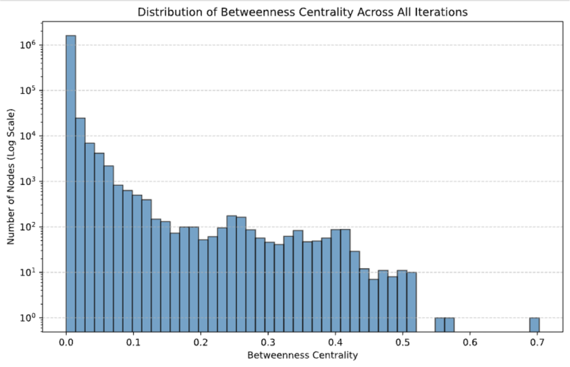
## Histogram: Distribution of Betweenness Centrality Across All Iterations
### Overview
The image displays a histogram titled "Distribution of Betweenness Centrality Across All Iterations." It visualizes the frequency distribution of a network metric called "betweenness centrality" for a large set of nodes, aggregated across multiple iterations of a process or simulation. The data is presented on a semi-logarithmic scale, with the y-axis (frequency) using a base-10 logarithmic scale to accommodate the vast range in node counts.
### Components/Axes
* **Chart Title:** "Distribution of Betweenness Centrality Across All Iterations" (centered at the top).
* **X-Axis:**
* **Label:** "Betweenness Centrality"
* **Scale:** Linear scale from 0.0 to 0.7.
* **Major Tick Marks:** 0.0, 0.1, 0.2, 0.3, 0.4, 0.5, 0.6, 0.7.
* **Y-Axis:**
* **Label:** "Number of Nodes (Log Scale)"
* **Scale:** Logarithmic scale (base 10).
* **Major Tick Marks (Powers of 10):** 10⁰ (1), 10¹ (10), 10² (100), 10³ (1,000), 10⁴ (10,000), 10⁵ (100,000), 10⁶ (1,000,000).
* **Data Series:** A single series represented by vertical blue bars. There is no legend, as the chart represents one dataset.
* **Grid:** Horizontal dashed grid lines are present at each major y-axis tick (10⁰, 10¹, etc.).
### Detailed Analysis
The histogram shows a highly right-skewed, heavy-tailed distribution. The vast majority of nodes have very low betweenness centrality, with the frequency dropping dramatically as centrality increases.
**Approximate Data Points (Bar Heights):**
| Centrality (Approx.) | Number of Nodes (Approx.) |
| :--- | :--- |
| ~0.0 | 1,500,000 |
| ~0.02 | 20,000 |
| ~0.04 | 7,000 |
| ~0.06 | 4,000 |
| ~0.08 | 2,000 |
| ~0.10 | 800 |
| ~0.12 | 600 |
| ~0.14 | 400 |
| ~0.16 | 150 |
| ~0.18 | 100 |
| ~0.20 | 100 |
| ~0.22 | 50 |
| ~0.24 | 60 |
| ~0.26 | 180 |
| ~0.28 | 160 |
| ~0.30 | 90 |
| ~0.32 | 50 |
| ~0.34 | 40 |
| ~0.36 | 60 |
| ~0.38 | 90 |
| ~0.40 | 50 |
| ~0.42 | 90 |
| ~0.44 | 30 |
| ~0.46 | 10 |
| ~0.48 | 8 |
| ~0.50 | 10 |
| ~0.52 | 10 |
| ~0.56 | 1 |
| ~0.58 | 1 |
| ~0.70 | 1 |
**Trend Verification:** The visual trend is a steep, near-exponential decay from the leftmost bin. The line of bar tops slopes sharply downward from left to right, with a minor, localized increase (a "bump") in the 0.24-0.28 range. The distribution becomes sparse and discontinuous beyond a centrality of 0.5.
### Key Observations
1. **Extreme Skew:** Over 99% of the nodes appear to have a betweenness centrality below 0.1. The single most frequent category is the lowest bin (0.0).
2. **Heavy Tail:** Despite the skew, there is a long tail extending to a centrality of 0.7, indicating the presence of a very small number of extremely central nodes.
3. **Logarithmic Scale Necessity:** The use of a log scale on the y-axis is essential. On a linear scale, all bars except the first would be visually indistinguishable from zero.
4. **Data Sparsity:** The rightmost portion of the chart (centrality > 0.5) shows significant gaps and isolated single-node bins, highlighting the rarity of high-centrality nodes.
5. **Local Peak:** A small but noticeable cluster of nodes exists in the 0.24-0.28 centrality range, suggesting a minor subgroup with moderately high importance.
### Interpretation
This histogram characterizes the structural importance of nodes within a large network (or across iterations of a dynamic network). Betweenness centrality measures how often a node lies on the shortest path between other nodes.
* **Network Structure:** The distribution suggests a **scale-free or hub-and-spoke-like network topology**. The overwhelming majority of nodes are peripheral, serving as endpoints rather than bridges. A tiny fraction of nodes (the "hubs" in the far-right tail) are critical connectors, controlling the flow of information or resources across the network.
* **Robustness and Vulnerability:** Such a network is typically robust to random failures (removing a random node is unlikely to affect overall connectivity) but highly vulnerable to targeted attacks on the high-centrality hubs.
* **Process Implications:** If this data comes from an iterative process (e.g., a simulation, optimization, or learning algorithm), it indicates that the process consistently identifies or creates a very small set of highly influential nodes. The local peak around 0.26 might represent a stable, secondary tier of important nodes that emerge under certain conditions.
* **Data Quality Note:** The values are approximate, read from a visual chart. The exact counts, especially for the tallest bar and the sparse tail, should be verified from the source data for precise analysis. The log scale can sometimes mask the true magnitude of differences; the difference between 10⁶ and 10⁵ nodes is 900,000 nodes, not just one order of magnitude.