# Technical Data Extraction: Performance Heatmap
## 1. Document Overview
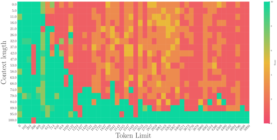
This image is a technical heatmap visualization representing the relationship between "Context length" and "Token Limit" on a numerical "Score." The chart uses a color gradient to represent performance metrics, where green indicates high scores and red indicates low scores.
## 2. Component Isolation
### A. Header / Metadata
* **Language:** English.
* **Content:** No explicit title text is present at the top of the image.
### B. Main Chart (Heatmap)
* **Type:** 2D Heatmap / Grid.
* **Y-Axis Label:** Context length (Vertical, left side).
* **X-Axis Label:** Token Limit (Horizontal, bottom).
* **Color Scale (Legend):** Located on the far right [x=950, y=500 approx.]. It is a vertical gradient bar labeled "Score".
### C. Axis Scales and Markers
#### Y-Axis (Context length)
The axis represents a percentage or ratio from 0.0 to 100.0, with markers every ~5.0 to 6.0 units:
`0.0, 5.0, 11.0, 16.0, 21.0, 26.0, 32.0, 37.0, 42.0, 47.0, 53.0, 58.0, 63.0, 68.0, 74.0, 79.0, 84.0, 89.0, 95.0, 100.0`
#### X-Axis (Token Limit)
The axis represents a count from 0 to 5000, with markers at irregular intervals (roughly every 102 units):
`0, 102, 204, 306, 408, 510, 612, 714, 816, 918, 1020, 1122, 1224, 1327, 1429, 1531, 1633, 1735, 1837, 1939, 2041, 2143, 2245, 2347, 2449, 2551, 2653, 2755, 2857, 2959, 3061, 3163, 3265, 3367, 3469, 3571, 3673, 3776, 3878, 3980, 4082, 4184, 4286, 4388, 4490, 4592, 4694, 4796, 4898, 5000`
## 3. Legend and Color Mapping
* **Score 10 (Bright Green):** Optimal performance.
* **Score 5-7 (Yellow/Orange):** Moderate/Degraded performance.
* **Score 0 (Red/Pink):** Failure or lowest performance.
## 4. Trend Verification and Data Analysis
### Visual Trend Analysis
1. **High Performance Zone (Green):** Concentrated in the bottom-left corner and along the bottom edge. As "Context length" increases (moving down the Y-axis), the system maintains high scores for longer "Token Limits."
2. **Degradation Zone (Red/Orange):** Concentrated in the top-right quadrant. As "Token Limit" increases while "Context length" remains low (top of the chart), performance drops significantly.
3. **The "Diagonal" Boundary:** There is a visible diagonal threshold. When `Context length` is low (e.g., 0.0 - 21.0), performance drops to red almost immediately after a Token Limit of ~510. When `Context length` is high (e.g., 95.0 - 100.0), performance remains green across almost the entire Token Limit range (0 to 5000).
### Key Data Observations
* **Low Context Length (0.0 - 16.0):** Performance is high (Green) only for very small Token Limits (< 510). Beyond 612, the score drops to Red (0-2) with scattered Orange (4-5) noise.
* **Mid Context Length (47.0 - 68.0):** Performance stays high (Green) up to a Token Limit of approximately 1020. Beyond this, it transitions into a "noisy" field of Red and Orange.
* **High Context Length (89.0 - 100.0):** Performance is consistently high (Green) across nearly the entire X-axis. There are very few "failure" pixels (Red), notably one at `Context length 100.0 / Token Limit 306`.
* **The "Noise" Pattern:** In the upper-right region (Token Limit > 2000, Context length < 50), the data is not solid red but "speckled" with orange and yellow, suggesting inconsistent or stochastic performance rather than total failure.
## 5. Summary of Findings
The chart demonstrates an inverse relationship between the two variables regarding performance stability. The system performs best when the **Context length** is high (near 100.0), regardless of the **Token Limit**. Conversely, when the Context length is low, the system can only handle very small Token Limits before the Score degrades to near zero.