## Scatter Plot Analysis: Work Index vs. Work Effect and Temperature vs. Temperature Effect
### Overview
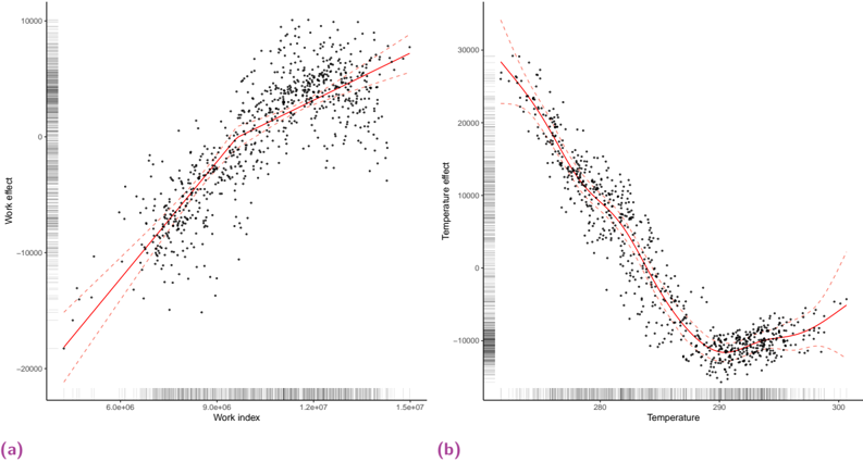
The image displays two side-by-side scatter plots, labeled (a) and (b), each showing the relationship between an independent variable and a dependent variable labeled as an "effect." Both plots include a fitted regression line (solid red) and dashed red lines representing confidence intervals. The data points are shown as black dots. The plots appear to be from a statistical or scientific analysis, likely visualizing partial effects from a model.
### Components/Axes
**Plot (a) - Left Panel:**
* **X-axis Label:** "Work index"
* **X-axis Scale:** Linear scale. Major tick marks are visible at approximately 5.0e+06, 9.0e+06, 1.2e+07, and 1.5e+07. The axis extends from slightly below 5.0e+06 to slightly above 1.5e+07.
* **Y-axis Label:** "Work effect"
* **Y-axis Scale:** Linear scale. Major tick marks are at -20000, -10000, 0, and 10000. The axis extends from approximately -22000 to 12000.
* **Data Series:** Black scatter points with a solid red regression line and two dashed red confidence interval lines.
* **Panel Label:** "(a)" in purple text, located at the bottom-left corner of the plot area.
**Plot (b) - Right Panel:**
* **X-axis Label:** "Temperature"
* **X-axis Scale:** Linear scale. Major tick marks are at 260, 280, and 300. The axis extends from approximately 250 to 305.
* **Y-axis Label:** "Temperature effect"
* **Y-axis Scale:** Linear scale. Major tick marks are at -10000, 0, 10000, 20000, and 30000. The axis extends from approximately -15000 to 35000.
* **Data Series:** Black scatter points with a solid red regression line and two dashed red confidence interval lines.
* **Panel Label:** "(b)" in purple text, located at the bottom-left corner of the plot area.
### Detailed Analysis
**Plot (a) - Work Index vs. Work Effect:**
* **Trend Verification:** The data shows a clear positive, approximately linear correlation. The solid red regression line slopes upward from left to right.
* **Data Point Distribution:** The scatter of points is densest in the middle range of the Work index (approx. 7.0e+06 to 1.3e+07). The spread (variance) of points around the regression line appears relatively consistent across the range.
* **Approximate Values:**
* At the low end of the Work index (~5.0e+06), the Work effect is approximately -18,000.
* At the high end of the Work index (~1.5e+07), the Work effect is approximately +8,000.
* The regression line crosses the zero-effect line at a Work index of approximately 9.5e+06.
**Plot (b) - Temperature vs. Temperature Effect:**
* **Trend Verification:** The data shows a clear non-linear, U-shaped (or quadratic) relationship. The solid red regression line slopes downward from left to right, reaches a minimum, and then begins to slope upward.
* **Data Point Distribution:** The scatter of points is densest around the minimum of the curve (Temperature ~280-290). The spread of points appears slightly wider at the extreme low and high temperatures.
* **Approximate Values:**
* At the low end of Temperature (~250), the Temperature effect is high, approximately +28,000.
* The curve reaches its minimum effect at a Temperature of approximately 285. The minimum effect value is approximately -12,000.
* At the high end of Temperature (~300), the Temperature effect has risen to approximately -5,000.
### Key Observations
1. **Contrasting Relationships:** The two plots demonstrate fundamentally different relationships. Plot (a) shows a monotonic, positive linear effect, while plot (b) shows a non-monotonic, curvilinear effect with a distinct minimum.
2. **Effect Magnitude:** The range of the "Temperature effect" (approx. 40,000 units) is larger than the range of the "Work effect" (approx. 26,000 units).
3. **Confidence Intervals:** In both plots, the dashed confidence interval lines are closest to the regression line in the regions of highest data density and diverge at the extremes of the x-axis, indicating greater model uncertainty where data is sparse.
4. **Data Density:** Both plots show a higher concentration of data points in the central region of the x-axis variable, with fewer observations at the extremes.
### Interpretation
These plots likely represent **partial dependence plots** or **marginal effect plots** from a statistical model (e.g., a generalized additive model or a regression with an interaction term). They isolate the individual effect of each predictor ("Work index" and "Temperature") on the response variable, holding other model terms constant.
* **Plot (a) Interpretation:** The "Work effect" increases linearly with the "Work index." This suggests a direct, proportional relationship where higher work index values are associated with a more positive (or less negative) outcome. The constant slope implies a consistent rate of change.
* **Plot (b) Interpretation:** The "Temperature effect" exhibits an optimal point. The effect is strongly positive at low temperatures, becomes negative as temperature increases, reaches a minimum (most negative) effect around 285 units, and then begins to recover. This suggests a process where performance or outcome degrades with increasing temperature up to a critical point, after which further increases may trigger a different mechanism that slightly mitigates the negative effect. This is characteristic of systems with an optimal operating temperature.
* **Relationship Between Elements:** The side-by-side presentation allows for direct comparison of the functional form and magnitude of two different predictors' effects. The key takeaway is that the influence of Temperature is more complex and non-linear compared to the straightforward linear influence of the Work index. The presence of confidence intervals is crucial for assessing the reliability of the estimated effects, especially at the boundaries of the observed data.