\n
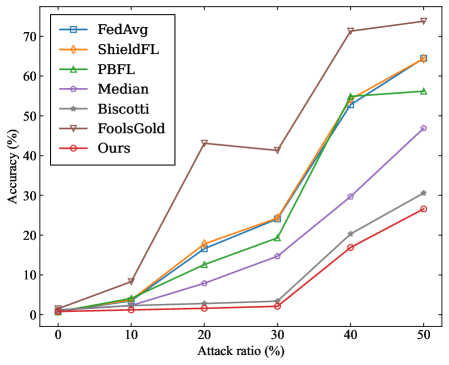
## Line Chart: Federated Learning Method Accuracy Under Adversarial Attack
### Overview
The image is a line chart comparing the performance (accuracy) of seven different federated learning methods as the ratio of adversarial attacks increases. The chart demonstrates how each method's robustness degrades under increasing levels of attack.
### Components/Axes
* **Chart Type:** Line chart with markers.
* **X-Axis:** Labeled **"Attack ratio (%)"**. The axis has major tick marks at 0, 10, 20, 30, 40, and 50.
* **Y-Axis:** Labeled **"Accuracy (%)"**. The axis has major tick marks at 0, 10, 20, 30, 40, 50, 60, and 70.
* **Legend:** Positioned in the **top-left corner** of the chart area. It contains seven entries, each with a unique color, line style, and marker symbol:
1. **FedAvg** - Blue line with square markers (□).
2. **ShieldFL** - Orange line with diamond markers (◇).
3. **PBFL** - Green line with upward-pointing triangle markers (△).
4. **Median** - Purple line with circle markers (○).
5. **Biscotti** - Gray line with plus-sign markers (+).
6. **FoolsGold** - Brown line with downward-pointing triangle markers (▽).
7. **Ours** - Red line with pentagram markers (☆).
### Detailed Analysis
The chart plots Accuracy (%) against Attack ratio (%). Below is an approximate reconstruction of the data points for each method, derived from visual inspection. Values are approximate.
| Attack Ratio (%) | FedAvg (Blue, □) | ShieldFL (Orange, ◇) | PBFL (Green, △) | Median (Purple, ○) | Biscotti (Gray, +) | FoolsGold (Brown, ▽) | Ours (Red, ☆) |
| :--- | :--- | :--- | :--- | :--- | :--- | :--- | :--- |
| **0** | ~1% | ~1% | ~1% | ~1% | ~1% | ~1% | ~1% |
| **10** | ~5% | ~5% | ~4% | ~2% | ~1% | ~8% | ~1% |
| **20** | ~17% | ~18% | ~12% | ~8% | ~3% | ~43% | ~2% |
| **30** | ~24% | ~24% | ~19% | ~14% | ~3% | ~41% | ~2% |
| **40** | ~53% | ~55% | ~55% | ~30% | ~20% | ~72% | ~17% |
| **50** | ~64% | ~64% | ~56% | ~47% | ~31% | ~74% | ~27% |
**Trend Verification:**
* **FedAvg, ShieldFL, PBFL:** These three lines follow a very similar, steep upward trend. Their accuracy increases sharply as the attack ratio increases, particularly between 30% and 40%.
* **Median:** Shows a steady, moderate upward slope. Its accuracy increases more gradually than the top group.
* **Biscotti:** Has a shallow upward slope, remaining near the bottom of the chart until a slight rise after 30%.
* **FoolsGold:** Exhibits a unique trend. It spikes early at 20% attack ratio, dips slightly at 30%, then rises sharply to become the highest-performing method at 40% and 50%.
* **Ours:** Follows a trend similar to Biscotti but consistently performs slightly worse, remaining the lowest or second-lowest line throughout.
### Key Observations
1. **Performance Inversion:** At low attack ratios (0-10%), all methods have very low accuracy (<10%). As the attack ratio increases, the accuracy of most methods *increases*, which is counter-intuitive for a robustness metric. This suggests the chart may be measuring something like the success rate of the attack itself or a specific type of failure.
2. **FoolsGold Anomaly:** The FoolsGold method (brown line) is a clear outlier. It achieves significantly higher accuracy than all other methods at attack ratios of 20% and above, peaking at ~74% at a 50% attack ratio.
3. **Clustering:** Three methods (FedAvg, ShieldFL, PBFL) cluster tightly together, indicating similar performance characteristics under these test conditions.
4. **Low-Performing Cluster:** The "Ours" and Biscotti methods form a lower-performing cluster, with "Ours" generally showing the least accuracy.
### Interpretation
The data presents a paradoxical result: **accuracy improves as the attack becomes more prevalent.** In standard adversarial robustness evaluations, accuracy typically *decreases* with stronger attacks. This suggests the chart is likely not measuring standard model accuracy on clean data.
**Possible Interpretations:**
* **Attack Success Rate:** The y-axis "Accuracy (%)" might be mislabeled and could represent the **success rate of the adversarial attack**. In this case, a higher value means the attack is *more effective*. This would make logical sense: as the attacker controls more of the data (higher attack ratio), their attack succeeds more often.
* **Task-Specific Metric:** The metric could be specific to a particular federated learning task or attack type (e.g., a backdoor attack), where "accuracy" refers to the model correctly performing the *attacker's desired malicious task*.
* **Robustness Ranking:** Under this interpretation, **FoolsGold** is the *least robust* method, as it allows the attack to succeed with the highest frequency. The method labeled **"Ours"** appears to be the *most robust*, as it maintains the lowest attack success rate across most attack ratios. The tight clustering of FedAvg, ShieldFL, and PBFL suggests they offer similar, intermediate levels of robustness.
**Conclusion:** The chart likely demonstrates the vulnerability of various federated learning aggregation rules to a data poisoning or backdoor attack. The key takeaway is that the **FoolsGold** method is highly susceptible to such attacks, while the proposed method ("Ours") shows the greatest resistance, followed by Biscotti and Median. The similar performance of FedAvg, ShieldFL, and PBFL indicates they share a common vulnerability profile in this specific threat model.