TECHNICAL ASSET FINGERPRINT
5b7fcb1b844eea7a413af6ae
Click to view fullscreen
Press ESC or click to close
FOUND IN PAPERS
EXPERT: healer-alpha-free VERSION 1
RUNTIME: free/openrouter/healer-alpha
INTEL_VERIFIED
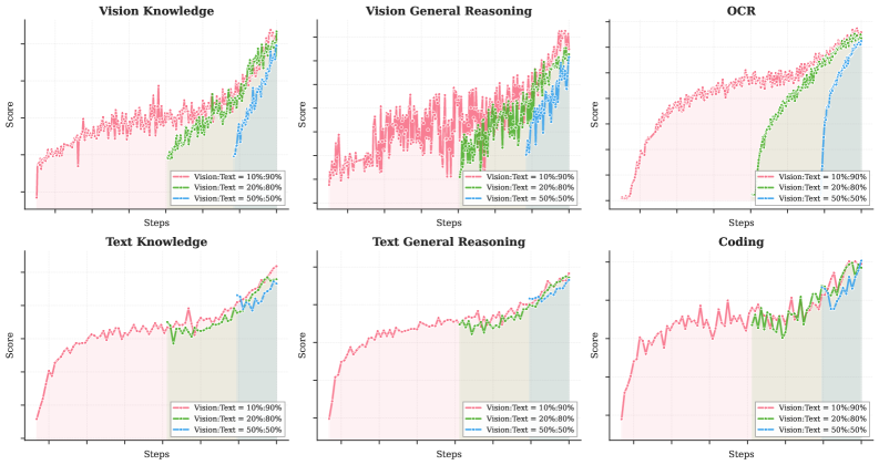
## Line Charts: Multi-Task Performance by Vision-Text Data Ratio
### Overview
The image displays a 2x3 grid of six line charts. Each chart plots the "Score" (y-axis) against "Steps" (x-axis) for a specific task, comparing three different training data mixtures defined by the ratio of Vision to Text data. The charts collectively analyze how varying the proportion of vision and text data in training affects model performance across different cognitive tasks.
### Components/Axes
* **Titles (Top of each chart):**
* Top Row (Left to Right): `Vision Knowledge`, `Vision General Reasoning`, `OCR`
* Bottom Row (Left to Right): `Text Knowledge`, `Text General Reasoning`, `Coding`
* **Axes:**
* **X-axis (All charts):** Labeled `Steps`. The axis has tick marks but no numerical labels, indicating a progression of training iterations.
* **Y-axis (All charts):** Labeled `Score`. The axis has tick marks but no numerical labels, indicating a performance metric (likely accuracy or a similar score) on a scale from low to high.
* **Legend (Present in the bottom-right corner of each chart):**
* A red line with a square marker: `Vision:Text = 10%:90%`
* A green line with a square marker: `Vision:Text = 20%:80%`
* A blue line with a square marker: `Vision:Text = 50%:50%`
* **Background Shading:** Each chart features vertical shaded regions corresponding to the colors of the three data series (red, green, blue from left to right). This likely indicates distinct phases of training where one data mixture was predominantly used.
### Detailed Analysis
**Chart 1: Vision Knowledge**
* **Trend Verification:**
* **Red Line (10%:90%):** Starts at a low score and shows a steady, noisy upward trend throughout all steps.
* **Green Line (20%:80%):** Begins at a later step (within the green shaded region) and exhibits a very steep upward slope, eventually surpassing the red line.
* **Blue Line (50%:50%):** Begins at the latest step (within the blue shaded region) and also shows a steep upward slope, converging near the top with the green line.
* **Key Data Points (Approximate):** The final scores for the green and blue lines are the highest, with the red line slightly lower. The green line shows the most dramatic improvement rate.
**Chart 2: Vision General Reasoning**
* **Trend Verification:**
* **Red Line (10%:90%):** Shows a noisy but generally upward trend from the start.
* **Green Line (20%:80%):** Starts later and rises sharply, crossing above the red line.
* **Blue Line (50%:50%):** Starts last and rises steeply, ending at a similar high level as the green line.
* **Key Data Points (Approximate):** Similar pattern to Vision Knowledge, with the 20% and 50% vision mixtures achieving higher final scores than the 10% mixture.
**Chart 3: OCR (Optical Character Recognition)**
* **Trend Verification:**
* **Red Line (10%:90%):** Rises quickly early on and then plateaus with minor fluctuations.
* **Green Line (20%:80%):** Starts later and climbs steadily, approaching the red line's plateau.
* **Blue Line (50%:50%):** Starts last and climbs, also approaching the plateau level.
* **Key Data Points (Approximate):** The red line establishes a high score early. The green and blue lines, starting from zero at later steps, show strong learning curves but do not clearly surpass the initial red line's performance within the displayed steps.
**Chart 4: Text Knowledge**
* **Trend Verification:**
* **Red Line (10%:90%):** Starts at a moderate score and shows a steady, gradual upward trend.
* **Green Line (20%:80%):** Begins at the same step as the red line but at a slightly lower initial score, following a parallel upward trend.
* **Blue Line (50%:50%):** Also begins at the same step, starting lower than both red and green, and follows a similar upward slope.
* **Key Data Points (Approximate):** The lines are ordered: Red (highest) > Green > Blue (lowest) throughout the entire training process, maintaining a consistent gap.
**Chart 5: Text General Reasoning**
* **Trend Verification:**
* **Red Line (10%:90%):** Shows a steady upward trend from the start.
* **Green Line (20%:80%):** Begins at the same step, follows a very similar trajectory to the red line but slightly below it.
* **Blue Line (50%:50%):** Begins at the same step, follows a similar trajectory but is the lowest of the three.
* **Key Data Points (Approximate):** The performance hierarchy (Red > Green > Blue) is maintained, but the gaps between the lines are smaller than in Text Knowledge.
**Chart 6: Coding**
* **Trend Verification:**
* **Red Line (10%:90%):** Exhibits a noisy but clear upward trend.
* **Green Line (20%:80%):** Starts at the same step, follows a similar noisy upward path, closely tracking the red line.
* **Blue Line (50%:50%):** Starts at the same step, also follows a similar noisy upward path, generally the lowest but intertwined with the green line.
* **Key Data Points (Approximate):** The three lines are closely clustered, showing similar performance and learning trends. The 10% vision mixture (red) has a slight edge for most of the training.
### Key Observations
1. **Task-Dependent Data Sensitivity:** Vision-centric tasks (Vision Knowledge, Vision General Reasoning, OCR) show a dramatic performance boost when the training data mixture includes a higher proportion of vision data (20% or 50%), especially when training starts from scratch with that mixture (indicated by the later starting points of green and blue lines).
2. **Text Task Robustness:** Text-centric tasks (Text Knowledge, Text General Reasoning, Coding) are less sensitive to the vision-text ratio. Performance is best with the highest text proportion (10%:90%), and increasing vision data leads to a gradual, consistent decrease in score.
3. **Staged Training Implication:** The shaded backgrounds and the delayed start of the green and blue lines in the top-row charts suggest a potential training curriculum: a model might be first trained on a text-heavy mixture (red phase), then fine-tuned on mixtures with more vision data (green and blue phases).
4. **Learning Efficiency:** For vision tasks, models trained with more vision data from the start (green/blue lines) learn much faster (steeper slope) once they begin, compared to the model trained throughout on text-heavy data (red line).
### Interpretation
The data demonstrates a clear trade-off in multi-modal model training: **specialization vs. generalization**. Allocating more data to a modality (vision) significantly boosts performance on tasks requiring that modality, but comes at a slight cost to performance on tasks dominated by the other modality (text).
The charts suggest that for optimal performance across a diverse benchmark, a balanced approach or a curriculum strategy (starting with text-heavy data for foundational knowledge, then incorporating more vision data) might be more effective than a single fixed ratio. The "OCR" chart is particularly insightful; while more vision data helps, the text-heavy model's early lead indicates that strong text understanding is a crucial foundation for character recognition, which is then refined with visual training.
The close clustering in the "Coding" chart implies that coding proficiency, as measured here, may be more dependent on textual (code) data and reasoning patterns than on visual information, making it robust to changes in the vision-text data mix. This analysis provides empirical guidance for designing data sampling strategies when training large multi-modal models.
DECODING INTELLIGENCE...