## Diagram: Comparative Circle Packing Visualization
### Overview
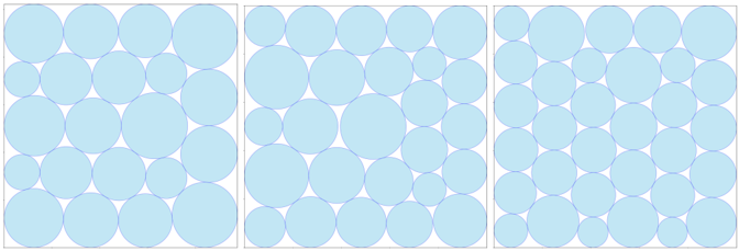
The image displays three adjacent square panels, each containing a grid of light blue circles of varying sizes against a white background. The panels appear to demonstrate different distributions or packing densities of circles within a fixed area. There is no textual information, labels, axes, legends, or data points present in the image.
### Components/Axes
* **Panels:** Three distinct square frames arranged horizontally.
* **Elements:** Each panel contains a 5x5 grid (25 total) of circles.
* **Color:** All circles are a uniform light blue (#ADD8E6 approximate).
* **Background:** White.
* **Text/Labels:** None present.
* **Axes/Legend:** None present.
### Detailed Analysis
The analysis is segmented by panel, from left to right.
**Panel 1 (Left):**
* **Spatial Grounding:** The circles are arranged in a regular 5x5 grid.
* **Trend/Pattern:** This panel exhibits the largest average circle size. The circles are tightly packed, with minimal white space between them. The size variation appears moderate; circles in the top-left and bottom-right corners seem slightly larger than those in the center, but all are relatively large.
**Panel 2 (Center):**
* **Spatial Grounding:** Same 5x5 grid structure.
* **Trend/Pattern:** This panel shows a mix of circle sizes. There is a clear pattern of larger circles placed at the four corners and the center of the grid, with smaller circles filling the intermediate positions. This creates a visual "X" or cross pattern of larger circles. The overall packing density appears slightly less than Panel 1 due to the increased size variation.
**Panel 3 (Right):**
* **Spatial Grounding:** Same 5x5 grid structure.
* **Trend/Pattern:** This panel contains the smallest average circle size. The circles are more uniform in their small size compared to the other panels, though some minor variation exists. Consequently, there is significantly more white space between circles, resulting in the lowest packing density of the three panels.
### Key Observations
1. **No Quantitative Data:** The image contains no numbers, measurements, scales, or labels. All observations are qualitative and relative.
2. **Uniform Grid Structure:** All three panels use an identical 5x5 grid layout for circle placement.
3. **Clear Visual Progression:** There is a distinct visual trend from left to right: Large Circles (High Density) -> Mixed Sizes (Medium Density) -> Small Circles (Low Density).
4. **Pattern in Center Panel:** The center panel is the only one with a deliberate, non-random size distribution pattern (large circles at corners and center).
### Interpretation
This diagram is a qualitative visual comparison, likely intended to illustrate concepts related to **packing efficiency, density, or size distribution** within a constrained space.
* **What it Demonstrates:** It visually contrasts three scenarios:
1. **High Density/Uniformity (Left):** Maximizing coverage with large, similarly sized elements.
2. **Structured Heterogeneity (Center):** A deliberate, patterned mix of large and small elements.
3. **Low Density/Uniformity (Right):** Sparse coverage with small, similarly sized elements.
* **Relationship Between Elements:** The panels are directly comparable due to their identical grid structure and color scheme. The only variable changing is the size distribution of the circles.
* **Potential Context:** This type of visualization could be used in fields like materials science (particle packing), logistics (container loading), data visualization (bubble charts), or design to intuitively convey how size variation affects space utilization and visual texture. The lack of specific data suggests its purpose is conceptual or educational rather than analytical.