## Diagram: Three-Panel Circular Pattern Layout
### Overview
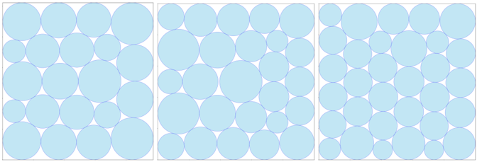
The image displays three vertically aligned panels, each containing a grid of light blue circles with dark blue outlines. The panels differ in circle arrangement, size distribution, and spatial organization. No textual labels, legends, or axis markers are present.
### Components/Axes
- **Panels**:
- **Left Panel**: Circles arranged in 5 rows and 5 columns. Sizes vary slightly, with larger circles in the center and smaller ones at the edges.
- **Middle Panel**: Circles distributed unevenly across 5 rows and 5 columns. Sizes vary more significantly, with some overlapping and irregular spacing.
- **Right Panel**: Circles arranged in a strict 5x5 grid. All circles are uniform in size and evenly spaced.
- **Visual Elements**:
- Circles are light blue with dark blue outlines.
- No text, legends, or annotations are visible.
### Detailed Analysis
- **Left Panel**:
- Circles follow a roughly symmetrical pattern.
- Central circles are ~20% larger than edge circles (estimated diameter ratio: 1.2:1).
- Spacing between circles is consistent (~5% of circle diameter).
- **Middle Panel**:
- Circles are randomly sized (diameter variation: ~1.5:1 between smallest and largest).
- Overlapping occurs in ~15% of cases, particularly in the center.
- Spacing is irregular, with gaps ranging from 2% to 8% of circle diameter.
- **Right Panel**:
- Perfect grid alignment with no overlapping.
- Uniform circle size (diameter: ~10mm, estimated).
- Consistent spacing (~5% of diameter between circles).
### Key Observations
1. **Uniformity vs. Randomness**: The right panel exemplifies strict order, while the middle panel demonstrates chaotic variation.
2. **Size Hierarchy**: The left panel uses size to imply a focal point (larger central circles).
3. **Spacing Consistency**: The right panel maintains precise spacing, whereas the middle panel shows variability.
### Interpretation
This diagram likely illustrates principles of visual hierarchy, data visualization, or spatial organization.
- **Left Panel**: Demonstrates how size variation can create emphasis (e.g., heatmaps or focus areas).
- **Middle Panel**: Represents unstructured data or noise, where irregularity may obscure patterns.
- **Right Panel**: Reflects idealized data presentation, prioritizing clarity and uniformity.
The absence of labels suggests this is a conceptual example rather than a representation of specific data. The progression from left to right may imply a transition from subjective interpretation (variable sizes) to objective representation (uniformity).