## Chart Compilation: Variable Importance & Prostate Cancer Data Analysis
### Overview
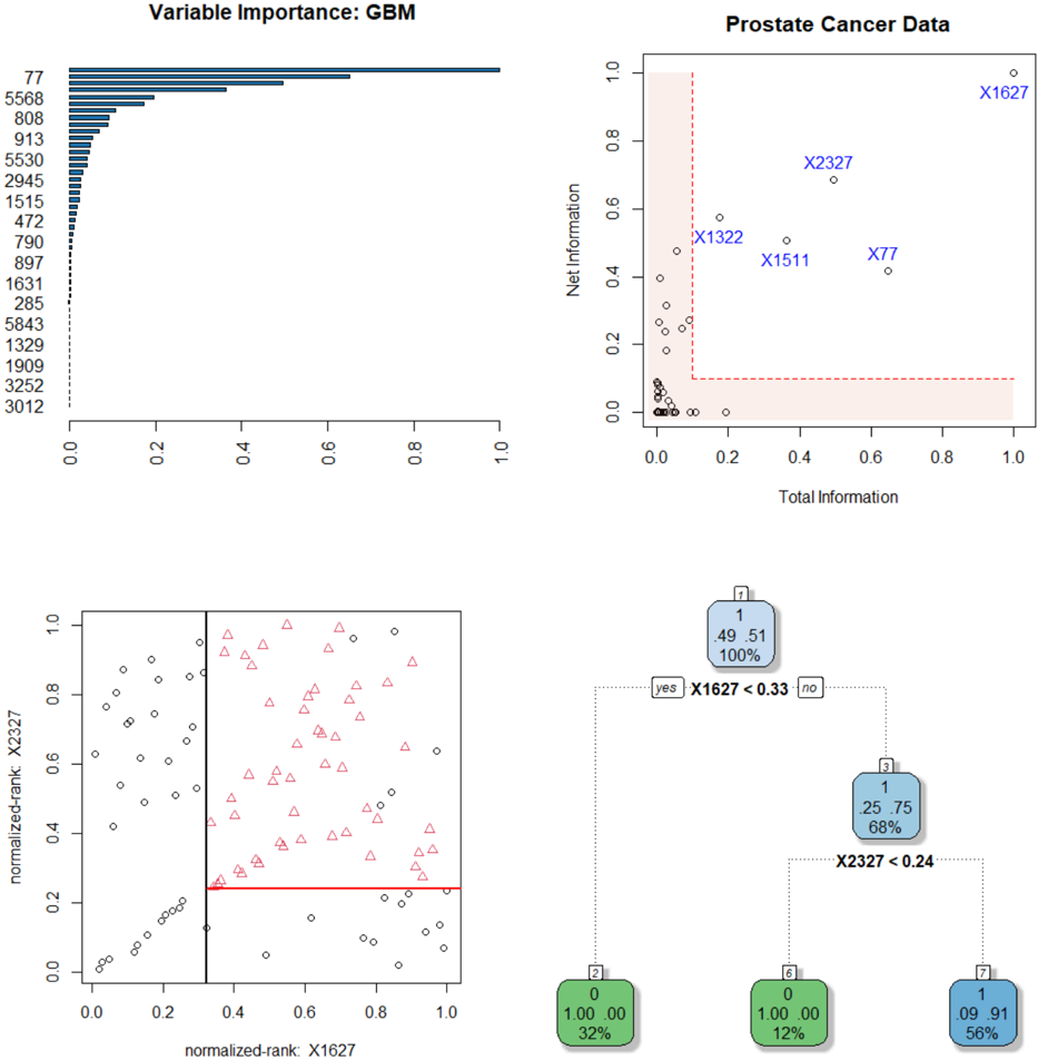
The image presents a compilation of four charts related to prostate cancer data analysis, likely stemming from a Gradient Boosting Machine (GBM) model. The charts explore variable importance, a scatter plot of Net Information vs. Total Information, and two scatter plots with associated histograms representing normalized ranks for variables X1627 and X2327.
### Components/Axes
* **Top-Left: Variable Importance (GBM)**
* X-axis: Variable Importance (scale 0.0 to 1.0, with increments of 0.2)
* Y-axis: Variable names (listed numerically, from 77 to 3012)
* Bar chart representing the importance of each variable in the GBM model.
* **Top-Right: Prostate Cancer Data - Net Information vs. Total Information**
* X-axis: Total Information (scale 0.0 to 1.0, with increments of 0.2)
* Y-axis: Net Information (scale 0.0 to 1.0, with increments of 0.2)
* Scatter plot of data points, with points labeled X1627, X2327, X1322, X1511, and X77. A red dashed rectangle is drawn in the top-right corner.
* **Bottom-Left: Scatter Plot - Normalized-rank: X2327 vs. Normalized-rank: X1627**
* X-axis: normalized-rank: X1627 (scale 0.0 to 1.0, with increments of 0.2)
* Y-axis: normalized-rank: X2327 (scale 0.0 to 1.0, with increments of 0.2)
* Scatter plot with two distinct point shapes: circles and triangles.
* **Bottom-Right: Histograms - X1627 & X2327**
* Two histograms, one for X1627 and one for X2327.
* X1627 Histogram:
* Categories: 0, 1
* Counts: 1, 49
* Percentages: 2%, 98%
* Label: "yes" (associated with 0) and "no" (associated with 1)
* Threshold: X1627 < 0.33
* X2327 Histogram:
* Categories: 0, 1
* Counts: 1, 56
* Percentages: 2%, 98%
* Label: "yes" (associated with 0) and "no" (associated with 1)
* Threshold: X2327 < 0.24
### Detailed Analysis or Content Details
* **Variable Importance (GBM):** The bar chart shows a decreasing trend in variable importance. The highest importance is around 3012, and the lowest is around 77. The values are approximately: 3012 (around 0.95), 5843 (around 0.85), 1329 (around 0.75), 1909 (around 0.65), 3252 (around 0.55), 5530 (around 0.45), 2945 (around 0.35), 515 (around 0.25), 472 (around 0.15), 77 (around 0.05).
* **Prostate Cancer Data - Net Information vs. Total Information:** The scatter plot shows a generally positive correlation, but with significant spread.
* X1627: Approximately (0.9, 0.85)
* X2327: Approximately (0.7, 0.75)
* X1322: Approximately (0.4, 0.35)
* X1511: Approximately (0.5, 0.3)
* X77: Approximately (0.6, 0.2)
The points are clustered, with X1627 being the most extreme point in the top-right quadrant.
* **Scatter Plot - Normalized-rank: X2327 vs. Normalized-rank: X1627:** The scatter plot shows two distinct clusters of points. The circles are generally concentrated in the lower-left quadrant, while the triangles are more dispersed, with a tendency towards the upper-right quadrant.
* **Histograms - X1627 & X2327:**
* X1627: The histogram shows a strong bias towards the value 1 (98% of the data), indicating that most samples have a normalized rank greater than 0.33.
* X2327: The histogram also shows a strong bias towards the value 1 (98% of the data), indicating that most samples have a normalized rank greater than 0.24.
### Key Observations
* Variable 3012 is the most important variable in the GBM model.
* X1627 has the highest Net and Total Information.
* The scatter plot of X2327 vs. X1627 suggests a potential relationship between these two variables, with the triangles indicating a higher normalized rank for X2327 given a higher normalized rank for X1627.
* Both X1627 and X2327 are predominantly greater than their respective thresholds (0.33 and 0.24).
### Interpretation
The data suggests that variable 3012 is a strong predictor in the GBM model for prostate cancer data. The Net Information vs. Total Information plot highlights X1627 as a particularly informative variable. The scatter plot and histograms suggest a relationship between X1627 and X2327, and that both variables are generally high-ranking. The histograms indicate that the majority of samples have normalized ranks above the specified thresholds for both variables. The red rectangle in the Net Information vs. Total Information plot may indicate a region of interest or a threshold for identifying potentially significant variables. The separation of the points in the scatter plot by shape (circles and triangles) could represent different subgroups within the data, potentially related to disease status or other clinical characteristics. Further investigation is needed to understand the specific meaning of these variables and their relationship to prostate cancer.