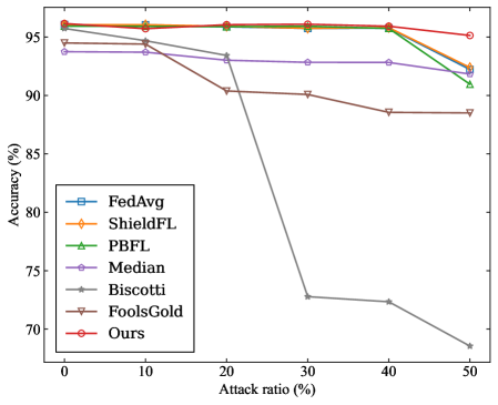
## Line Chart: Accuracy vs. Attack Ratio for Federated Learning Methods
### Overview
The image is a line chart comparing the performance (accuracy) of seven different federated learning methods or algorithms as the percentage of malicious participants (attack ratio) in the system increases. The chart demonstrates how each method's accuracy degrades under increasing adversarial pressure.
### Components/Axes
* **Chart Type:** Multi-line chart with markers.
* **X-Axis:** Labeled **"Attack ratio (%)"**. It has major tick marks at 0, 10, 20, 30, 40, and 50.
* **Y-Axis:** Labeled **"Accuracy (%)"**. It has major tick marks at 70, 75, 80, 85, 90, and 95.
* **Legend:** Positioned in the **bottom-left corner** of the chart area. It contains seven entries, each with a unique color and marker symbol:
1. **FedAvg:** Blue line with square markers (□).
2. **ShieldFL:** Orange line with diamond markers (◇).
3. **PBFL:** Green line with upward-pointing triangle markers (△).
4. **Median:** Purple line with circle markers (○).
5. **Biscotti:** Gray line with star/asterisk markers (*).
6. **FoolsGold:** Brown line with downward-pointing triangle markers (▽).
7. **Ours:** Red line with pentagon markers (⬠).
### Detailed Analysis
The chart plots Accuracy (%) against Attack ratio (%). Below is an analysis of each data series, with approximate values read from the chart. Values are approximate due to visual estimation.
**1. FedAvg (Blue, □):**
* **Trend:** Starts high and remains nearly flat until a sharp decline after 40% attack ratio.
* **Data Points:** ~96% at 0%, ~96% at 10%, ~96% at 20%, ~96% at 30%, ~96% at 40%, ~92% at 50%.
**2. ShieldFL (Orange, ◇):**
* **Trend:** Very similar to FedAvg, maintaining high accuracy before a late decline.
* **Data Points:** ~96% at 0%, ~96% at 10%, ~96% at 20%, ~96% at 30%, ~96% at 40%, ~92.5% at 50%.
**3. PBFL (Green, △):**
* **Trend:** Follows the same high-accuracy plateau as FedAvg and ShieldFL but begins its decline slightly earlier.
* **Data Points:** ~96% at 0%, ~96% at 10%, ~96% at 20%, ~96% at 30%, ~96% at 40%, ~91% at 50%.
**4. Median (Purple, ○):**
* **Trend:** Starts slightly lower than the top group and shows a very gradual, linear decline.
* **Data Points:** ~94% at 0%, ~94% at 10%, ~93% at 20%, ~93% at 30%, ~93% at 40%, ~92% at 50%.
**5. Biscotti (Gray, *):**
* **Trend:** Exhibits the most severe and rapid degradation. It starts high but plummets dramatically between 20% and 30% attack ratio.
* **Data Points:** ~96% at 0%, ~95% at 10%, ~93% at 20%, **~73% at 30%**, ~72% at 40%, ~68% at 50%.
**6. FoolsGold (Brown, ▽):**
* **Trend:** Starts lower than most and shows a steady, moderate decline.
* **Data Points:** ~94.5% at 0%, ~94% at 10%, ~90.5% at 20%, ~90% at 30%, ~88.5% at 40%, ~88.5% at 50%.
**7. Ours (Red, ⬠):**
* **Trend:** Maintains the highest and most stable accuracy across the entire range, with only a very slight dip at the highest attack ratio.
* **Data Points:** ~96% at 0%, ~96% at 10%, ~96% at 20%, ~96% at 30%, ~96% at 40%, ~95% at 50%.
### Key Observations
1. **Performance Clustering:** Three distinct performance clusters are visible:
* **High-Resilience Group:** "Ours", FedAvg, ShieldFL, and PBFL maintain ~96% accuracy until 40% attack ratio.
* **Moderate-Resilience Group:** "Median" and "FoolsGold" start lower and degrade more gradually.
* **Low-Resilience Outlier:** "Biscotti" experiences a catastrophic failure, losing over 20 percentage points of accuracy between 20% and 30% attack ratio.
2. **Critical Threshold:** The 20%-30% attack ratio range is a critical point where the performance of several methods diverges sharply.
3. **Top Performer:** The method labeled "Ours" demonstrates superior robustness, maintaining near-peak accuracy even at a 50% attack ratio, while all other methods show some decline.
### Interpretation
This chart is a robustness evaluation of federated learning algorithms against poisoning attacks (where a fraction of participants are malicious). The "Attack ratio (%)" represents the proportion of malicious clients.
* **What the data suggests:** The proposed method ("Ours") is significantly more robust to adversarial attacks than the six baseline methods compared. It maintains model accuracy even when half the participants are malicious.
* **How elements relate:** The x-axis (attack strength) is the independent variable testing the systems. The y-axis (accuracy) is the dependent variable measuring system performance. The legend identifies the different defensive strategies being tested.
* **Notable trends/anomalies:**
* The **Biscotti** method's sharp drop indicates a specific vulnerability that is triggered once the attack ratio exceeds 20%. This is a critical failure mode.
* The **FedAvg, ShieldFL, and PBFL** methods show a "cliff-edge" failure pattern—they are highly effective up to a point (40% attack ratio) but then degrade quickly.
* The **"Ours"** method's flat line suggests it employs a fundamentally different or more effective defense mechanism that does not degrade linearly or catastrophically with increased attack strength.
* **Peircean Investigation:** The chart is an **index** of resilience (the lines point to the performance outcome) and a **symbol** of a comparative study (the legend encodes the meaning of each line). The stark visual contrast between the red "Ours" line and the plummeting gray "Biscotti" line is the most significant **iconic** representation of the claimed improvement. The data argues that the new method solves a stability problem present in prior work.