\n
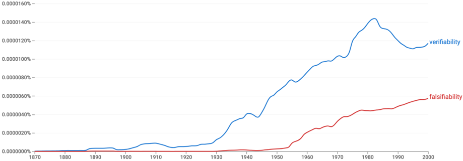
## Line Chart: Verifiability vs. Falsifiability Over Time
### Overview
The image presents a line chart illustrating the trends of "verifiability" and "falsifiability" over time, spanning from approximately 1870 to 2000. The x-axis represents time (years), and the y-axis represents a percentage-like value ranging from 0.000000% to 0.000160%. Two distinct lines depict the evolution of each concept.
### Components/Axes
* **X-axis:** Time (Years) - Marked with approximate decade intervals from 1870 to 2000.
* **Y-axis:** Percentage-like value - Scale ranges from 0.000000% to 0.000160%.
* **Line 1 (Blue):** Represents "verifiability".
* **Line 2 (Red):** Represents "falsifiability".
* **Legend:** Located in the top-right corner, labeling the lines as "verifiability" (blue) and "falsifiability" (red).
### Detailed Analysis
**Verifiability (Blue Line):**
The blue line, representing verifiability, begins at approximately 0.000002% in 1870 and remains relatively flat until around 1930, fluctuating between 0.000002% and 0.000008%. From 1930 onwards, the line exhibits a steep upward trend, reaching a peak of approximately 0.000145% around 1980. After 1980, the line declines, ending at approximately 0.000115% in 2000.
**Falsifiability (Red Line):**
The red line, representing falsifiability, starts at approximately 0.000001% in 1870 and remains nearly flat until around 1940, fluctuating between 0.000001% and 0.000003%. From 1940, the line shows a gradual upward trend, but at a much slower rate than verifiability. It reaches approximately 0.000007% in 2000.
### Key Observations
* **Divergent Trends:** Verifiability and falsifiability exhibit significantly different trends. Verifiability experiences a dramatic increase starting around 1930, while falsifiability shows a much more gradual increase.
* **Correlation:** There appears to be a positive correlation between the two lines, particularly after 1940. As verifiability increases, falsifiability also tends to increase, although at a slower pace.
* **Peak and Decline:** Verifiability reaches a peak around 1980 and then declines slightly, while falsifiability continues to increase, albeit slowly, until 2000.
### Interpretation
The chart suggests a historical relationship between the concepts of verifiability and falsifiability. The sharp increase in verifiability around 1930 could be linked to advancements in scientific methodology, the rise of empiricism, or the development of new technologies that enabled more rigorous testing and validation of theories. The slower increase in falsifiability suggests that while the ability to verify claims has grown rapidly, the ability to definitively disprove them has lagged behind.
The peak in verifiability around 1980, followed by a slight decline, might indicate a period of increased skepticism or a recognition of the limitations of certain verification methods. The continued, albeit slow, increase in falsifiability suggests a growing emphasis on critical thinking and the importance of challenging established beliefs.
The positive correlation between the two lines implies that as our ability to verify claims improves, so does our ability to falsify them, potentially reflecting a more nuanced and rigorous approach to knowledge acquisition. The chart could be interpreted as a visualization of the evolving standards of scientific inquiry and the increasing complexity of knowledge in the 20th century.