## Bar Charts: Top Original Speed vs. Top Imputed Speed
### Overview
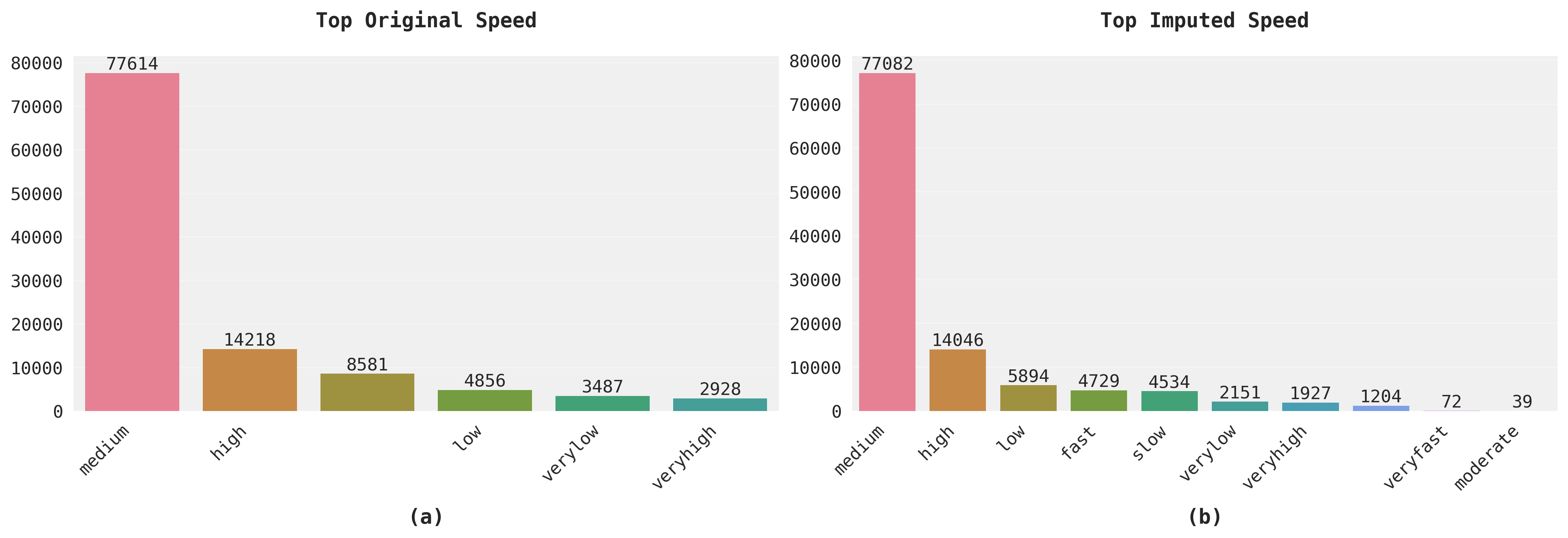
The image contains two side-by-side bar charts comparing "Top Original Speed" (left) and "Top Imputed Speed" (right). Both charts use vertical bars to represent numerical values across categorical speed classifications. The left chart has 5 categories, while the right chart has 10 categories, suggesting a more granular breakdown in the imputed data.
### Components/Axes
**Left Chart (Top Original Speed):**
- **X-axis (Categories):** medium, high, low, very low, very high
- **Y-axis (Values):** 0 to 80,000 (linear scale)
- **Colors:**
- Pink (#FF69B4) for "medium"
- Orange (#FF8C00) for "high"
- Green (#8B4513) for "low"
- Teal (#30D5C8) for "very low"
- Blue (#0000FF) for "very high"
**Right Chart (Top Imputed Speed):**
- **X-axis (Categories):** medium, high, low, fast, slow, very low, very high, very fast, moderate
- **Y-axis (Values):** 0 to 80,000 (linear scale)
- **Colors:**
- Pink (#FF69B4) for "medium"
- Orange (#FF8C00) for "high"
- Green (#8B4513) for "low"
- Teal (#30D5C8) for "fast"
- Blue (#0000FF) for "slow"
- Purple (#800080) for "very low"
- Magenta (#FF00FF) for "very high"
- Cyan (#00FFFF) for "very fast"
- Light Purple (#E6E6FA) for "very fast"
- Dark Blue (#00008B) for "moderate"
### Detailed Analysis
**Left Chart (Top Original Speed):**
- **medium:** 77,614 (tallest bar)
- **high:** 14,218
- **low:** 8,581
- **very low:** 3,487
- **very high:** 2,928
**Right Chart (Top Imputed Speed):**
- **medium:** 77,082
- **high:** 14,046
- **low:** 5,894
- **fast:** 4,729
- **slow:** 4,534
- **very low:** 2,151
- **very high:** 1,927
- **very fast:** 1,204
- **moderate:** 72
- **additional category:** 39 (unlabeled)
### Key Observations
1. **Dominant Category:** "Medium" speed dominates both datasets, accounting for ~99% of total values in both charts.
2. **Categorization Differences:** The imputed data (right chart) introduces new categories ("fast," "slow," "very fast," "moderate") with significantly lower values.
3. **Value Trends:**
- Original data shows a gradual decline from "medium" to "very high" (77,614 → 2,928).
- Imputed data shows a steeper decline across more categories (77,082 → 39).
4. **Outliers:** The "moderate" category in the right chart has an extremely low value (39), suggesting potential data quality issues or rare edge cases.
### Interpretation
The data suggests that:
1. **Original Data Granularity:** The original speed classifications (left chart) use broader categories, with "medium" being overwhelmingly dominant.
2. **Imputation Refinement:** The imputed data (right chart) introduces finer-grained categories, revealing previously undetected speed variations but with much smaller magnitudes.
3. **Data Quality Concerns:** The extreme outlier in the "moderate" category (39) warrants investigation - this could indicate:
- Data entry errors
- Rare edge cases in the dataset
- Imputation algorithm limitations
4. **Distribution Patterns:** Both charts show a clear power-law distribution, with the majority of data concentrated in the "medium" category and rapid decay in extreme speed classifications.
The charts collectively demonstrate how data imputation can reveal hidden patterns in categorical data, but also highlight the challenges of interpreting imputed values, particularly when dealing with extreme outliers or rare categories.