## Line Chart: MER Average vs. N for Different Methods
### Overview
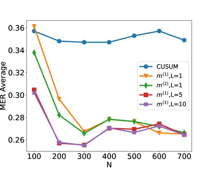
This image displays a line chart illustrating the "MER Average" on the y-axis against "N" on the x-axis. Five different data series, representing various methods (CUSUM, m⁽¹⁾,L=1, m⁽²⁾,L=1, m⁽¹⁾,L=5, and m⁽¹⁾,L=10), are plotted. The chart shows how the MER Average changes with increasing values of N for each method.
### Components/Axes
* **Y-axis Label**: "MER Average"
* **Scale**: Ranges from approximately 0.25 to 0.36, with major tick marks at 0.26, 0.28, 0.30, 0.32, 0.34, and 0.36.
* **X-axis Label**: "N"
* **Scale**: Ranges from 100 to 700, with major tick marks at 100, 200, 300, 400, 500, 600, and 700.
* **Legend**: Located in the top-right quadrant of the chart. It maps colors and markers to the different data series:
* **Blue circles**: CUSUM
* **Orange inverted triangles**: m⁽¹⁾,L=1
* **Green diamonds**: m⁽²⁾,L=1
* **Red squares**: m⁽¹⁾,L=5
* **Purple crosses**: m⁽¹⁾,L=10
### Detailed Analysis
**Data Series Trends and Values:**
1. **CUSUM (Blue circles)**:
* **Trend**: The CUSUM line generally shows a slight upward trend from N=100 to N=500, then a slight dip and another slight rise. It remains relatively stable across the range of N.
* **Approximate Data Points**:
* N=100: ~0.358
* N=200: ~0.347
* N=300: ~0.345
* N=400: ~0.345
* N=500: ~0.352
* N=600: ~0.355
* N=700: ~0.348
2. **m⁽¹⁾,L=1 (Orange inverted triangles)**:
* **Trend**: This line starts at its highest MER Average at N=100 and then shows a sharp downward trend until N=300, followed by a slight upward trend.
* **Approximate Data Points**:
* N=100: ~0.362
* N=200: ~0.298
* N=300: ~0.267
* N=400: ~0.278
* N=500: ~0.273
* N=600: ~0.270
* N=700: ~0.265
3. **m⁽²⁾,L=1 (Green diamonds)**:
* **Trend**: This line begins with a significant drop from N=100 to N=200, then shows a gradual upward trend with some fluctuations.
* **Approximate Data Points**:
* N=100: ~0.339
* N=200: ~0.280
* N=300: ~0.267
* N=400: ~0.279
* N=500: ~0.277
* N=600: ~0.275
* N=700: ~0.267
4. **m⁽¹⁾,L=5 (Red squares)**:
* **Trend**: This line starts at a moderate MER Average and shows a general downward trend until N=300, followed by a slight increase and then a decrease.
* **Approximate Data Points**:
* N=100: ~0.304
* N=200: ~0.257
* N=300: ~0.255
* N=400: ~0.270
* N=500: ~0.273
* N=600: ~0.275
* N=700: ~0.266
5. **m⁽¹⁾,L=10 (Purple crosses)**:
* **Trend**: This line shows a sharp initial decrease from N=100 to N=200, then remains relatively stable with minor fluctuations, generally trending downwards slightly towards the end.
* **Approximate Data Points**:
* N=100: ~0.303
* N=200: ~0.257
* N=300: ~0.255
* N=400: ~0.268
* N=500: ~0.270
* N=600: ~0.272
* N=700: ~0.265
### Key Observations
* **Initial Performance**: At N=100, the m⁽¹⁾,L=1 method shows the highest MER Average (~0.362), while CUSUM is also high (~0.358). The other methods (m⁽¹⁾,L=5, m⁽¹⁾,L=10, and m⁽²⁾,L=1) start at lower MER Averages, around 0.30 to 0.34.
* **Convergence**: For N values between 200 and 300, several lines (m⁽¹⁾,L=1, m⁽²⁾,L=1, m⁽¹⁾,L=5, and m⁽¹⁾,L=10) converge to similar low MER Average values, around 0.255 to 0.267.
* **CUSUM Stability**: The CUSUM method exhibits the most stable MER Average across the range of N, fluctuating within a narrow band of approximately 0.345 to 0.358.
* **Lowest MER Averages**: The lowest MER Average values are generally observed for N=300 and N=700, with values around 0.265-0.267 for m⁽¹⁾,L=1, m⁽²⁾,L=1, and m⁽¹⁾,L=10 at N=700.
* **L Parameter Impact**: Comparing m⁽¹⁾,L=1, m⁽¹⁾,L=5, and m⁽¹⁾,L=10, it appears that increasing L (from 1 to 5 and 10) initially leads to lower MER Averages for smaller N (e.g., N=200), but the performance becomes more similar for larger N.
### Interpretation
The chart suggests a comparative analysis of different methods for calculating or estimating some metric (MER Average) as a function of a parameter N.
* **Method Performance**: The CUSUM method appears to be the most robust and stable across varying N, maintaining a consistently moderate MER Average. In contrast, methods like m⁽¹⁾,L=1 show a significant initial drop in MER Average, indicating a potential sensitivity to initial data points or a rapid adaptation.
* **Parameter Influence**: The parameter L in the m⁽¹⁾ method seems to influence its performance. For smaller N, a higher L (like 5 or 10) might lead to a lower MER Average, suggesting better initial performance or stability. However, for larger N, the differences between different L values for m⁽¹⁾ become less pronounced, and they tend to perform similarly to m⁽²⁾,L=1.
* **Trade-offs**: The initial high MER Average for m⁽¹⁾,L=1 at N=100 might be a trade-off for its rapid decrease to lower values at N=200 and N=300. This could imply that it is more sensitive to changes or anomalies early on but becomes more efficient later.
* **Overall Goal**: The data likely aims to demonstrate which method or parameter setting provides the lowest and most consistent MER Average for a given N, which could be crucial in applications where minimizing this metric is important (e.g., in statistical process control, anomaly detection, or signal processing). The convergence of several lines at lower N values suggests that for certain ranges, different methods might achieve similar levels of performance. The CUSUM method's consistent performance might be desirable in scenarios where predictability and stability are prioritized over achieving the absolute lowest MER Average.