\n
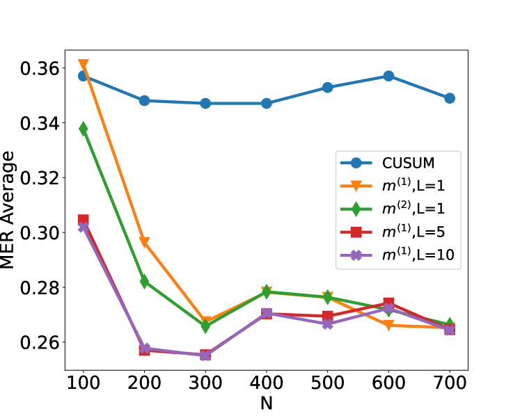
## Line Chart: MER Average vs. N for Different Methods
### Overview
This image presents a line chart comparing the Mean Error Rate (MER) Average for different methods (CUSUM, m^(1),L=1, m^(2),L=1, m^(1),L=5, m^(1),L=10) as a function of N, likely representing sample size or number of iterations. The chart visually demonstrates how the MER Average changes with increasing N for each method.
### Components/Axes
* **X-axis:** Labeled "N", ranging from 100 to 700, with markers at 100, 200, 300, 400, 500, 600, and 700.
* **Y-axis:** Labeled "MER Average", ranging from 0.26 to 0.36, with markers at 0.26, 0.28, 0.30, 0.32, 0.34, and 0.36.
* **Legend:** Located in the top-right corner of the chart. It identifies the following data series:
* CUSUM (Blue)
* m^(1),L=1 (Orange)
* m^(2),L=1 (Light Green)
* m^(1),L=5 (Red)
* m^(1),L=10 (Purple)
### Detailed Analysis
Here's a breakdown of each data series and their trends:
* **CUSUM (Blue):** The line starts at approximately 0.355 at N=100, decreases slightly to around 0.345 at N=200, remains relatively stable around 0.345-0.35 until N=600, and then increases slightly to approximately 0.35 at N=700. The trend is generally flat with minor fluctuations.
* **m^(1),L=1 (Orange):** This line begins at approximately 0.355 at N=100, decreases sharply to around 0.28 at N=200, continues to decrease to approximately 0.26 at N=300, then increases slightly to around 0.27 at N=400, and remains relatively stable around 0.27-0.28 until N=700. The trend is a steep initial decline followed by stabilization.
* **m^(2),L=1 (Light Green):** The line starts at approximately 0.33 at N=100, decreases to around 0.28 at N=200, continues to decrease to approximately 0.26 at N=300, then increases slightly to around 0.27 at N=400, and remains relatively stable around 0.27-0.28 until N=700. The trend is similar to m^(1),L=1, with a decline and stabilization.
* **m^(1),L=5 (Red):** This line begins at approximately 0.31 at N=100, decreases to around 0.27 at N=200, continues to decrease to approximately 0.26 at N=300, then increases to around 0.27 at N=400, and remains relatively stable around 0.27-0.28 until N=700. The trend is a decline and stabilization, similar to the previous two.
* **m^(1),L=10 (Purple):** The line starts at approximately 0.31 at N=100, decreases to around 0.26 at N=200, remains relatively stable around 0.26-0.27 until N=700. The trend is a decline and stabilization, with a flatter profile than the others.
### Key Observations
* All methods show a decreasing MER Average as N increases initially, suggesting improved performance with larger sample sizes.
* The m^(1),L=1, m^(2),L=1, m^(1),L=5, and m^(1),L=10 methods all converge to a similar MER Average around 0.27-0.28 as N increases.
* CUSUM consistently exhibits a higher MER Average compared to the other methods across all values of N.
* The most significant performance improvement for the m^(1),L=1, m^(2),L=1, m^(1),L=5, and m^(1),L=10 methods occurs between N=100 and N=300.
### Interpretation
The data suggests that the methods m^(1),L=1, m^(2),L=1, m^(1),L=5, and m^(1),L=10 are more effective at reducing the Mean Error Rate than the CUSUM method, particularly for smaller values of N. As N increases, the performance gap between these methods narrows, indicating that all methods achieve comparable accuracy with sufficiently large sample sizes. The initial rapid decline in MER Average for the m^(1),L=1, m^(2),L=1, m^(1),L=5, and m^(1),L=10 methods suggests that they benefit significantly from increased data, while CUSUM's performance plateaus. The parameter 'L' likely represents a smoothing factor or window size, and the results suggest that increasing L (from 1 to 5 to 10) leads to a more stable, but potentially slightly less responsive, performance. The choice of method would depend on the trade-off between initial accuracy and stability, as well as the computational cost of each method. The fact that all methods converge suggests a limit to the achievable accuracy, regardless of the method used.