\n
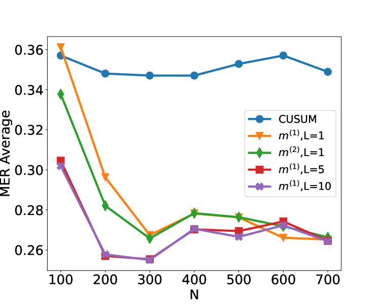
## Line Chart: MER Average vs. N for Different Methods
### Overview
The image displays a line chart comparing the performance of five different statistical methods or parameter settings. The performance metric is "MER Average," plotted against a variable "N" (likely sample size or number of observations). The chart shows how the average MER (Misclassification Error Rate, or a similar metric) changes for each method as N increases from 100 to 700.
### Components/Axes
* **Chart Type:** Multi-line chart with markers.
* **X-Axis:**
* **Label:** `N`
* **Scale:** Linear, from 100 to 700.
* **Tick Markers:** 100, 200, 300, 400, 500, 600, 700.
* **Y-Axis:**
* **Label:** `MER Average`
* **Scale:** Linear, from approximately 0.26 to 0.36.
* **Tick Markers:** 0.26, 0.28, 0.30, 0.32, 0.34, 0.36.
* **Legend:** Located in the top-right quadrant of the chart area. It contains five entries, each associating a line color and marker shape with a method label.
1. **Blue line with circle markers:** `CUSUM`
2. **Orange line with downward-pointing triangle markers:** `m^(1), L=1`
3. **Green line with diamond markers:** `m^(2), L=1`
4. **Red line with square markers:** `m^(1), L=5`
5. **Purple line with pentagon (or star-like) markers:** `m^(1), L=10`
### Detailed Analysis
The following describes the trend and approximate data points for each series. Values are estimated from the chart's grid.
1. **CUSUM (Blue, Circle):**
* **Trend:** Relatively flat and stable across all N values, showing only minor fluctuations. It maintains the highest MER Average among all methods for most of the range.
* **Approximate Data Points:**
* N=100: ~0.358
* N=200: ~0.348
* N=300: ~0.347
* N=400: ~0.347
* N=500: ~0.353
* N=600: ~0.357
* N=700: ~0.349
2. **m^(1), L=1 (Orange, Downward Triangle):**
* **Trend:** Starts very high, experiences a sharp, significant drop between N=100 and N=300, then fluctuates with a slight downward trend towards N=700.
* **Approximate Data Points:**
* N=100: ~0.361 (Highest point on the entire chart)
* N=200: ~0.298
* N=300: ~0.268
* N=400: ~0.279
* N=500: ~0.277
* N=600: ~0.266
* N=700: ~0.265
3. **m^(2), L=1 (Green, Diamond):**
* **Trend:** Similar shape to the orange line but starts lower. It shows a steep decline from N=100 to N=300, a slight rise at N=400, and then a gradual decline.
* **Approximate Data Points:**
* N=100: ~0.338
* N=200: ~0.282
* N=300: ~0.265
* N=400: ~0.279
* N=500: ~0.276
* N=600: ~0.272
* N=700: ~0.267
4. **m^(1), L=5 (Red, Square):**
* **Trend:** Starts at a moderate level, drops to a minimum at N=300, then shows a slight, steady increase before a final dip at N=700.
* **Approximate Data Points:**
* N=100: ~0.305
* N=200: ~0.257
* N=300: ~0.255 (Lowest point for this series)
* N=400: ~0.271
* N=500: ~0.270
* N=600: ~0.275
* N=700: ~0.264
5. **m^(1), L=10 (Purple, Pentagon):**
* **Trend:** Follows a path very similar to the red line (`m^(1), L=5`), often overlapping or running just below it. It also reaches its minimum at N=300.
* **Approximate Data Points:**
* N=100: ~0.302
* N=200: ~0.258
* N=300: ~0.254 (Appears to be the lowest data point on the entire chart)
* N=400: ~0.270
* N=500: ~0.267
* N=600: ~0.272
* N=700: ~0.264
### Key Observations
1. **Performance Hierarchy:** For N > 200, the methods `m^(1), L=5` and `m^(1), L=10` consistently achieve the lowest (best) MER Average, followed closely by `m^(2), L=1` and `m^(1), L=1`. The `CUSUM` method consistently has the highest (worst) MER Average.
2. **Critical Transition at N=200-300:** All methods except `CUSUM` show a dramatic improvement (decrease in MER) as N increases from 100 to 300. The most significant drop occurs between N=100 and N=200.
3. **Convergence:** At the highest measured value (N=700), the performance of the four non-CUSUM methods converges to a narrow band between approximately 0.264 and 0.267.
4. **CUSUM Stability:** The `CUSUM` method exhibits remarkable stability, with its MER Average varying within a very narrow range (~0.347 to ~0.358) across the entire span of N.
5. **Parameter Sensitivity (L):** For the `m^(1)` method, increasing the parameter `L` from 1 to 5 or 10 results in significantly better performance (lower MER), especially at lower N values (N=100, 200).
### Interpretation
This chart likely evaluates change-point detection or sequential analysis algorithms. "MER" probably stands for "Missed Event Rate" or "Misclassification Error Rate," where a lower value is better. "N" represents the number of data points or observations.
The data suggests that the `CUSUM` (Cumulative Sum) algorithm, a classic method, is robust and stable but may have a higher baseline error rate in this specific scenario. The other methods, denoted `m^(1)` and `m^(2)` with different `L` parameters, appear to be alternative or modified algorithms.
The key finding is that these alternative methods, particularly `m^(1)` with a larger `L` value (5 or 10), significantly outperform `CUSUM` as the sample size (N) grows beyond 100. Their performance improves rapidly with more data and converges to a similar, low error rate. The parameter `L` seems to control a memory or window length; a larger `L` provides better performance, likely by incorporating more historical data for decision-making, which is especially beneficial when N is small. The chart demonstrates a clear trade-off: `CUSUM` offers predictability, while the `m` methods offer superior asymptotic performance that is sensitive to parameter tuning.