## Time Series Charts: Resource Usage Over Time
### Overview
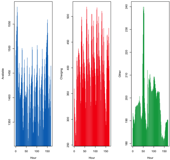
The image presents three time series charts, each displaying the fluctuation of a different resource category ("Available", "Charging", and "Other") over a period of 150 hours. Each chart shares the same x-axis ("Hour") but has a different y-axis scale representing the quantity of the respective resource.
### Components/Axes
* **X-Axis (Shared):** "Hour", ranging from 0 to 150.
* **Chart 1 (Left):**
* Y-Axis: "Available", ranging from 1350 to 1550.
* Data Series: Blue line representing the "Available" resource.
* **Chart 2 (Middle):**
* Y-Axis: "Charging", ranging from 250 to 500.
* Data Series: Red line representing the "Charging" resource.
* **Chart 3 (Right):**
* Y-Axis: "Other", ranging from 180 to 240.
* Data Series: Green line representing the "Other" resource.
### Detailed Analysis
**Chart 1: Available**
* **Trend:** The blue line shows a cyclical pattern with peaks and troughs. The "Available" resource fluctuates between approximately 1375 and 1575.
* **Data Points:**
* Minimum value: Approximately 1375.
* Maximum value: Approximately 1575.
* The peaks appear roughly every 10-12 hours.
**Chart 2: Charging**
* **Trend:** The red line also exhibits a cyclical pattern, with more pronounced peaks than the "Available" resource.
* **Data Points:**
* Minimum value: Approximately 250.
* Maximum value: Approximately 500.
* The peaks appear roughly every 10-12 hours, similar to the "Available" resource.
**Chart 3: Other**
* **Trend:** The green line shows a different pattern compared to the other two. It has a large spike around hour 75, followed by a gradual decline and some smaller fluctuations.
* **Data Points:**
* Minimum value: Approximately 185.
* Maximum value: Approximately 240.
* The spike around hour 75 reaches approximately 240.
### Key Observations
* The "Available" and "Charging" resources show a clear inverse relationship. When "Charging" is high, "Available" tends to be low, and vice versa.
* The "Other" resource has a unique pattern, with a significant spike around hour 75, suggesting a specific event or activity at that time.
* All three resources exhibit some level of cyclical behavior, potentially indicating daily or other periodic patterns.
### Interpretation
The charts likely represent the usage of resources in a system over time. The inverse relationship between "Available" and "Charging" suggests that when more resources are being used for "Charging," fewer are "Available." The "Other" resource category seems to represent a different type of activity, with a concentrated event around hour 75.
The cyclical patterns could be related to daily usage patterns, such as increased charging during certain times of the day. The spike in the "Other" resource could be due to a specific event, such as a system update or maintenance activity.
Further analysis would require more context about the specific resources being tracked and the system in which they are used.