## Time-Series Chart: System State Metrics Over 150 Hours
### Overview
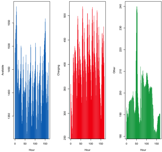
The image displays three separate, vertically oriented time-series plots arranged side-by-side. Each plot tracks a different metric over the same time period (0 to 150 hours) but on different y-axis scales. The plots are color-coded: blue for "Available," red for "Charging," and green for "Other." The data shows high-frequency fluctuations with distinct patterns for each metric.
### Components/Axes
* **Common X-Axis (All Plots):**
* **Label:** `Hour`
* **Scale:** Linear, from 0 to 150.
* **Major Tick Marks:** 0, 50, 100, 150.
* **Left Plot (Blue):**
* **Y-Axis Label:** `Available`
* **Y-Axis Scale:** Linear, ranging approximately from 1350 to 1550.
* **Major Tick Marks (approximate):** 1350, 1400, 1450, 1500, 1550.
* **Center Plot (Red):**
* **Y-Axis Label:** `Charging`
* **Y-Axis Scale:** Linear, ranging approximately from 250 to over 500.
* **Major Tick Marks (approximate):** 250, 300, 350, 400, 450, 500.
* **Right Plot (Green):**
* **Y-Axis Label:** `Other`
* **Y-Axis Scale:** Linear, ranging approximately from 180 to 240.
* **Major Tick Marks (approximate):** 180, 190, 200, 210, 220, 230, 240.
* **Legend/Color Key:** Implicit. The color of each plot line corresponds directly to its y-axis label: Blue = Available, Red = Charging, Green = Other.
### Detailed Analysis
* **"Available" (Blue Plot - Left):**
* **Trend:** The series exhibits a highly volatile, spiky pattern with no clear long-term upward or downward trend over the 150 hours. It oscillates rapidly between a baseline around 1350-1400 and frequent peaks reaching 1500-1550.
* **Data Points (Approximate):** The lowest values are near 1350. The highest peaks consistently approach or slightly exceed 1550. The density of spikes appears relatively uniform across the time range.
* **"Charging" (Red Plot - Center):**
* **Trend:** This series shows extremely dense, high-amplitude fluctuations. The overall envelope of the data suggests a possible slight increase in the average value and peak intensity from hour 0 to hour 150.
* **Data Points (Approximate):** The baseline appears to be around 250-300. The peaks frequently exceed 450, with the highest points reaching just above the 500 mark, particularly in the latter half of the timeline.
* **"Other" (Green Plot - Right):**
* **Trend:** This series has a distinctly different pattern. It starts low (~180-190), rises to a broad plateau between hours ~20-40, then experiences a very sharp, singular spike to its maximum value around hour 50. After this peak, it declines to a lower, volatile plateau before tapering off towards the end.
* **Data Points (Approximate):** The initial and final values are near 180-190. The broad plateau ranges from ~190 to 210. The singular peak at hour ~50 reaches approximately 240. The subsequent plateau ranges from ~200 to 210.
### Key Observations
1. **Scale Disparity:** The three metrics operate on vastly different scales. "Available" values are an order of magnitude higher than "Other," and "Charging" has the widest absolute range.
2. **Pattern Divergence:** "Available" and "Charging" show continuous, high-frequency noise. "Other" shows a more structured, event-driven pattern with a clear anomalous spike.
3. **Temporal Anomaly:** The most notable feature is the sharp, isolated peak in the "Other" metric at approximately hour 50, which is not mirrored in the other two plots.
4. **Correlation Lack:** There is no immediately obvious visual correlation between the spikes in the three plots. They appear to be driven by independent processes.
### Interpretation
This chart likely visualizes the state of a system (e.g., a fleet of devices, servers, or vehicles) over a week (150 hours ≈ 6.25 days). The metrics suggest:
* **"Available"** represents a count of units in a ready state. Its constant fluctuation indicates a dynamic system where units are frequently transitioning in and out of availability.
* **"Charging"** represents units actively drawing power. The high volatility and slight upward trend could indicate increasing usage or a charging cycle pattern that intensifies over time.
* **"Other"** represents units in an unspecified state (e.g., maintenance, transit, error). The pattern suggests a baseline level of "Other" activity, punctuated by a significant event around hour 50 that caused a large number of units to enter this state simultaneously. This could be a scheduled batch operation, a system-wide fault, or a data collection anomaly.
The lack of correlation between the plots implies that the factors driving units to become "Available," start "Charging," or enter "Other" states are largely independent. The hour-50 event in "Other" is critical for investigation, as it represents a major deviation from the system's normal operational noise.