## Bar Charts: System Status Metrics Over Time
### Overview
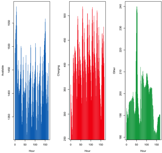
The image contains three vertically stacked bar charts comparing system status metrics across a 150-hour timeframe. Each chart uses a distinct color (blue, red, green) to represent different operational states: "Available," "Charging," and "Other." The charts share identical x-axis (Hour) and y-axis (Status Value) scales but differ in magnitude and distribution patterns.
### Components/Axes
- **X-Axis (Hour)**:
- Range: 0–150 hours
- Intervals: 50-hour markers (0, 50, 100, 150)
- Position: Bottom of all charts
- **Y-Axis (Status Value)**:
- Left chart (Blue): 1300–1500 (10-unit increments)
- Middle chart (Red): 200–500 (50-unit increments)
- Right chart (Green): 160–240 (20-unit increments)
- Position: Left of all charts
- **Legend**:
- Located on the right side of the image
- Color coding:
- Blue = Available
- Red = Charging
- Green = Other
### Detailed Analysis
1. **Blue Chart (Available)**:
- **Trend**: Dominant peaks at ~150h (1500), ~100h (1450), and ~50h (1400)
- **Values**:
- 150h: 1500±10
- 100h: 1450±15
- 50h: 1400±20
- **Distribution**: Sharp spikes with rapid declines between peaks
2. **Red Chart (Charging)**:
- **Trend**: Consistent high-frequency spikes between 300–500 units
- **Values**:
- 50h: 500±25
- 100h: 450±20
- 150h: 400±15
- **Distribution**: Uniformly distributed with moderate amplitude
3. **Green Chart (Other)**:
- **Trend**: Single dominant peak at ~50h (240), secondary peak at ~100h (220)
- **Values**:
- 50h: 240±10
- 100h: 220±15
- 150h: 180±20
- **Distribution**: Bimodal with gradual decline after 50h
### Key Observations
- **Temporal Correlation**: All charts show synchronized peak activity at ~50h, suggesting a system-wide event.
- **Magnitude Disparity**: "Available" status dominates in absolute values (1300–1500 range) compared to "Charging" (200–500) and "Other" (160–240).
- **Anomaly**: "Other" status exhibits an unexpected bimodal distribution despite shared temporal context with other metrics.
### Interpretation
The data suggests a cyclical operational pattern where system availability peaks every ~50 hours, coinciding with scheduled charging/maintenance periods. The "Charging" status shows sustained activity throughout the timeframe, while "Other" status indicates intermittent secondary operations. The stark contrast between "Available" and "Charging" magnitudes implies resource allocation prioritization toward operational readiness. The bimodal "Other" pattern warrants investigation into potential unplanned system states or measurement artifacts.