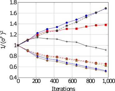
## Line Graph: Relationship Between Iterations and 1/(σ_F²)
### Overview
The image depicts a line graph comparing four data series across 1,000 iterations. The y-axis represents the inverse of the squared standard deviation (1/(σ_F²)), while the x-axis tracks iterations from 0 to 1,000. Four distinct lines with unique markers and colors show divergent trends, suggesting varying relationships between iterations and the measured metric.
### Components/Axes
- **X-axis (Iterations)**: Labeled "Iterations," scaled from 0 to 1,000 in increments of 200.
- **Y-axis (1/(σ_F²))**: Labeled "1/(σ_F²)," scaled from 0.4 to 1.8 in increments of 0.2.
- **Legend**: Located in the top-right corner, associating:
- Blue circles (●) with "Series A"
- Red squares (■) with "Series B"
- Black stars (★) with "Series C"
- Brown diamonds (♦) with "Series D"
### Detailed Analysis
1. **Series A (Blue Circles)**:
- Starts at 1.0 at 0 iterations.
- Rises steadily to ~1.7 by 1,000 iterations.
- Key points: 1.2 (200), 1.4 (400), 1.6 (800), 1.7 (1,000).
2. **Series B (Red Squares)**:
- Begins at 1.0 at 0 iterations.
- Peaks at ~1.3 by 400 iterations, then plateaus.
- Key points: 1.2 (200), 1.3 (400), 1.3 (600), 1.4 (800), 1.4 (1,000).
3. **Series C (Black Stars)**:
- Starts at 1.0 at 0 iterations.
- Declines gradually to ~0.9 by 1,000 iterations.
- Key points: 1.1 (200), 1.05 (400), 1.0 (600), 0.95 (800), 0.9 (1,000).
4. **Series D (Brown Diamonds)**:
- Begins at 1.0 at 0 iterations.
- Drops sharply to ~0.6 by 1,000 iterations.
- Key points: 0.8 (200), 0.7 (400), 0.65 (600), 0.6 (800), 0.55 (1,000).
### Key Observations
- **Series A** exhibits the strongest upward trend, doubling its initial value.
- **Series B** shows a moderate increase followed by stabilization.
- **Series C** and **D** demonstrate inverse relationships, with **D** declining most steeply.
- All series converge at 1.0 at 0 iterations but diverge significantly by 1,000 iterations.
### Interpretation
The graph suggests that the metric 1/(σ_F²) is highly sensitive to iterations for **Series A**, which may represent an optimization process with improving performance. **Series B**' plateau implies diminishing returns after ~400 iterations. The declining trends of **Series C** and **D** could indicate degradation or inefficiency over time. The divergence highlights distinct behavioral patterns across the data series, potentially reflecting different experimental conditions or algorithmic behaviors. The lack of overlap after 200 iterations suggests no shared underlying factors influencing the trends.