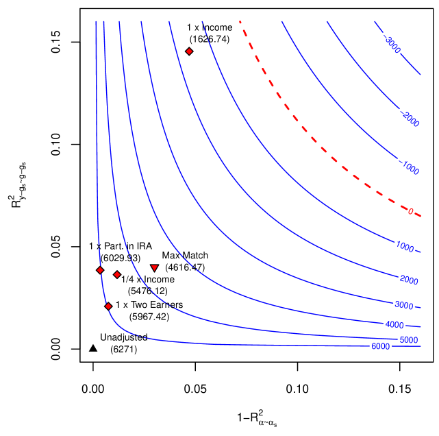
## Contour Plot: R² vs. 1-R² with Likelihood Contours
### Overview
The image presents a contour plot visualizing the relationship between two R-squared values (R²<sub>y-gs-qs</sub> and 1-R²<sub>α-as</sub>) and their corresponding likelihood values. The plot displays several data points representing different scenarios (e.g., "1 x Income", "1 x Part. in IRA") overlaid on the contour lines. A dashed red line indicates a likelihood of 0.
### Components/Axes
* **X-axis:** Labeled "1-R²<sub>α-as</sub>", ranging from approximately 0.00 to 0.15.
* **Y-axis:** Labeled "R²<sub>y-gs-qs</sub>", ranging from approximately 0.00 to 0.15.
* **Contour Lines:** Represent different likelihood values, labeled with numerical values ranging from -3000 to 6000, increasing from left to right. The contour lines are curved, indicating a non-linear relationship between the two R-squared values and the likelihood.
* **Data Points:** Represent specific scenarios, each labeled with a descriptive name and a numerical value in parentheses. The points are marked with different symbols (diamonds, triangles).
* **Zero Likelihood Contour:** A dashed red line representing a likelihood of 0.
### Detailed Analysis
The plot shows the following data points:
* **Unadjusted:** Located at approximately (0.00, 0.00), marked with a black triangle, value: 6271.
* **1 x Two Earners:** Located at approximately (0.01, 0.02), marked with a red diamond, value: 5967.42.
* **1/4 x Income:** Located at approximately (0.02, 0.04), marked with a red diamond, value: 5476.12.
* **1 x Part. in IRA:** Located at approximately (0.02, 0.05), marked with a red diamond, value: 6029.93.
* **Max Match:** Located at approximately (0.06, 0.03), marked with a red triangle, value: 4616.47.
* **1 x Income:** Located at approximately (0.03, 0.12), marked with a red diamond, value: 1626.74.
The contour lines are densely packed in the bottom-left corner of the plot (near the origin), indicating a higher likelihood in that region. As you move towards the top-right corner, the contour lines become more sparse, indicating a lower likelihood. The dashed red line (likelihood = 0) cuts across the plot, separating regions of positive and negative likelihood.
### Key Observations
* The "Unadjusted" scenario has the highest likelihood value among the plotted points.
* The "1 x Income" scenario has the lowest likelihood value.
* The likelihood generally decreases as both R²<sub>y-gs-qs</sub> and 1-R²<sub>α-as</sub> increase.
* The contour lines are not perfectly symmetrical, suggesting a complex relationship between the two R-squared values and the likelihood.
### Interpretation
This plot likely represents a statistical model comparison, where R²<sub>y-gs-qs</sub> and 1-R²<sub>α-as</sub> are measures of model fit for different scenarios. The likelihood contours indicate how well each scenario explains the observed data. A higher likelihood suggests a better fit.
The fact that the "Unadjusted" scenario has the highest likelihood suggests that, in this context, a simpler model without adjustments performs best. The "1 x Income" scenario, with its low likelihood, indicates that incorporating income information into the model may not improve its predictive power.
The dashed red line (likelihood = 0) represents the boundary between scenarios that are statistically supported by the data and those that are not. Scenarios above the line have a positive likelihood, while those below have a negative likelihood.
The non-symmetrical shape of the contour lines suggests that the relationship between the two R-squared values and the likelihood is not linear and may be influenced by other factors not explicitly shown in the plot. The plot is a visualization of a likelihood surface, allowing for a comparison of different model specifications based on their statistical support.