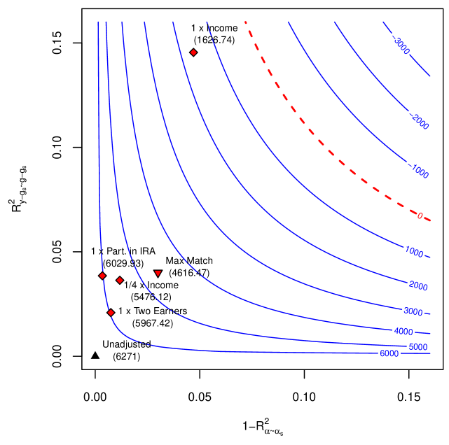
## Contour Plot: Trade-off Between Two R² Measures with Scenario Data Points
### Overview
This image is a technical contour plot illustrating the relationship between two statistical measures, likely related to model fit or explanatory power. The plot features blue contour lines representing a third variable (with values ranging from -3000 to 6000) and a dashed red line at the zero contour. Several labeled data points (scenarios) are overlaid, each with a shape, color, and a numerical value in parentheses. The chart appears to analyze trade-offs in a financial or econometric context, given labels like "Income" and "IRA."
### Components/Axes
* **X-Axis:** Labeled `1 - R²_{α~α_s}`. The scale runs from 0.00 to 0.15, with major tick marks at 0.00, 0.05, 0.10, and 0.15.
* **Y-Axis:** Labeled `R²_{y~g_a, g_s}`. The scale runs from 0.00 to 0.15, with major tick marks at 0.00, 0.05, 0.10, and 0.15.
* **Contour Lines:** A series of solid blue curves representing constant values of a third variable. The labeled values, from top-right to bottom-left, are: `-3000`, `-2000`, `-1000`, `0` (dashed red line), `1000`, `2000`, `3000`, `4000`, `5000`, `6000`.
* **Data Points (Scenarios):** Six distinct markers are plotted, each with a text label and a numerical value in parentheses.
1. **Marker:** Red diamond. **Label:** `1 x Income`. **Value:** `(1626.74)`. **Position:** Upper-center of the plot, near the `y=0.15` line and `x=0.05`.
2. **Marker:** Red diamond. **Label:** `1 x Part. in IRA`. **Value:** `(6029.53)`. **Position:** Left side, near `y=0.04` and `x=0.00`.
3. **Marker:** Red diamond. **Label:** `1/4 x Income`. **Value:** `(5476.12)`. **Position:** Left-center, near `y=0.035` and `x=0.01`.
4. **Marker:** Red inverted triangle. **Label:** `Max Match`. **Value:** `(4616.47)`. **Position:** Center-left, near `y=0.04` and `x=0.03`.
5. **Marker:** Red diamond. **Label:** `1 x Two Earners`. **Value:** `(5967.42)`. **Position:** Lower-left, near `y=0.02` and `x=0.01`.
6. **Marker:** Black triangle (pointing up). **Label:** `Unadjusted`. **Value:** `(6271)`. **Position:** Bottom-left corner, at the origin `(0.00, 0.00)`.
### Detailed Analysis
* **Contour Gradient:** The blue contour lines show a clear gradient. Values increase (become more positive) as one moves from the top-right corner of the plot towards the bottom-left corner. The lines are closer together in the top-right, indicating a steeper gradient in that region.
* **Zero Contour:** The dashed red line labeled `0` runs diagonally from the top-center to the middle-right edge, separating negative contour values (top-right) from positive ones (bottom-left).
* **Data Point Distribution:** The six data points are not evenly distributed. Five are clustered in the lower-left quadrant (x < 0.05, y < 0.05), while the "1 x Income" point is an outlier, positioned much higher on the y-axis.
* **Value vs. Position Relationship:** There is an observable inverse relationship between the y-axis value (`R²_{y~g_a, g_s}`) and the numerical value in parentheses for the clustered points. The point with the highest y-value in the cluster ("1 x Part. in IRA" at ~y=0.04) has a value of 6029.53, while the point with the lowest y-value ("Unadjusted" at y=0.00) has the highest value of 6271. The outlier "1 x Income" has the lowest value (1626.74) and the highest y-position.
### Key Observations
1. **The "Unadjusted" Baseline:** The "Unadjusted" point sits at the origin (0,0) and has the highest associated value (6271). This suggests it may represent a baseline or reference scenario with maximum "value" but zero on both plotted R²-derived axes.
2. **The "Income" Outlier:** The "1 x Income" scenario is visually and numerically distinct. It has a high `R²_{y~g_a, g_s}` (~0.14) but the lowest associated value (1626.74), placing it near the negative contour lines.
3. **Clustering of Adjusted Scenarios:** The other five scenarios ("Part. in IRA", "1/4 x Income", "Max Match", "Two Earners") are grouped closely together in the region of low `1 - R²_{α~α_s}` and low-to-moderate `R²_{y~g_a, g_s}`. Their associated values range from 4616.47 to 6029.53.
4. **Contour Interpretation:** The contours likely represent a utility, cost, or net benefit function. Moving towards the bottom-left (higher contour values) appears desirable if the goal is to maximize the contoured variable.
### Interpretation
This chart visualizes a multi-dimensional optimization problem. The two axes represent different measures of model fit or explanatory power (`R²` variants). The contour lines map out combinations of these two measures that yield equal levels of a third, outcome-related metric (e.g., financial return, policy effectiveness).
The data points represent different policy or behavioral scenarios. The analysis suggests a trade-off: scenarios that achieve a higher `R²_{y~g_a, g_s}` (like "1 x Income") are associated with a much lower outcome value (1626.74). Conversely, scenarios with lower values on both axes, particularly the "Unadjusted" baseline, are associated with the highest outcome value (6271).
The "Max Match" scenario (inverted triangle) sits in the middle of the clustered group, potentially representing a balanced or optimized point among the adjusted options. The chart implies that adjustments (like participating in an IRA or having two earners) move the system away from the "Unadjusted" origin, trading off some of the outcome value (as seen in the lower numbers in parentheses) for changes in the underlying R² metrics. The dashed red zero-contour may represent a critical threshold where the nature of the trade-off changes.