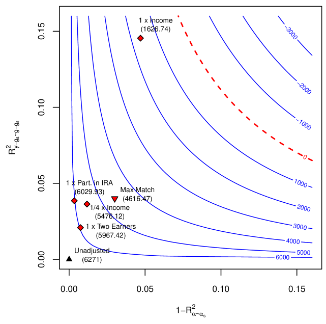
## Scatter Plot: Relationship Between Adjusted and Unadjusted R² Values
### Overview
The image is a scatter plot visualizing the relationship between two statistical metrics: **R²_Y_α_α_p** (adjusted R²) and **1-R²_α-α_s** (1 minus unadjusted R²). The plot includes labeled data points, contour lines, and a legend. The x-axis represents **1-R²_α-α_s** (unadjusted R²), while the y-axis represents **R²_Y_α_α_p** (adjusted R²). The plot uses color-coded lines and markers to distinguish between different scenarios and thresholds.
---
### Components/Axes
- **X-axis**: Labeled **"1-R²_α-α_s"** (1 minus unadjusted R²), ranging from **0.00** to **0.15**.
- **Y-axis**: Labeled **"R²_Y_α_α_p"** (adjusted R²), ranging from **0.00** to **0.15**.
- **Legend**:
- **Red dashed line**: Labeled **"0"**.
- **Blue solid lines**: Labeled **"1000, 2000, 3000, 4000, 5000, 6000"**.
- **Black triangle**: Labeled **"Unadjusted"**.
- **Data Points**: Labeled with scenarios (e.g., "1x Income", "1/4 x Income") and numerical values in parentheses.
---
### Detailed Analysis
#### Axes and Scales
- The x-axis (**1-R²_α-α_s**) increases from left to right, indicating decreasing unadjusted R² values.
- The y-axis (**R²_Y_α_α_p**) increases from bottom to top, indicating higher adjusted R² values.
- The red dashed line (labeled "0") runs diagonally from the bottom-left to the top-right, suggesting a baseline or threshold.
#### Contour Lines
- Blue solid lines represent contour levels for **R²_Y_α_α_p** values: **1000, 2000, 3000, 4000, 5000, 6000**.
- These lines curve upward, indicating that higher adjusted R² values correspond to lower **1-R²_α-α_s** (i.e., better model performance).
#### Data Points
- **Unadjusted** (black triangle): Positioned at **(0.00, 0.00)**, representing the lowest adjusted R².
- **1x Income** (red diamond): At **(0.05, 0.10)**, with a value of **(1626.74)**.
- **1/4 x Income** (red diamond): At **(0.03, 0.08)**, with a value of **(6029.93)**.
- **Max Match** (red diamond): At **(0.04, 0.09)**, with a value of **(4616.47)**.
- **1/4 x Two Earners** (red diamond): At **(0.02, 0.07)**, with a value of **(5478.12)**.
- **1x Two Earners** (red diamond): At **(0.03, 0.09)**, with a value of **(5967.42)**.
---
### Key Observations
1. **Red Dashed Line ("0")**: Acts as a reference line, possibly indicating a threshold where adjusted R² equals unadjusted R².
2. **Blue Contour Lines**: Higher values (e.g., 6000) are concentrated in the lower-left region, suggesting that scenarios with lower **1-R²_α-α_s** (higher unadjusted R²) achieve higher adjusted R².
3. **Data Point Distribution**:
- **1x Income** and **Max Match** are near the **1626.74** and **4616.47** contour lines, respectively.
- **1/4 x Income** and **1/4 x Two Earners** are closer to the **6000** contour line, indicating better performance.
- **Unadjusted** is at the origin, showing no adjustment.
---
### Interpretation
The plot demonstrates how different income scenarios affect the trade-off between unadjusted and adjusted R² values. Key insights:
- **Adjustments improve performance**: Scenarios like **1/4 x Income** and **1/4 x Two Earners** achieve higher adjusted R² (closer to the **6000** contour) compared to unadjusted models.
- **Threshold behavior**: The red dashed line ("0") may represent a critical boundary where adjustments no longer improve performance.
- **Outliers**: The **Unadjusted** point at the origin highlights the baseline performance without adjustments.
- **Income impact**: Higher income scenarios (e.g., **1x Income**) show moderate improvements, while lower-income scenarios (e.g., **1/4 x Income**) achieve better adjusted R², possibly due to more conservative adjustments.
This visualization underscores the importance of model adjustments in optimizing statistical performance, with specific scenarios yielding distinct trade-offs between unadjusted and adjusted metrics.