## Scatter Plots: G1 vs. G2
### Overview
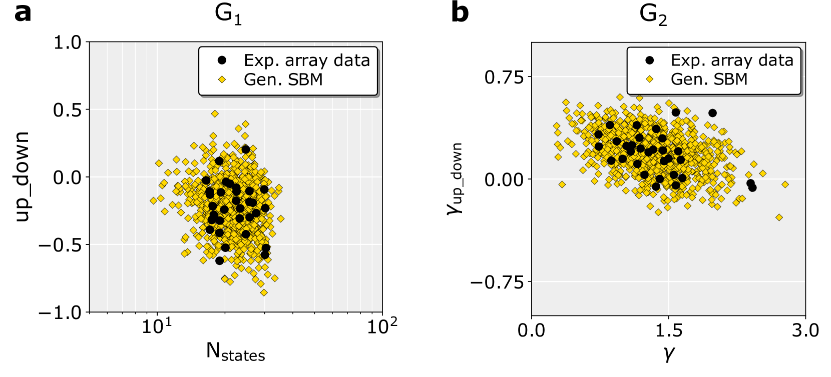
The image contains two scatter plots, labeled 'a' and 'b', displaying the relationship between different variables. Plot 'a' (G1) shows "up_down" against "N_states" (logarithmic scale), while plot 'b' (G2) shows "Y_up_down" against "Y". Each plot contains two data series: "Exp. array data" (black circles) and "Gen. SBM" (yellow diamonds).
### Components/Axes
**Plot a (G1):**
* **Title:** G1 (top-center)
* **X-axis:** N_states (bottom). Logarithmic scale from approximately 10^1 to 10^2.
* **Y-axis:** up_down (left). Linear scale from -1.0 to 1.0, with tick marks at -0.5, 0.0, and 0.5.
* **Legend:** Located in the top-right corner.
* Black circle: Exp. array data
* Yellow diamond: Gen. SBM
**Plot b (G2):**
* **Title:** G2 (top-center)
* **X-axis:** Y (bottom). Linear scale from 0.0 to 3.0, with a tick mark at 1.5.
* **Y-axis:** Y_up_down (left). Linear scale from -0.75 to 0.75, with a tick mark at 0.0.
* **Legend:** Located in the top-right corner.
* Black circle: Exp. array data
* Yellow diamond: Gen. SBM
### Detailed Analysis
**Plot a (G1):**
* **Exp. array data (black circles):** The data points are clustered around the center of the plot. The majority of the points are between N_states values of 10 and 20, and up_down values of -0.5 and 0.5.
* **Gen. SBM (yellow diamonds):** The data points are more spread out than the "Exp. array data". They form a cloud around the "Exp. array data", with some points extending to the edges of the plot.
**Plot b (G2):**
* **Exp. array data (black circles):** The data points are clustered around the center of the plot. The majority of the points are between Y values of 1.0 and 2.0, and Y_up_down values of 0.0 and 0.5.
* **Gen. SBM (yellow diamonds):** The data points are more spread out than the "Exp. array data". They form a cloud around the "Exp. array data", with some points extending to the edges of the plot. The data appears to have a slight negative correlation.
### Key Observations
* Both plots show a clustering of "Exp. array data" in the center, with "Gen. SBM" data points more dispersed around them.
* Plot 'a' has a logarithmic x-axis, while plot 'b' has a linear x-axis.
* Plot 'b' shows a slight negative correlation between Y and Y_up_down for the "Gen. SBM" data.
### Interpretation
The plots compare experimental array data with data generated using a Stochastic Block Model (SBM). The clustering of experimental data suggests a more constrained relationship between the variables, while the broader distribution of the generated data indicates a less constrained or more variable relationship. The negative correlation in plot 'b' for the generated data might indicate an inverse relationship between the variables in the model. The plots suggest that the SBM model captures some aspects of the experimental data but also introduces more variability.