## Scatter Plots: G1 and G2
### Overview
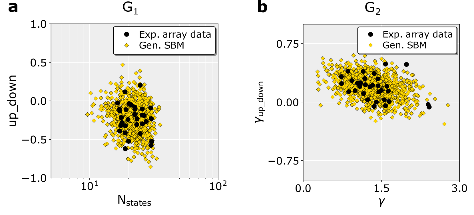
The image presents two scatter plots, labeled G1 and G2, comparing "Exp. array data" (Experimental array data) and "Gen. SBM" (Generated Stochastic Block Model) data. Both plots visualize the relationship between two variables, with the experimental data represented by black circles and the generated data by yellow diamonds.
### Components/Axes
**Plot G1:**
* **Title:** G1 (top-left)
* **X-axis:** Nstates (logarithmic scale from approximately 8 to 100)
* **Y-axis:** up\_down (scale from -1.0 to 1.0)
* **Legend:** Located in the top-right corner.
* Black circles: Exp. array data
* Yellow diamonds: Gen. SBM
**Plot G2:**
* **Title:** G2 (top-left)
* **X-axis:** γ (scale from 0.0 to 3.0)
* **Y-axis:** γup\_down (scale from -0.75 to 0.75)
* **Legend:** Located in the top-right corner.
* Black circles: Exp. array data
* Yellow diamonds: Gen. SBM
### Detailed Analysis or Content Details
**Plot G1:**
The black circles (Exp. array data) are clustered in a relatively tight group around Nstates ≈ 20-40, with up\_down values ranging from approximately -0.6 to 0.2. The yellow diamonds (Gen. SBM) are more dispersed, covering a wider range of Nstates (8 to 100) and up\_down values (-0.8 to 0.6). The Gen. SBM data appears to have a slight upward trend as Nstates increases.
* **Approximate Data Points (Exp. array data):**
* (10, -0.2)
* (20, 0.0)
* (30, 0.1)
* (40, -0.1)
* (50, -0.3)
* **Approximate Data Points (Gen. SBM):**
* (10, 0.4)
* (20, 0.2)
* (30, -0.1)
* (40, -0.3)
* (50, -0.5)
* (80, 0.3)
* (100, 0.6)
**Plot G2:**
The black circles (Exp. array data) are concentrated around γ ≈ 1.5, with γup\_down values ranging from approximately -0.3 to 0.3. The yellow diamonds (Gen. SBM) are also somewhat clustered around γ ≈ 1.5, but are more spread out, with γup\_down values ranging from approximately -0.7 to 0.6. The Gen. SBM data shows a slight positive correlation between γ and γup\_down.
* **Approximate Data Points (Exp. array data):**
* (0.5, 0.1)
* (1.0, -0.1)
* (1.5, 0.0)
* (2.0, -0.2)
* (2.5, 0.2)
* **Approximate Data Points (Gen. SBM):**
* (0.5, -0.5)
* (1.0, 0.2)
* (1.5, 0.4)
* (2.0, 0.1)
* (2.5, -0.3)
* (3.0, 0.6)
### Key Observations
* In both plots, the experimental data (black circles) is more tightly clustered than the generated data (yellow diamonds).
* In G1, the generated data shows a slight upward trend with increasing Nstates.
* In G2, both datasets appear centered around γ = 1.5, but the generated data has a wider spread.
* The scales of the axes are different between the two plots.
### Interpretation
These plots likely represent a validation of a stochastic block model (SBM) against experimental data. The SBM is a statistical model used to represent networks with community structure. The plots compare the distribution of certain network properties (up\_down and γup\_down) in the experimental data to those generated by the SBM.
The tighter clustering of the experimental data suggests that the real-world network has more constrained properties than the SBM allows for. The differences in distribution between the experimental and generated data indicate that the SBM may not perfectly capture the characteristics of the real-world network. The trends observed in the generated data (e.g., the upward trend in G1) could be artifacts of the model or reflect underlying relationships in the data that are not fully understood. The fact that the generated data covers a wider range of values suggests that the SBM is capable of producing a variety of network structures, but may not be accurately reflecting the specific structure of the experimental data. Further analysis would be needed to determine the extent to which the SBM is a valid representation of the real-world network.