\n
## Scatter Plot: Dimensionality Reduction Visualization
### Overview
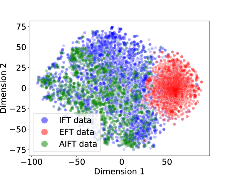
This image presents a scatter plot visualizing data points reduced to two dimensions (Dimension 1 and Dimension 2). The data is categorized into four groups: IFT data, EFT data, AIFT data, and another instance of IFT data. The plot appears to demonstrate clustering of these data types in the two-dimensional space.
### Components/Axes
* **X-axis:** Dimension 1, ranging approximately from -100 to 60.
* **Y-axis:** Dimension 2, ranging approximately from -75 to 75.
* **Legend:** Located in the bottom-left corner, identifying the four data categories with corresponding colors:
* IFT data (Blue)
* EFT data (Red)
* AIFT data (Green)
* IFT data (Light Blue - slightly desaturated)
### Detailed Analysis
The plot shows four distinct clusters of data points.
* **Blue IFT Data:** This cluster is located in the upper-left quadrant, centered around Dimension 1 ≈ -25 and Dimension 2 ≈ 35. The points are densely packed.
* **Red EFT Data:** This cluster is located in the upper-right quadrant, centered around Dimension 1 ≈ 40 and Dimension 2 ≈ 10. The points are also densely packed.
* **Green AIFT Data:** This cluster is located in the lower-left quadrant, centered around Dimension 1 ≈ -20 and Dimension 2 ≈ -20. The points are densely packed.
* **Light Blue IFT Data:** This cluster is located in the lower-center quadrant, centered around Dimension 1 ≈ 0 and Dimension 2 ≈ -40. The points are densely packed.
There is some overlap between the green AIFT data and the light blue IFT data, particularly in the region where Dimension 1 is close to 0 and Dimension 2 is negative. The blue IFT data and red EFT data appear to be well-separated.
### Key Observations
* The data clearly separates into four distinct groups based on the two dimensions.
* The IFT data appears in two distinct clusters, suggesting potential sub-groupings within this category.
* The EFT and AIFT data are relatively well-separated from each other and from the IFT data.
* The distribution of points within each cluster appears relatively uniform.
### Interpretation
This scatter plot likely represents the result of a dimensionality reduction technique (e.g., PCA, t-SNE, UMAP) applied to a higher-dimensional dataset. The goal of dimensionality reduction is to represent the data in a lower-dimensional space while preserving as much of the original variance as possible.
The clear separation of the four data categories (IFT, EFT, AIFT) suggests that these categories are distinguishable based on the features used to generate the original high-dimensional data. The presence of two IFT clusters indicates that there may be two sub-types or variations within the IFT category.
The plot could be used to visualize the relationships between different data types and to identify potential outliers or anomalies. The fact that the data clusters well suggests that the dimensionality reduction technique was successful in capturing the underlying structure of the data. Further investigation would be needed to understand the specific features that contribute to the separation of these categories.