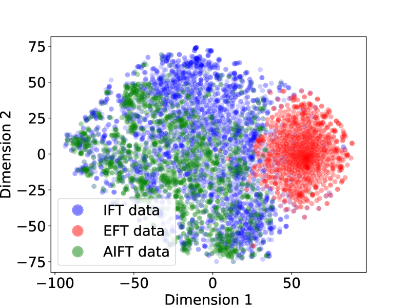
## Scatter Plot: Dimensional Analysis of IFT, EFT, and AIFT Data
### Overview
The image is a 2D scatter plot visualizing three distinct datasets projected onto two dimensions. The plot reveals clear spatial clustering and separation between the datasets, suggesting they occupy different regions in this feature space. The data points are semi-transparent, allowing density to be inferred from color saturation.
### Components/Axes
* **Chart Type:** Scatter Plot
* **X-Axis:** Labeled "Dimension 1". The scale runs from approximately -100 to +75, with major tick marks at -100, -50, 0, and 50.
* **Y-Axis:** Labeled "Dimension 2". The scale runs from approximately -75 to +75, with major tick marks at -75, -50, -25, 0, 25, 50, and 75.
* **Legend:** Located in the bottom-left quadrant of the plot area. It contains three entries:
* A blue circle labeled "IFT data"
* A red circle labeled "EFT data"
* A green circle labeled "AIFT data"
### Detailed Analysis
**Data Series and Spatial Distribution:**
1. **IFT data (Blue Points):**
* **Trend/Placement:** This series forms a broad, dispersed cloud primarily occupying the left and central regions of the plot.
* **Spatial Range:** Spans Dimension 1 from approximately -90 to +40 and Dimension 2 from approximately -70 to +70.
* **Density:** Points are moderately dense, with higher concentration in the central area around (Dimension 1: -20, Dimension 2: 0). The cloud has an irregular, somewhat amorphous shape.
2. **EFT data (Red Points):**
* **Trend/Placement:** This series forms a very dense, compact, and roughly circular cluster located in the right portion of the plot.
* **Spatial Range:** Concentrated within Dimension 1 from approximately +20 to +80 and Dimension 2 from approximately -40 to +40. The core of the cluster appears centered near (Dimension 1: +50, Dimension 2: 0).
* **Density:** Extremely high density, indicated by the deep, saturated red color at the cluster's core. This suggests a high degree of similarity or low variance among these data points in this 2D projection.
3. **AIFT data (Green Points):**
* **Trend/Placement:** This series forms a distinct cluster primarily on the left side of the plot, overlapping significantly with the lower-left portion of the IFT (blue) cloud.
* **Spatial Range:** Spans Dimension 1 from approximately -90 to +10 and Dimension 2 from approximately -75 to +25.
* **Density:** Moderately dense, with a concentration in the region around (Dimension 1: -50, Dimension 2: -25). It appears less dispersed than the IFT data but more spread out than the EFT data.
**Inter-Series Relationships:**
* There is a clear and significant separation between the **EFT (red)** cluster and the other two datasets along Dimension 1. The EFT data occupies a distinct region with minimal overlap.
* The **IFT (blue)** and **AIFT (green)** datasets show substantial overlap, particularly in the region where Dimension 1 is between -90 and 0. However, the AIFT cluster appears more concentrated in the lower-left quadrant, while the IFT data extends further upwards and to the right.
### Key Observations
1. **Distinct Clustering:** The most prominent feature is the tight, isolated cluster of EFT data, indicating it is fundamentally different from IFT and AIFT data in this representation.
2. **Overlap and Proximity:** The significant overlap between IFT and AIFT data suggests these two datasets share more common characteristics or are derived from more similar processes compared to EFT data.
3. **Density Gradient:** The EFT cluster exhibits a strong density gradient, being extremely dense at its center and becoming sparser at its edges. The IFT and AIFT clouds have more uniform, lower densities.
4. **Axis Dominance:** The primary separation between the three groups occurs along **Dimension 1**. Dimension 2 shows more overlap, especially between IFT and EFT data in the vertical range of -25 to +25.
### Interpretation
This scatter plot likely represents the output of a dimensionality reduction technique (like t-SNE or PCA) applied to high-dimensional data from three different sources or methods: IFT, EFT, and AIFT.
* **What the data suggests:** The visualization strongly implies that the **EFT data** represents a distinct, homogeneous class or state. In contrast, **IFT and AIFT data** appear to be related, possibly representing variations of a similar underlying phenomenon or data from a related but noisier process. The AIFT data might be a subset or a refined version of the IFT data, given its more concentrated location within the IFT cloud's domain.
* **How elements relate:** The spatial arrangement acts as a similarity map. Points close together are similar in the original high-dimensional space. The clear isolation of the red cluster means EFT samples are consistently different from the others. The blue-green overlap means samples from IFT and AIFT are often similar to each other.
* **Notable anomalies/outliers:** There are no extreme outliers far from their respective main clusters. All data points belong clearly to one of the three regional groupings. The most notable "anomaly" is the stark separation of the EFT group itself.
* **Underlying meaning:** In a technical context (e.g., machine learning, signal processing, or experimental data analysis), this plot would be used to argue that the EFT method or dataset captures a unique signal or property not present in IFT/AIFT. Conversely, it would suggest IFT and AIFT are capturing related information. The effectiveness of the dimensionality reduction in separating these classes is high for EFT but moderate for distinguishing IFT from AIFT.