## Density Plot: General Text vs. Medical Text
### Overview
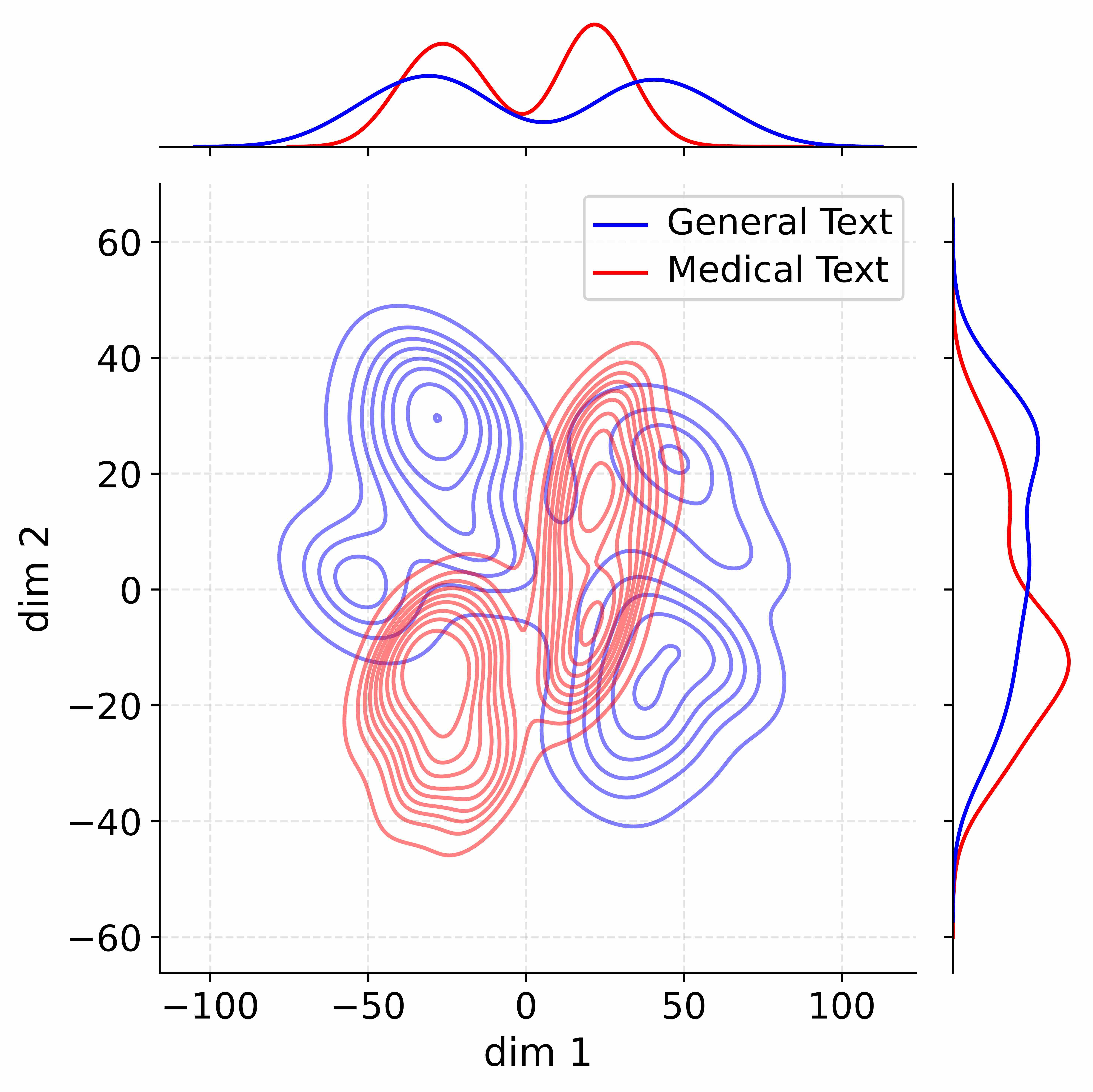
The image is a density plot comparing "General Text" and "Medical Text" across two dimensions, labeled "dim 1" and "dim 2". The plot includes density contours for both categories, along with marginal density plots along the top and right axes.
### Components/Axes
* **Main Plot:**
* X-axis: "dim 1", ranging from -100 to 100, with tick marks at -100, -50, 0, 50, and 100.
* Y-axis: "dim 2", ranging from -60 to 60, with tick marks at -60, -40, -20, 0, 20, 40, and 60.
* Gridlines: Light gray dashed lines.
* Contours:
* Blue contours represent "General Text".
* Red contours represent "Medical Text".
* **Top Marginal Plot:**
* X-axis: Aligned with the main plot's "dim 1" axis.
* Y-axis: Density.
* Curves:
* Blue curve represents the marginal density of "General Text" along "dim 1".
* Red curve represents the marginal density of "Medical Text" along "dim 1".
* **Right Marginal Plot:**
* Y-axis: Aligned with the main plot's "dim 2" axis.
* X-axis: Density.
* Curves:
* Blue curve represents the marginal density of "General Text" along "dim 2".
* Red curve represents the marginal density of "Medical Text" along "dim 2".
* **Legend:** Located in the top-right corner.
* "General Text" - Blue line.
* "Medical Text" - Red line.
### Detailed Analysis or Content Details
* **General Text (Blue):**
* Main Plot: The blue contours show two main clusters. One is centered around dim1 = -50 and dim2 = 20, and the other is centered around dim1 = 50 and dim2 = 0.
* Top Marginal Plot: The blue curve shows two peaks, one around dim1 = -50 and another around dim1 = 50.
* Right Marginal Plot: The blue curve shows a peak around dim2 = 20.
* **Medical Text (Red):**
* Main Plot: The red contours show one main cluster centered around dim1 = 0 and dim2 = -20, and another smaller cluster around dim1 = 30 and dim2 = 30.
* Top Marginal Plot: The red curve shows two peaks, one around dim1 = 0 and another around dim1 = 30.
* Right Marginal Plot: The red curve shows a peak around dim2 = -20.
### Key Observations
* The "General Text" distribution has two distinct clusters, while the "Medical Text" distribution has a more concentrated cluster.
* The marginal distributions confirm the clustering observed in the main plot.
* There is some overlap between the "General Text" and "Medical Text" distributions, but they are largely distinct.
### Interpretation
The density plot visualizes the distribution of "General Text" and "Medical Text" across two dimensions. The separation of the clusters suggests that "dim 1" and "dim 2" are able to differentiate between the two types of text. The "General Text" distribution is more spread out, indicating greater variability, while the "Medical Text" distribution is more concentrated, suggesting more consistency. The marginal distributions provide further insight into the distribution of each text type along each individual dimension.