## Contour Plot: Dimensionality Reduction of Text Data
### Overview
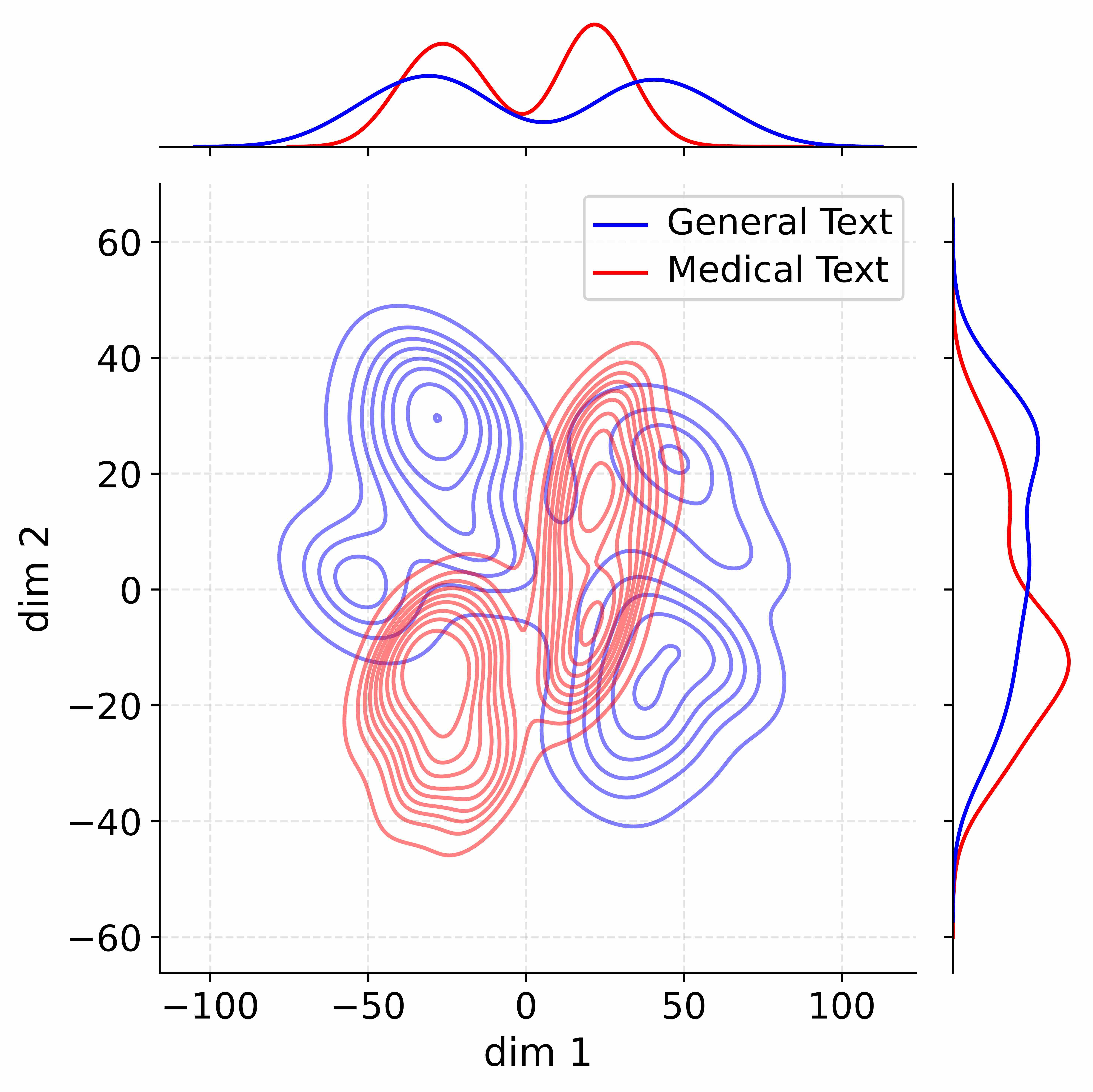
This image presents a 2D contour plot visualizing the distribution of two text categories – "General Text" and "Medical Text" – after dimensionality reduction. The plot shows density contours representing the concentration of data points in the reduced dimensional space. Marginal distributions (histograms) are displayed along the top and right edges, showing the distribution of each category along each dimension.
### Components/Axes
* **X-axis:** Labeled "dim 1", ranging approximately from -110 to 110.
* **Y-axis:** Labeled "dim 2", ranging approximately from -60 to 60.
* **Contour Lines:** Represent density levels for both "General Text" (blue) and "Medical Text" (red).
* **Legend:** Located in the top-right corner, associating blue with "General Text" and red with "Medical Text".
* **Top Histogram:** Shows the distribution of data points along the x-axis ("dim 1") for both categories. The red histogram (Medical Text) is centered around a value of approximately 70, with a peak around 80, and declines towards -100. The blue histogram (General Text) is centered around a value of approximately -30, with a peak around -20, and declines towards 100.
* **Right Histogram:** Shows the distribution of data points along the y-axis ("dim 2") for both categories. The red histogram (Medical Text) is centered around a value of approximately -10, with a peak around 0, and declines towards 40. The blue histogram (General Text) is centered around a value of approximately 20, with a peak around 30, and declines towards -50.
### Detailed Analysis
The contour plot reveals distinct clustering patterns for the two text categories.
* **General Text (Blue):** The density contours for "General Text" form two primary clusters. One cluster is centered around (-40, 30) and the other around (40, 20). The contours are relatively elongated and overlapping in the central region.
* **Medical Text (Red):** The density contours for "Medical Text" also form two primary clusters. One cluster is centered around (-30, -20) and the other around (20, -10). The contours are more compact and less overlapping than those of "General Text".
* **Overlap:** There is a significant region of overlap between the contours of the two categories, particularly around the origin (0,0). This suggests some ambiguity in distinguishing between the two types of text based on these dimensions.
* **Histogram Analysis:** The histograms confirm the separation of the two categories along each dimension. The "Medical Text" histogram along "dim 1" is heavily skewed towards positive values, while the "General Text" histogram is skewed towards negative values. Along "dim 2", the "Medical Text" histogram is centered around slightly negative values, while the "General Text" histogram is centered around positive values.
### Key Observations
* The two text categories exhibit a clear separation in the reduced dimensional space, but with some overlap.
* The "Medical Text" category tends to occupy a region with higher values of "dim 1" and lower values of "dim 2".
* The "General Text" category tends to occupy a region with lower values of "dim 1" and higher values of "dim 2".
* The marginal distributions (histograms) provide further evidence of the separation between the two categories along each dimension.
### Interpretation
This plot likely represents the results of a dimensionality reduction technique (e.g., PCA, t-SNE) applied to a dataset of text documents. The goal is to visualize the inherent structure of the data and to see how well the two categories ("General Text" and "Medical Text") can be separated based on their features.
The separation observed in the plot suggests that the features used to represent the text documents (e.g., word frequencies, TF-IDF scores) are able to capture some of the differences between the two categories. However, the overlap between the contours indicates that the separation is not perfect, and that some documents may be difficult to classify.
The histograms provide additional insights into the distribution of the data along each dimension. The skewed distributions suggest that certain features may be more important for distinguishing between the two categories than others.
The fact that the plot shows two clusters within each category suggests that there may be sub-categories or variations within each type of text. Further analysis would be needed to investigate these sub-categories.