## Bar Chart: Task 08ed6ac7
### Overview
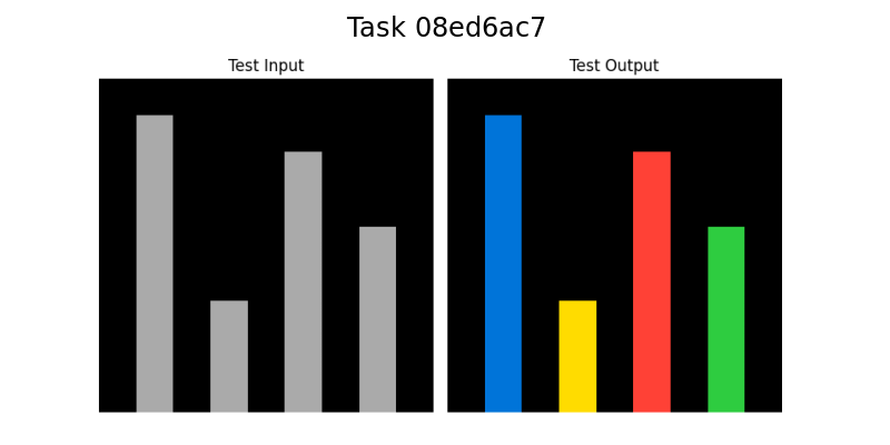
The image contains two adjacent bar charts labeled "Test Input" (left) and "Test Output" (right), both with black backgrounds. Each chart has four bars of varying heights, with distinct color coding in the "Test Output" chart.
### Components/Axes
- **Titles**:
- Left chart: "Test Input"
- Right chart: "Test Output"
- **X-Axis**:
- No explicit labels for categories; four bars per chart, ordered left to right.
- "Test Input" bars are uniformly gray.
- "Test Output" bars use distinct colors: blue (1st), yellow (2nd), red (3rd), green (4th).
- **Y-Axis**:
- Scale from 0 to 100 (approximate).
- No gridlines or tick marks visible.
- **Legend**:
- No explicit legend present. Color assignments inferred from bar order and labels.
### Detailed Analysis
#### Test Input (Left Chart)
- **Bar Heights (approximate)**:
1. Tallest bar: ~90
2. Shortest bar: ~30
3. Medium bar: ~80
4. Medium bar: ~60
- **Trend**:
- Bimodal distribution: Two taller bars (1st and 3rd) and two shorter bars (2nd and 4th).
#### Test Output (Right Chart)
- **Bar Heights (approximate)**:
1. Tallest bar: ~85 (blue)
2. Shortest bar: ~25 (yellow)
3. Medium bar: ~75 (red)
4. Medium bar: ~55 (green)
- **Trend**:
- Similar bimodal pattern to "Test Input," but with reduced magnitude in the second bar (~25 vs. ~30).
### Key Observations
1. **Consistent Structure**: Both charts share the same bar order and height distribution pattern.
2. **Color Coding**: "Test Output" uses distinct colors for each bar, suggesting categorical differentiation (e.g., status, priority, or classification).
3. **Height Reduction**: The second bar in "Test Output" is slightly shorter than its counterpart in "Test Input," while the fourth bar is marginally shorter.
4. **No Explicit Legend**: Color meanings are ambiguous without additional context.
### Interpretation
- The "Test Output" chart likely represents a processed or categorized version of the "Test Input" data. The preserved bimodal pattern suggests the transformation maintains core trends but introduces categorical distinctions via color.
- The slight reduction in the second and fourth bars’ heights may indicate filtering, normalization, or prioritization during processing.
- The absence of a legend limits definitive interpretation of color assignments, but the order (blue → yellow → red → green) could imply a sequential or hierarchical relationship (e.g., priority levels).
- The uniform gray in "Test Input" implies a baseline or raw data state, while the colored bars in "Test Output" suggest post-processing categorization.
## Additional Notes
- **Language**: All text is in English.
- **Spatial Grounding**:
- "Test Input" is positioned to the left of "Test Output."
- Bars within each chart are ordered left to right, with colors assigned sequentially.
- **Uncertainties**:
- Exact y-axis values are estimates due to lack of gridlines.
- Color semantics (e.g., blue = high priority, green = low priority) require external context.