\n
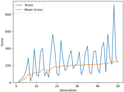
## Line Chart: Score vs. Generation
### Overview
This image presents a line chart illustrating the relationship between 'Generation' and 'Score', with a secondary line representing the 'Mean Score'. The chart appears to track the performance of a system or process over successive generations.
### Components/Axes
* **X-axis:** 'Generation', ranging from approximately 0 to 50.
* **Y-axis:** 'Score', ranging from approximately 0 to 800.
* **Legend:** Located in the top-left corner.
* 'Score' - Represented by a blue line.
* 'Mean Score' - Represented by an orange line.
### Detailed Analysis
The chart displays two distinct lines: 'Score' and 'Mean Score'.
**Score Line (Blue):**
The 'Score' line exhibits high volatility, fluctuating significantly across generations.
* At Generation 0, the Score is approximately 0.
* The Score rises rapidly to a peak of approximately 400 around Generation 7.
* It then declines to around 100 at Generation 10.
* The line continues to oscillate, reaching a maximum of approximately 550 at Generation 18, then dropping to around 150 at Generation 22.
* The Score continues to fluctuate, peaking again at approximately 850 around Generation 47, before falling to approximately 200 at Generation 50.
**Mean Score Line (Orange):**
The 'Mean Score' line is much smoother and less volatile than the 'Score' line.
* Starting at approximately 0 at Generation 0, the Mean Score gradually increases.
* It reaches a plateau of approximately 200 between Generations 20 and 40.
* Towards the end of the chart (Generations 40-50), the Mean Score shows a slight increase, reaching approximately 230 at Generation 50.
### Key Observations
* The 'Score' line demonstrates significant variance, indicating instability or sensitivity to changes in each generation.
* The 'Mean Score' line provides a smoothed representation of the overall trend, suggesting a gradual improvement in average performance over time.
* The gap between the 'Score' and 'Mean Score' lines is substantial, highlighting the variability in individual generation scores.
* The highest score observed is around 850 at Generation 47, while the lowest is near 0 at Generation 0.
### Interpretation
The chart likely represents the results of an evolutionary algorithm or a similar iterative process. The 'Score' line represents the performance of the best individual in each generation, while the 'Mean Score' line represents the average performance of the population. The high volatility of the 'Score' line suggests that the algorithm is exploring a complex search space, with occasional breakthroughs leading to high scores, followed by regressions. The gradual increase in the 'Mean Score' line indicates that the algorithm is, on average, making progress towards improving performance over time. The large gap between the two lines suggests that there is significant diversity within the population, with some individuals performing much better than others. The peak at Generation 47 could represent a particularly successful generation, but the subsequent decline suggests that this improvement may not be sustainable. The data suggests that while the algorithm is capable of achieving high scores, maintaining consistent performance remains a challenge.