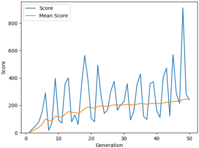
## Line Chart: Score vs. Generation
### Overview
The image displays a line chart plotting two data series over 50 generations. The chart illustrates the relationship between a "Score" (likely a fitness or performance metric) and the progression of "Generation" (suggesting an iterative process like an evolutionary algorithm or optimization routine). The visual shows high volatility in the individual score contrasted with a steadily improving mean score.
### Components/Axes
* **Chart Type:** Line chart with two data series.
* **X-Axis:**
* **Label:** "Generation"
* **Scale:** Linear, from 0 to 50.
* **Major Tick Marks:** At intervals of 10 (0, 10, 20, 30, 40, 50).
* **Y-Axis:**
* **Label:** "Score"
* **Scale:** Linear, from 0 to 800.
* **Major Tick Marks:** At intervals of 200 (0, 200, 400, 600, 800).
* **Legend:**
* **Position:** Top-left corner of the chart area.
* **Series 1:** "Score" - Represented by a blue line.
* **Series 2:** "Mean Score" - Represented by an orange line.
### Detailed Analysis
**1. "Score" (Blue Line) - Trend & Data Points:**
* **Trend:** The blue line exhibits a highly volatile, sawtooth pattern with sharp peaks and deep troughs. Despite the extreme short-term fluctuations, the overall trend is upward, with the magnitude of the peaks generally increasing over generations.
* **Key Approximate Data Points (Peaks & Troughs):**
* Starts near 0 at Generation 0.
* First significant peak: ~300 at Generation ~7.
* Notable peaks: ~580 at Gen ~18, ~500 at Gen ~22, ~420 at Gen ~32, ~580 at Gen ~45.
* **Highest Peak:** Approximately 900 at Generation ~48.
* Troughs frequently drop to between 50-150 throughout the chart.
**2. "Mean Score" (Orange Line) - Trend & Data Points:**
* **Trend:** The orange line shows a smooth, monotonic, and gradual upward trend. It acts as a central tendency line, filtering out the noise of the individual "Score."
* **Key Approximate Data Points:**
* Starts near 0 at Generation 0.
* Reaches ~100 by Generation ~10.
* Reaches ~200 by Generation ~25.
* Ends at approximately 250 at Generation 50.
### Key Observations
* **Volatility vs. Stability:** The most striking feature is the extreme contrast between the erratic, high-amplitude oscillations of the individual "Score" and the stable, predictable rise of the "Mean Score."
* **Increasing Peak Magnitude:** The highest peaks of the blue line occur in the latter half of the generations (e.g., Gen 45, 48), suggesting that while performance is unstable, the potential for high-scoring solutions increases over time.
* **Correlation of Dips:** The deep troughs in the blue line often occur immediately after a high peak, indicating a potential pattern of exploration (high score) followed by a period of lower-performing but perhaps diverse solutions.
* **Convergence Hint:** In the final generations (45-50), the blue line's troughs appear to be rising slightly, and the orange line continues its steady climb, which could indicate the beginning of population convergence toward higher fitness.
### Interpretation
This chart is characteristic of data from an **evolutionary algorithm or genetic optimization process**. The "Generation" axis represents iterations of the algorithm. The volatile "Score" likely represents the fitness value of the single best individual solution found in each generation. The smooth "Mean Score" represents the average fitness of the entire population in each generation.
The data suggests the algorithm is successfully improving the overall population's quality (rising Mean Score). However, the process is highly exploratory and non-monotonic at the individual level. The algorithm frequently discovers exceptionally high-performing solutions (the peaks), but these are not immediately retained or built upon in the next generation, leading to sharp drops. This could be due to mechanisms like mutation or a focus on maintaining population diversity to avoid local optima. The final observation of rising troughs is a positive sign, indicating that the baseline performance of the population is improving, even if the absolute best solution fluctuates wildly. The ultimate goal of such a process is for the Mean Score to continue rising and for the high peaks to become more frequent and sustained.