## Chart: Density Plot Comparison
### Overview
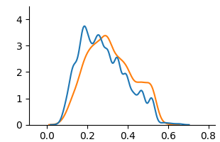
The image shows a density plot comparing two distributions. One distribution is represented by a blue line, and the other by an orange line. The x-axis ranges from approximately -0.1 to 0.8, and the y-axis ranges from 0 to 4. The plot illustrates the probability density of a continuous variable.
### Components/Axes
* **X-axis:** Ranges from -0.1 to 0.8 in increments of 0.2.
* **Y-axis:** Ranges from 0 to 4 in increments of 1.
* **Blue Line:** Represents one distribution.
* **Orange Line:** Represents another distribution.
### Detailed Analysis
* **Blue Line:**
* Starts near 0 at x = -0.1.
* Rises to a peak around y = 3.8 at x = 0.2.
* Decreases to approximately y = 1 at x = 0.5.
* Ends near 0 at x = 0.8.
* **Orange Line:**
* Starts near 0 at x = -0.1.
* Rises to a peak around y = 3 at x = 0.25.
* Decreases to approximately y = 1.6 at x = 0.5.
* Ends near 0 at x = 0.8.
### Key Observations
* Both distributions have a similar shape, with a peak between x = 0.2 and x = 0.3.
* The blue line has a slightly higher peak than the orange line.
* The blue line has more fluctuations than the orange line.
### Interpretation
The density plot compares two distributions, showing their relative probabilities across a range of values. The similarity in shape suggests that the underlying processes generating these distributions may be related. The differences in peak height and fluctuations indicate variations in the frequency and variability of the data. The blue distribution has a higher peak, suggesting a higher concentration of values around x = 0.2, while the orange distribution is slightly more spread out.