\n
## Density Plot: Comparison of Two Unlabeled Distributions
### Overview
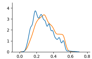
The image displays a density plot (or smoothed histogram) comparing two continuous distributions. The plot features two overlapping curves—one blue and one orange—plotted against a common x-axis. There are no explicit titles, axis labels, or a legend present in the image. The chart appears to be a standard statistical visualization, likely generated by a library such as Matplotlib or Seaborn.
### Components/Axes
* **X-Axis:** A horizontal numerical axis ranging from `0.0` to `0.8`. Major tick marks are placed at intervals of `0.2` (0.0, 0.2, 0.4, 0.6, 0.8). The axis has no label.
* **Y-Axis:** A vertical numerical axis ranging from `0` to `4`. Major tick marks are placed at integer intervals (0, 1, 2, 3, 4). The axis has no label.
* **Data Series:** Two series are represented by smooth, continuous lines.
* **Series 1 (Blue Line):** A darker blue curve.
* **Series 2 (Orange Line):** A lighter orange curve.
* **Legend:** No legend is present in the image. The series are distinguished solely by color.
* **Title/Labels:** No chart title, x-axis label, y-axis label, or annotations are visible.
### Detailed Analysis
**Trend Verification & Data Point Approximation:**
* **Blue Curve Trend:** The blue line starts near y=0 at x=0.0, rises sharply to a primary peak, then descends with several smaller fluctuations (secondary peaks/shoulders) before tapering off near y=0 at x=0.6.
* **Primary Peak:** Located at approximately **x ≈ 0.20**, with a peak density value of **y ≈ 3.8**.
* **Secondary Features:** Notable smaller peaks or shoulders occur around **x ≈ 0.30 (y ≈ 2.8)** and **x ≈ 0.40 (y ≈ 2.0)**.
* **Range:** The bulk of the distribution (where y > 0.5) spans from roughly **x=0.10 to x=0.50**.
* **Orange Curve Trend:** The orange line also starts near y=0 at x=0.0, rises to a peak slightly to the right of the blue peak, then descends more smoothly with one prominent secondary hump before tapering off near y=0 at x=0.6.
* **Primary Peak:** Located at approximately **x ≈ 0.25**, with a peak density value of **y ≈ 3.4**.
* **Secondary Feature:** A distinct, broad shoulder or secondary peak is centered around **x ≈ 0.45**, with a local maximum of **y ≈ 1.6**.
* **Range:** The bulk of the distribution spans from roughly **x=0.12 to x=0.55**.
**Spatial Grounding & Cross-Reference:**
* The two curves intersect at two approximate points: near **x ≈ 0.15** and **x ≈ 0.35**.
* To the left of the first intersection (x < 0.15), the blue curve is above the orange curve.
* Between the intersections (0.15 < x < 0.35), the orange curve is above the blue curve.
* To the right of the second intersection (x > 0.35), the blue curve is generally above the orange curve until the orange secondary peak, after which they converge.
### Key Observations
1. **Peak Discrepancy:** The blue distribution has a higher and earlier peak (x≈0.20, y≈3.8) compared to the orange distribution (x≈0.25, y≈3.4).
2. **Shape Difference:** The blue curve is more "jagged" or multimodal, suggesting potential subgroups or noise in the underlying data. The orange curve is smoother but exhibits a pronounced secondary mode around x=0.45.
3. **Spread:** The orange distribution appears slightly more spread out (has a wider effective range) due to its prominent secondary hump extending further to the right.
4. **Overlap:** There is significant overlap between the two distributions, indicating they share a common range of values, but their central tendencies and shapes differ.
### Interpretation
This chart visually compares the probability density of two datasets or conditions. Without labels, the specific context is unknown, but the patterns suggest the following:
* **The blue group** has a strong concentration of values around 0.20, with less probability mass at higher values. Its jagged shape might indicate a mixture of underlying processes or a smaller sample size leading to less smooth estimation.
* **The orange group** has its central tendency shifted slightly higher (mode at 0.25) and shows a significant secondary concentration of values around 0.45. This bimodal characteristic could suggest the presence of two distinct subgroups within the orange dataset or a different generating process compared to the blue dataset.
* **The relationship** between the curves implies that while both phenomena operate in a similar domain (0.0 to 0.6), the "orange" phenomenon is more likely to produce values in the mid-to-high range (0.25-0.55) than the "blue" phenomenon, which is more tightly clustered at the lower end.
**Note:** The absence of axis labels and a legend is a critical limitation. To derive concrete meaning, one would need to know what the x-axis represents (e.g., time, concentration, score) and what the two colors signify (e.g., Control vs. Treatment, Model A vs. Model B, Group 1 vs. Group 2). The provided information is purely statistical and descriptive of the visualized shapes.