## Bar Chart: Naming Variation by Concept (Inconsistency Measure)
### Overview
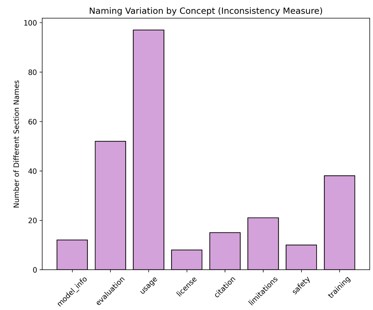
The chart visualizes the inconsistency in naming across eight technical documentation concepts. Bars represent the number of different section names used for each concept, with "usage" showing the highest inconsistency (~98) and "license" the lowest (~8). All bars are purple, and the legend is positioned on the right.
### Components/Axes
- **X-axis (Categories)**:
`model_info`, `evaluation`, `usage`, `license`, `citation`, `limitations`, `safety`, `training`
- **Y-axis (Values)**:
Labeled "Number of Different Section Names" with a scale from 0 to 100.
- **Legend**:
Single entry for "Number of Different Section Names" (purple bars).
### Detailed Analysis
- **model_info**: ~12 different names (low inconsistency).
- **evaluation**: ~52 different names (moderate-high inconsistency).
- **usage**: ~98 different names (highest inconsistency).
- **license**: ~8 different names (lowest inconsistency).
- **citation**: ~15 different names (low inconsistency).
- **limitations**: ~21 different names (moderate inconsistency).
- **safety**: ~10 different names (low inconsistency).
- **training**: ~38 different names (moderate inconsistency).
### Key Observations
1. **Usage** dominates with ~98 different names, suggesting extreme variability in terminology.
2. **Evaluation** and **training** follow as the next most inconsistent concepts (~52 and ~38, respectively).
3. **License**, **safety**, and **citation** show the least inconsistency (~8–15 names).
4. **Limitations** (~21) and **model_info** (~12) fall in the mid-to-low range.
### Interpretation
The data highlights significant naming inconsistency in **usage** sections, potentially reflecting ad-hoc or context-dependent terminology. **Evaluation** and **training** also show notable variability, possibly due to iterative or audience-specific naming conventions. In contrast, **license** and **safety** sections exhibit standardized naming, likely due to regulatory or compliance requirements. The stark contrast between **usage** (~98) and **license** (~8) underscores the need for clearer naming guidelines in high-variability areas. The uniform purple color across bars simplifies interpretation but limits differentiation between concepts.
## Peircean Investigative Insight
The chart invites further inquiry into why **usage** sections exhibit such high inconsistency. Are these sections more prone to subjective interpretation, or do they lack centralized oversight? The low inconsistency in **license** and **safety** suggests these areas benefit from formalized standards, offering a model for reducing variability elsewhere. The absence of a secondary color scheme (e.g., for severity levels) leaves room for deeper analysis of root causes.