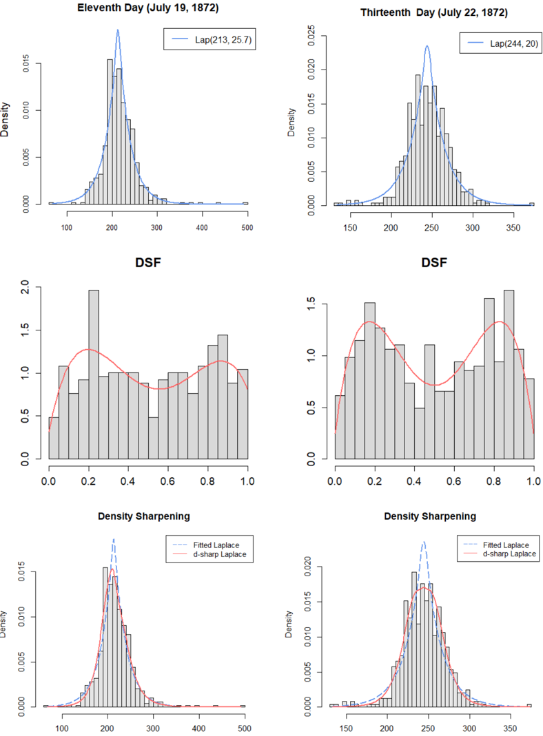
## Chart/Diagram Type: Comparative Histograms and Density Plots
### Overview
The image presents a comparative analysis of data distributions across two different days: July 19, 1872 (Eleventh Day) and July 22, 1872 (Thirteenth Day). For each day, three plots are shown: a histogram with a fitted Laplace distribution, a histogram representing Density Sharpening Function (DSF), and a histogram with both fitted Laplace and d-sharp Laplace distributions. The plots are arranged in two columns, with the Eleventh Day on the left and the Thirteenth Day on the right.
### Components/Axes
**Top Row (Laplace Distribution):**
* **Title (Left):** Eleventh Day (July 19, 1872)
* **Title (Right):** Thirteenth Day (July 22, 1872)
* **Y-axis:** Density, ranging from 0.000 to 0.015 (left) and 0.000 to 0.025 (right).
* **X-axis (Left):** Ranges from 100 to 500.
* **X-axis (Right):** Ranges from 150 to 350.
* **Data:** Histograms with overlaid blue Laplace distribution curves.
* **Legend (Top Right of each plot):** "Lap(x, y)" where x and y are numerical values. Left plot: Lap(213, 25.7). Right plot: Lap(244, 20).
**Middle Row (DSF):**
* **Title (Left):** DSF
* **Title (Right):** DSF
* **Y-axis:** Ranges from 0.0 to 2.0 (left) and 0.0 to 1.5 (right).
* **X-axis:** Ranges from 0.0 to 1.0.
* **Data:** Histograms with overlaid red curves.
**Bottom Row (Density Sharpening):**
* **Title (Left):** Density Sharpening
* **Title (Right):** Density Sharpening
* **Y-axis:** Density, ranging from 0.000 to 0.015 (left) and 0.000 to 0.020 (right).
* **X-axis (Left):** Ranges from 100 to 500.
* **X-axis (Right):** Ranges from 150 to 350.
* **Data:** Histograms with overlaid blue dashed (Fitted Laplace) and red solid (d-sharp Laplace) curves.
* **Legend (Bottom Right of each plot):**
* Fitted Laplace (blue dashed line)
* d-sharp Laplace (red solid line)
### Detailed Analysis
**Top Row (Laplace Distribution):**
* **Eleventh Day (July 19, 1872):** The histogram shows a distribution centered around 200, with a long tail extending to the right. The blue Laplace curve fits this distribution, peaking around 213.
* **Thirteenth Day (July 22, 1872):** The histogram is centered around 250, with a narrower spread compared to the Eleventh Day. The blue Laplace curve peaks around 244.
**Middle Row (DSF):**
* **Eleventh Day (July 19, 1872):** The red curve shows a relatively flat distribution with a slight peak around 0.2 and another around 0.8.
* **Thirteenth Day (July 22, 1872):** The red curve shows two distinct peaks, one around 0.2 and another around 0.8.
**Bottom Row (Density Sharpening):**
* **Eleventh Day (July 19, 1872):** Both the blue dashed (Fitted Laplace) and red solid (d-sharp Laplace) curves peak around 200-220, with the d-sharp Laplace curve being slightly more peaked.
* **Thirteenth Day (July 22, 1872):** Both curves peak around 240-250, with the d-sharp Laplace curve being more peaked.
### Key Observations
* The distributions on the Thirteenth Day (July 22, 1872) appear to be more concentrated around their mean compared to the Eleventh Day (July 19, 1872).
* The Density Sharpening plots show that the d-sharp Laplace distribution is more peaked than the fitted Laplace distribution for both days.
* The DSF plots show different patterns between the two days, suggesting changes in the underlying data characteristics.
### Interpretation
The image presents a comparative analysis of data distributions on two different days using histograms and fitted Laplace distributions. The shift in the central tendency and the change in the shape of the distributions between the Eleventh and Thirteenth days suggest that the underlying data characteristics have changed over this period. The Density Sharpening plots further highlight these differences, indicating that the data on the Thirteenth Day may be more concentrated or "sharper" than on the Eleventh Day. The Laplace distribution parameters (Lap(213, 25.7) vs. Lap(244, 20)) quantify these changes, showing an increase in the mean and a decrease in the standard deviation from the Eleventh to the Thirteenth day. The d-sharp Laplace distribution consistently shows a more peaked distribution, indicating a higher concentration of data around the mean compared to the fitted Laplace distribution.